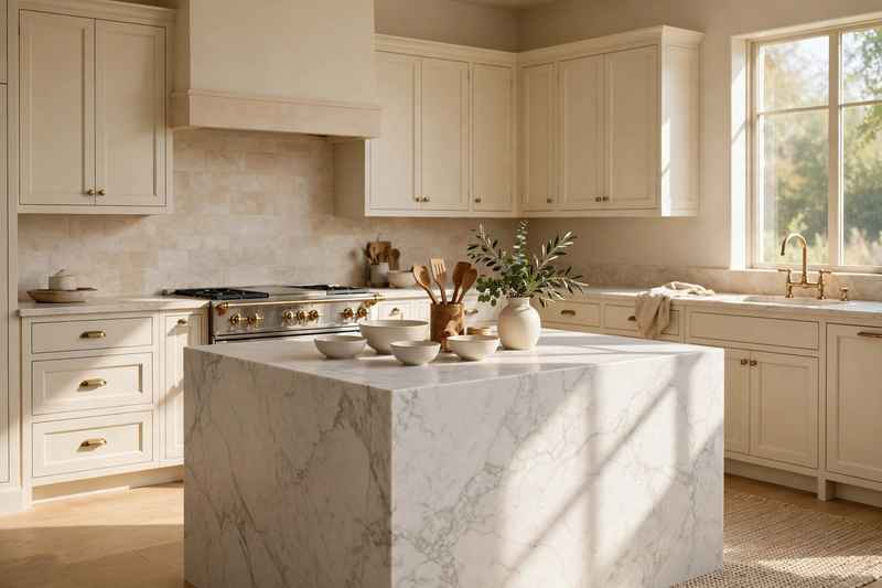
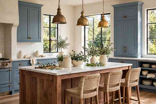
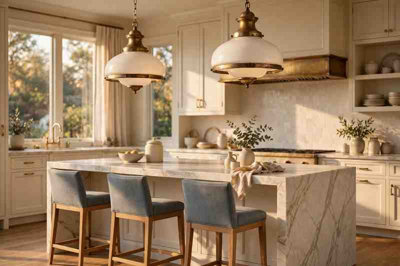
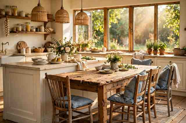
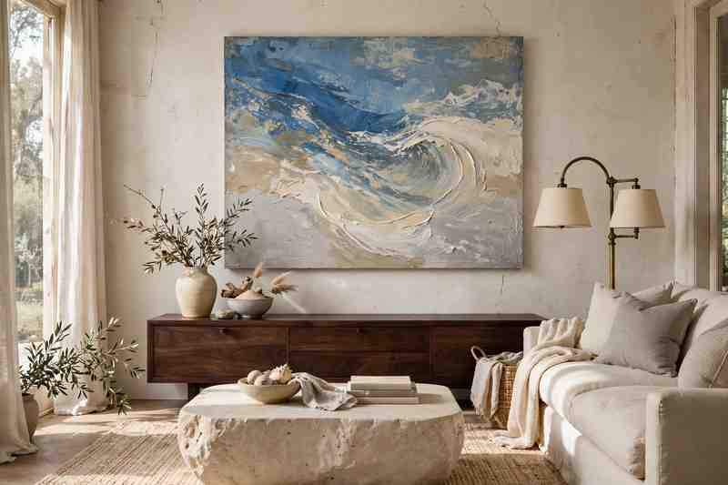
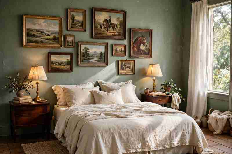
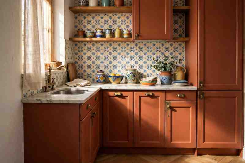
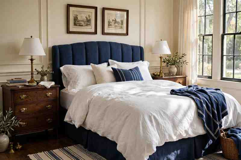
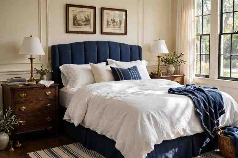
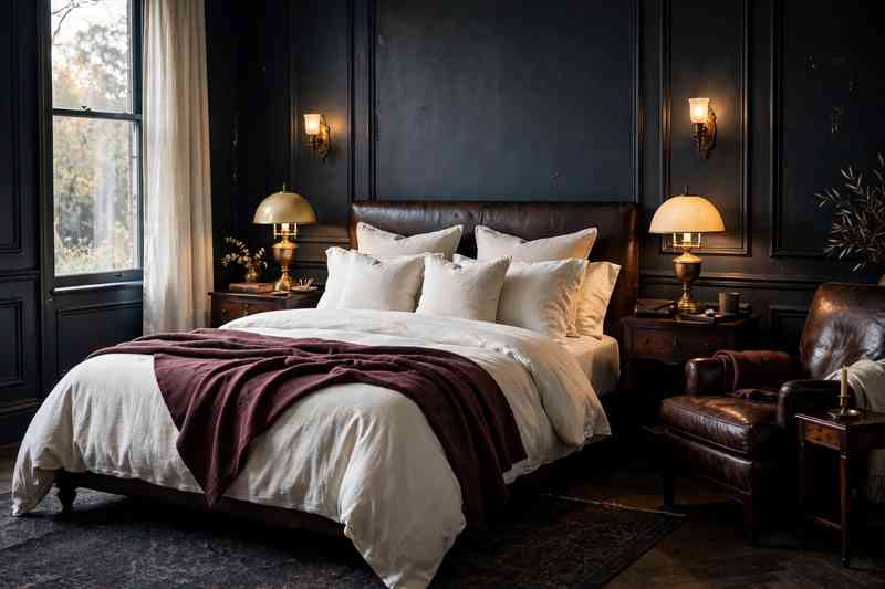
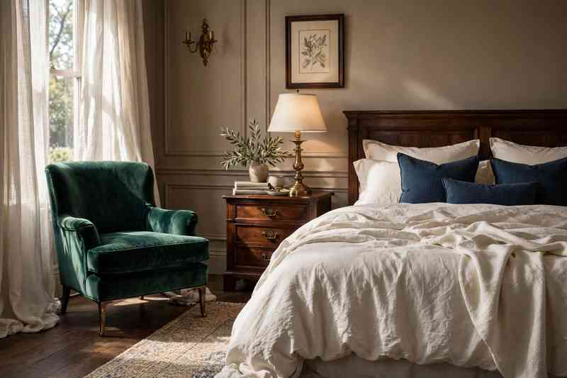
Summer decorating does not have to mean filling your home with bright colors, seashells, or obvious beach accessories. The best summer interiors for 2026 feel lighter, cooler, and more relaxed while still looking polished.
This year’s summer home decor trends lean toward natural textures, soft coastal colors, breathable fabrics, relaxed furniture, and small details that make everyday rooms feel more comfortable. You can completely refresh a room with a linen curtain, woven pendant, striped pillow, or a bowl of fresh greenery.
Whether you love coastal interiors, modern farmhouse style, quiet luxury, or a more collected look, these 25 summer home decor ideas can help you create a breezy home without making it feel overly seasonal.
1. Layer Soft Linen Everywhere
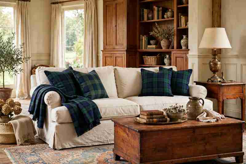
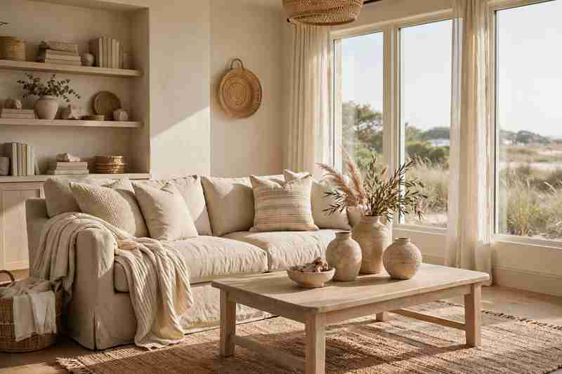
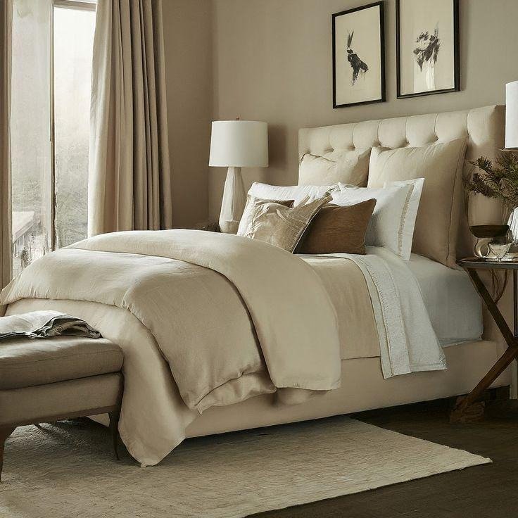
Linen is one of the easiest ways to make a room feel ready for summer. Its slightly rumpled texture gives furniture and bedding a relaxed appearance while keeping the overall look sophisticated.
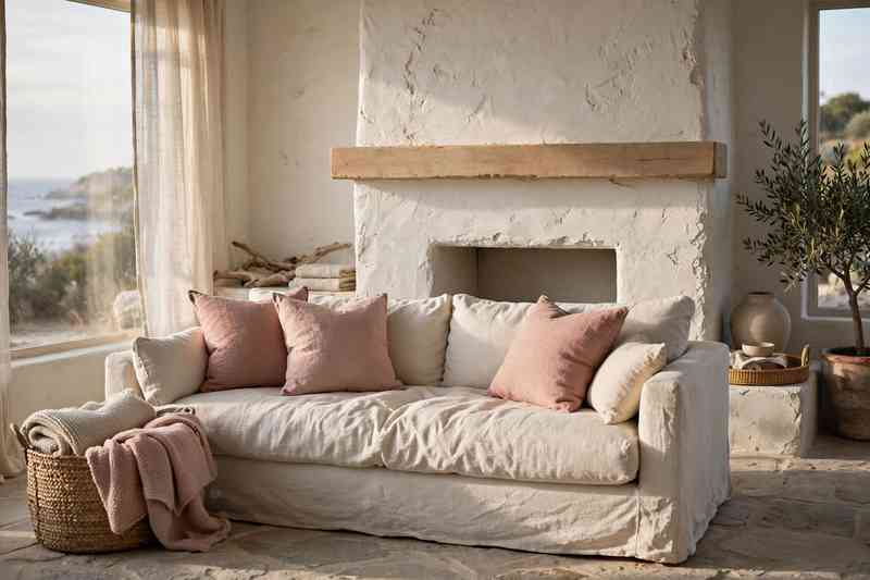
Try linen duvet covers in bedrooms, relaxed slipcovers in living rooms, or lightweight linen curtains that allow plenty of daylight through.
For a timeless palette, stick with ivory, oatmeal, warm white, or soft beige.
2. Bring in Natural Woven Textures
Woven materials instantly add warmth and texture without making a room visually heavy. Think rattan baskets, cane furniture, woven lampshades, seagrass rugs, and jute accessories.
You do not need to decorate an entire room with natural fibers. One or two larger woven pieces can be enough to create that breezy summer feeling.
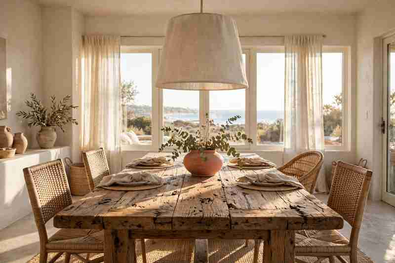
A rattan pendant over a dining table is especially effective because it adds texture while keeping the room visually light.
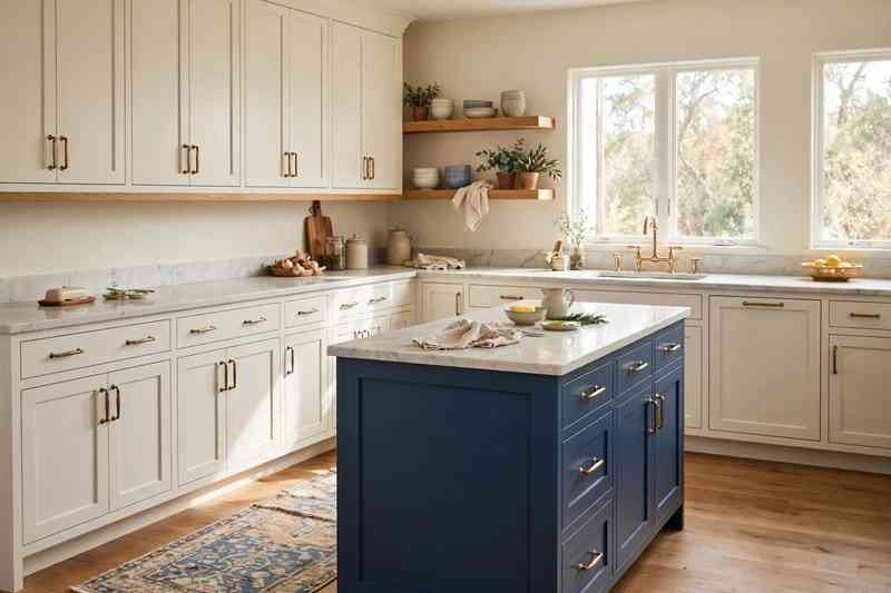
3. Try a Soft Blue and Cream Color Palette
Blue and cream remain a beautiful combination for summer because they feel fresh without becoming too bright.
Instead of using a strong ocean blue everywhere, try dusty blue, faded denim, powder blue, or muted blue-gray with creamy whites.
Use blue on pillows, artwork, a kitchen island, an accent chair, or bedroom bedding while keeping larger surfaces neutral.
4. Add Stripes in Unexpected Places
Stripes are having a particularly useful moment in summer interiors because they can work with almost any decorating style.
Try ticking stripes on dining chairs, wide-striped curtains, striped lumbar pillows, or a subtle striped rug.
For a more sophisticated look, combine one bold stripe with smaller patterns instead of covering the entire room in matching stripes.
5. Choose Lightweight Cotton Bedding
Summer bedrooms benefit from bedding that looks as comfortable as it feels.
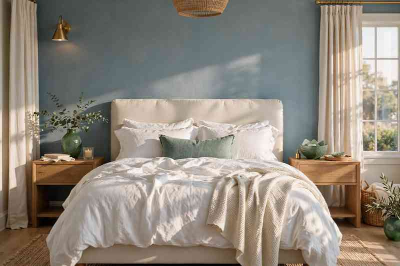
Replace heavy layers with breathable cotton quilts, lightweight coverlets, cotton percale sheets, and loosely folded blankets.
White is an easy starting point, but pale blue, sage, soft tan, and faded gray can add more personality without making the bedroom feel busy.
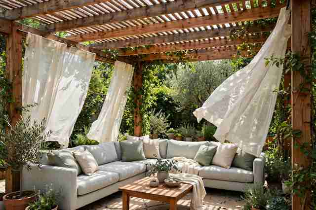
6. Use Sheer Curtains for an Airy Look
Heavy window treatments can make rooms feel darker during warmer months. Sheer or lightweight curtains create a softer atmosphere while allowing natural daylight to filter through.
Choose warm white or ivory instead of stark white if your room has beige, wood, or natural stone elements.
Hang curtains slightly wider and higher than the window frame to make the room feel more spacious.
7. Bring Pale Wood Into Summer Rooms
Light oak, ash, maple, and other pale woods work beautifully with summer decorating.
A pale wood coffee table, dining table, nightstand, or console can make a room feel brighter without relying on white furniture.
Pair light wood with linen, woven textures, ceramic pieces, and muted blue or green accents for an effortless combination.
8. Create a Relaxed Coastal-Inspired Corner
You do not need a beach house to borrow a few coastal decorating ideas.
Create a small coastal-inspired corner with a comfortable linen chair, woven basket, light wood side table, blue-and-white cushion, and simple artwork.
Avoid filling the space with anchors, shells, or nautical signs. The goal is to capture the relaxed feeling of the coast rather than recreate a souvenir shop.
9. Decorate With Fresh Greenery
Fresh greenery is one of the simplest summer decor updates and works in almost every room.
Place leafy branches in a tall ceramic vase, add eucalyptus to a bathroom, or use a simple arrangement of seasonal stems on the dining table.
Even a few branches in an oversized glass or pottery vessel can create a beautiful focal point.
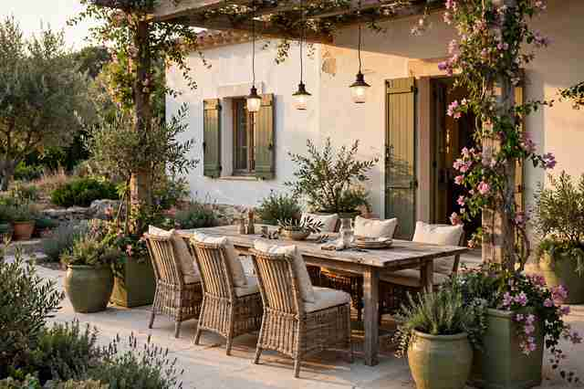
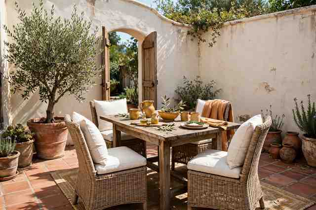
10. Embrace Mediterranean-Inspired Details
Mediterranean interiors are bringing warmer summer energy into homes through terracotta, natural wood, handmade ceramics, limewashed surfaces, and earthy textiles.
You can introduce the look without changing your entire room.
A terracotta vase, woven pendant, rustic ceramic bowl, or textured neutral throw can provide just enough Mediterranean character.
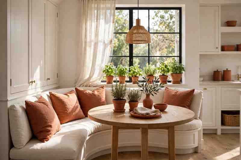
11. Try Terracotta With Cream
Terracotta is a wonderful alternative to the usual summer blue palette.
Pair warm terracotta with cream walls, natural wood, beige linen, and woven accessories. The combination feels sun-warmed and inviting without becoming too colorful.
Use terracotta sparingly through pottery, cushions, artwork, tableware, or a small accent rug.
12. Style an Indoor Summer Dining Table
Summer is a good excuse to make everyday meals feel a little more special.
Keep the dining table simple with natural linen napkins, ceramic plates, clear glassware, a wooden serving board, and a small arrangement of greenery.
For a relaxed table, skip overly formal place settings. A few well-chosen textures often look better than a table covered with accessories.
13. Add Handcrafted Ceramic Pieces
Perfectly matching accessories can sometimes make a room feel too staged. Handmade ceramics bring small variations in shape, glaze, and texture that make a space feel more collected.
Look for bowls, vases, pitchers, candle holders, and serving pieces in creamy white, sandy beige, soft blue, or earthy clay tones.
Display a few pieces together rather than scattering dozens throughout the house.
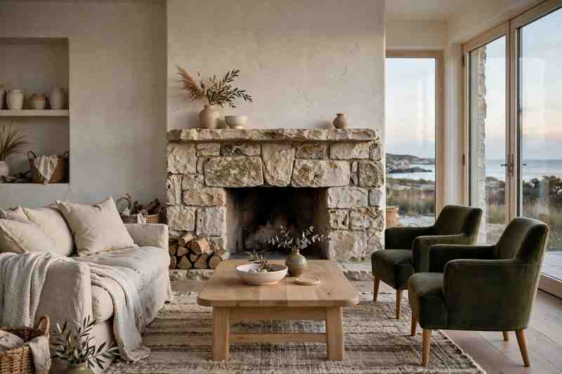
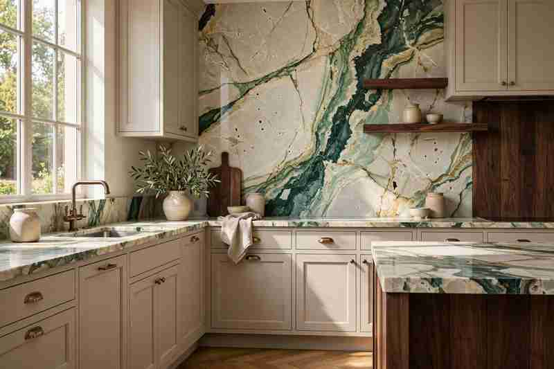
14. Use Natural Stone as an Accent
Natural stone brings a cool, grounded quality to summer spaces.
Travertine, limestone, marble, and soapstone can appear in coffee tables, side tables, trays, countertops, or decorative objects.
If a new stone table is outside your budget, try a small stone tray or lamp base for a similar material effect.
15. Bring the Outdoors Into the Entryway
Summer decorating should not stop at the living room.
Give your entryway a lighter feel with a woven basket, simple bench, pale wood console, ceramic vase, and fresh greenery.
A natural fiber runner can also soften the space while adding texture underfoot.
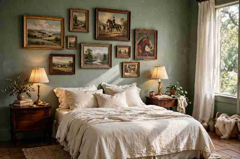
16. Create a Breezy Summer Bedroom
A summer bedroom should feel calm rather than overly decorated.
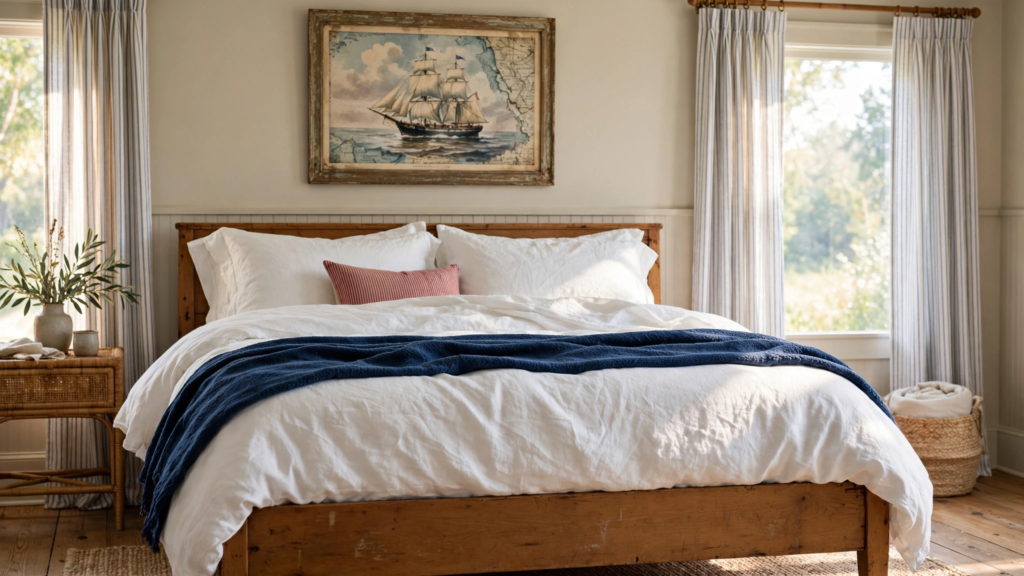
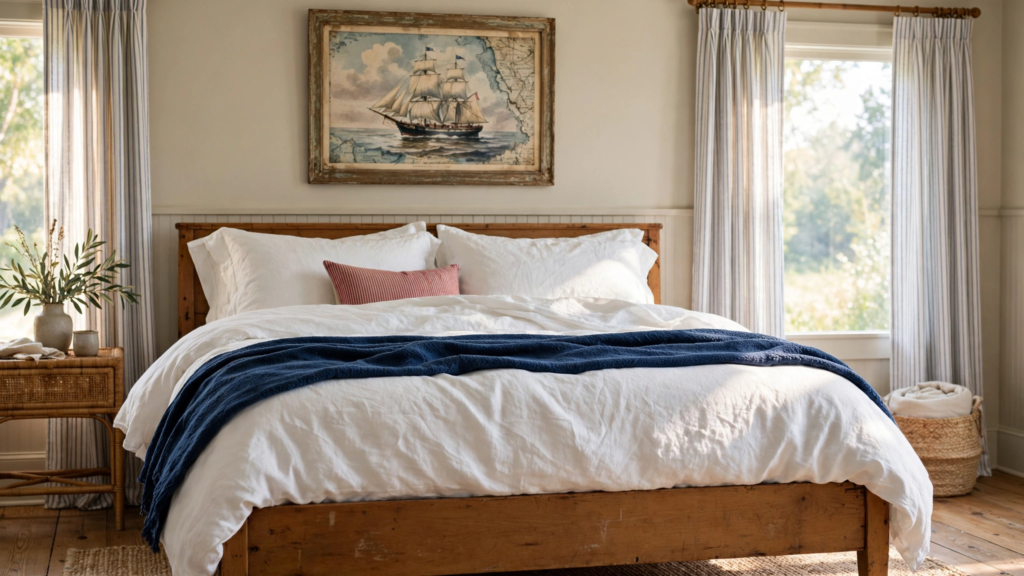
Start with light bedding, natural textures, minimal bedside accessories, and breathable curtains. Add one or two blue, green, or sandy-toned accents for color.
If your bedroom already has neutral furniture, simply changing the bedding and window treatments can make a surprisingly large difference.
17. Mix Blue With Warm Wood
Blue can sometimes make a room feel cool, especially when paired with lots of white. Warm wood balances it beautifully.
Try a navy or dusty blue chair beside a walnut table, blue bedding against a wood headboard, or blue kitchen cabinets with oak shelving.
The contrast creates a summer palette that feels comfortable throughout the year.
18. Add a Woven Pendant Light
Lighting is often overlooked when decorating for summer, but a woven pendant can change the atmosphere of an entire room.
Rattan, cane, bamboo, and seagrass shades create soft shadows and introduce natural texture.
Use one above a breakfast table, kitchen island, bedroom nightstand, or small reading area.
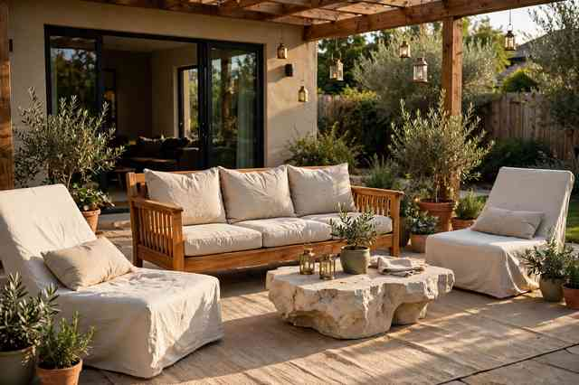
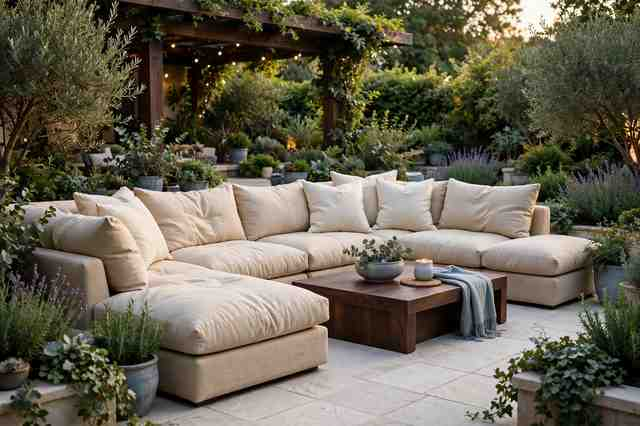
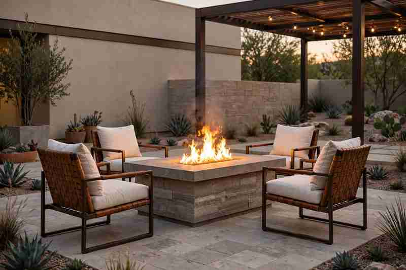
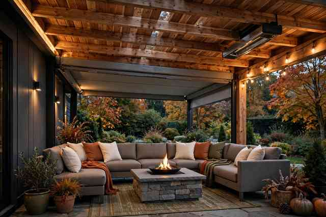
19. Make Outdoor Spaces Feel Like Real Rooms
Patios and balconies are becoming extensions of indoor living spaces.
Instead of treating outdoor furniture as an afterthought, create distinct zones for lounging, dining, and relaxing.
Add outdoor cushions, a durable rug, lantern-style lighting, side tables, and plenty of greenery. The result feels more intentional and comfortable for long summer evenings.
20. Use Oversized Greenery as Decor
Small houseplants are always useful, but large greenery can make a stronger visual statement.
Try a tall olive tree, fiddle-leaf fig, bird of paradise, or another suitable indoor plant in a large textured planter.
Place it beside a window, in an empty corner, or next to a console where its height can balance the room.
21. Bring in Faded Vintage Textiles
Summer interiors do not have to look brand new.
Faded vintage-style rugs, washed cotton throws, antique quilts, and old-fashioned striped fabrics add character while keeping the room relaxed.
Look for pieces with slightly imperfect patterns and softened colors. They pair especially well with linen and natural wood.
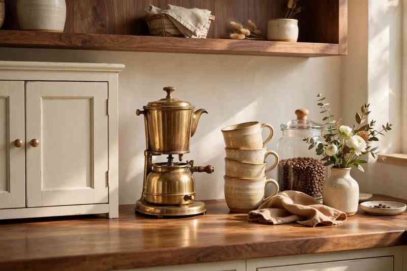
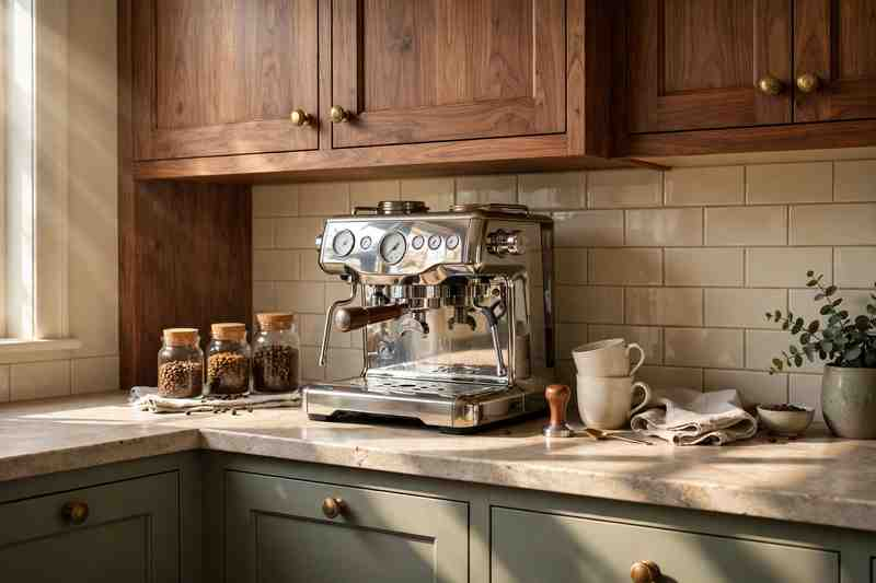
22. Create a Simple Summer Coffee Station
A small coffee station can become a charming seasonal detail in a kitchen or dining area.
Use a wooden tray, ceramic mugs, a glass jar for coffee beans, a small vase of greenery, and perhaps a bowl for sugar or pastries.
Keep the setup functional rather than overcrowded. The best coffee stations still feel like part of the kitchen.
23. Add Soft Green Accents
Green is another excellent summer color because it connects naturally with the outdoors.
For 2026, consider muted sage, olive, eucalyptus, or soft moss instead of extremely bright green.
A green throw, accent chair, kitchen accessories, artwork, or bedroom pillow can add freshness without overpowering a neutral room.
24. Use Less Decor and Better Textures
One of the strongest summer decorating ideas is simply editing the room.
Remove a few unnecessary accessories and allow your larger pieces, natural materials, and architectural details to breathe.
A linen sofa, wood table, woven basket, ceramic vase, and one beautiful piece of artwork can often create more visual interest than a crowded collection of small decorations.
25. Create a Collected Summer Living Room
The most appealing summer interiors rarely follow one decorating style perfectly.
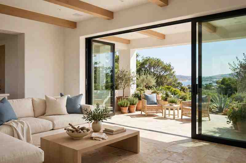
Combine a comfortable linen sofa with a vintage-style rug, warm wood coffee table, woven basket, blue accent pillows, ceramic objects, and fresh greenery.
The result should feel like a home that has developed naturally rather than a room decorated from one matching collection.
That collected approach is especially useful if you want your summer decor to remain attractive once the season changes.
How to Refresh Your Home for Summer Without Redecorating
You do not need to replace major furniture pieces to make your home feel lighter.
Start with the areas that have the biggest visual impact:
Replace heavy throws with lightweight cotton or linen.
Switch dark cushions for soft blue, green, cream, or natural tones.
Add sheer curtains where practical.
Introduce one or two woven accessories.
Bring in fresh greenery.
Swap heavy rugs for lighter textures where appropriate.
Remove unnecessary decorative objects.
Add a ceramic vase or handmade bowl.
Change a few pieces of artwork for brighter seasonal colors.
Rearrange furniture to improve airflow and create more open space.
Small changes are often enough to make a room feel noticeably different.
The Best Summer Decor Color Combinations for 2026
If you are unsure which palette to choose, these combinations are easy starting points:
Cream + Pale Blue: Fresh, coastal, and timeless.
Sand + Sage Green: Soft, natural, and relaxed.
White + Warm Wood: Simple and airy with plenty of warmth.
Terracotta + Cream: Earthy and Mediterranean-inspired.
Navy + Linen: Classic and slightly more dramatic.
Olive + Natural Beige: Rich enough for a sophisticated interior while still feeling connected to nature.
Soft Blue + Walnut: A balanced combination of cool and warm tones.
Summer Decor Ideas on a Budget
A seasonal refresh does not have to become a major shopping trip.
Start by shopping your own home. Move baskets, lamps, artwork, pillows, and ceramic pieces between rooms to create a different arrangement.
You can also make inexpensive changes by:
Adding new pillow covers instead of replacing pillows.
Using thrifted baskets for storage.
Displaying branches from your garden in a simple vase.
Switching dark bedding for a lightweight cotton quilt.
Painting a small side table in a lighter shade.
Adding a secondhand vintage-style rug.
Using inexpensive linen-look curtains.
Styling an existing tray with summer accessories.
Bringing outdoor plants into suitable indoor areas.
The trick is to change texture and arrangement before spending money on new furniture.
Summer Decorating Mistakes to Avoid
Summer decor can quickly become predictable if every piece points toward the same theme.
Avoid using too many nautical accessories, overly bright beach colors, matching coastal signs, or excessive seashell decorations.
Another common mistake is making everything white. A room filled with white furniture, white walls, white curtains, and white accessories can feel flat.
Instead, combine warm neutrals with wood, woven textures, muted colors, ceramics, greenery, and subtle patterns.
Finally, do not sacrifice comfort for appearance. Summer rooms should look inviting enough that people actually want to sit, eat, read, and relax in them.
Summer Home Decor Checklist
Before you consider your summer refresh finished, check whether your home has:
☐ Lightweight fabrics ☐ Natural woven textures ☐ A simple summer color palette ☐ Fresh greenery or plants ☐ At least one warm wood element ☐ Comfortable seating ☐ Soft, breathable window treatments ☐ A few handmade or textured accessories ☐ Seasonal table details ☐ Less unnecessary clutter ☐ Comfortable outdoor seating if you have an outdoor space
Frequently Asked Questions
What are the biggest summer home decor trends for 2026?
Some of the strongest summer decorating directions include linen fabrics, natural woven textures, soft blue and green palettes, pale wood, handmade ceramics, relaxed coastal influences, warm earthy tones, and indoor-outdoor living.
What colors are popular for summer home decor in 2026?
Cream, warm white, pale blue, dusty blue, sage, olive, sand, terracotta, and natural beige are versatile choices for summer interiors.
How can I make my house feel summery without using beach decor?
Focus on light fabrics, natural textures, greenery, pale wood, breathable curtains, soft colors, and uncluttered rooms. These elements create a summer atmosphere without obvious nautical accessories.
What is the easiest summer decor update?
Changing textiles is usually one of the easiest options. Swap heavy bedding, curtains, pillows, and throws for lighter fabrics and softer colors. Adding fresh greenery can make the change even more noticeable.
How can I decorate for summer on a small budget?
Rearrange furniture and shop your existing decor first. Then focus your spending on affordable changes such as pillow covers, baskets, plants, ceramic accessories, lightweight throws, and simple curtains.
Final Thoughts
The best 2026 summer home decor trends are less about creating a perfectly themed seasonal house and more about making everyday spaces feel lighter, cooler, and easier to live in.
Start with breathable fabrics, natural textures, soft colors, greenery, and a little less clutter. Then add personality through vintage textiles, handmade ceramics, warm wood, stripes, or earthy accents.
You do not need to change everything. A few thoughtful updates can give your home that breezy summer feeling while still looking beautiful long after the season ends.
Decorating for the 4th of July does not mean covering every surface in red, white, and blue. A few thoughtful touches can make your home feel festive while still looking stylish and comfortable.
The best 4th of July home decor ideas mix classic American colors with natural textures, simple table settings, seasonal flowers, porch details, and pieces you can reuse every summer. Whether you live in a small apartment, suburban house, farmhouse, or modern home, there are plenty of ways to celebrate without making the decor feel overwhelming.
From an easy front porch refresh to a patriotic dining table, here are 21 ideas worth saving for your next Independence Day gathering.
1. Start With a Classic Red, White, and Blue Palette
The easiest way to create a 4th of July atmosphere is with the traditional colors of the holiday.
You do not need equal amounts of each shade. Start with a mostly neutral room and introduce red and blue through pillows, flowers, table linens, artwork, or small accessories.
Keeping the background white, cream, or natural wood helps the patriotic colors feel intentional rather than overwhelming.
2. Decorate the Front Porch With American Flags
The front porch is one of the easiest places to make a holiday statement.
Hang a small American flag near the door, place a larger flag in a planter, or use several small flags along the porch steps. Pair them with simple greenery, a classic doormat, and neutral planters.
The result feels festive without requiring a complete porch makeover.
3. Create a Patriotic Summer Wreath
A seasonal wreath can instantly change the look of your front door.
Try a simple wreath made with eucalyptus, cotton stems, dried grasses, or greenery accented with small red, white, and blue ribbons.
For a more traditional look, use navy ribbon and small fabric stars. If your home already has colorful landscaping, a mostly green wreath with a small patriotic accent may look more polished.
4. Style a Red, White, and Blue Dining Table
The dining table is a natural focal point for Independence Day gatherings.
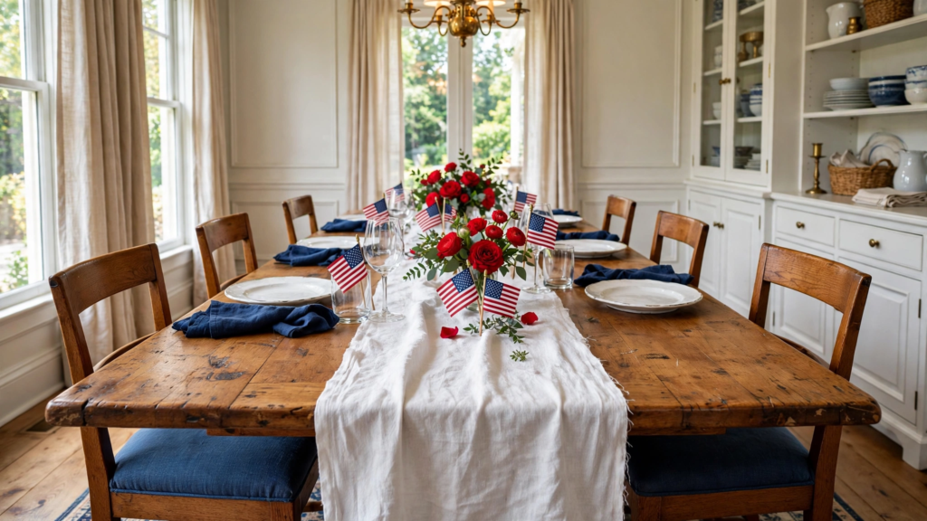
Start with a white or natural linen tablecloth. Add blue napkins, red flowers, simple white plates, and clear glassware.
You can also place small American flags beside each setting for an unmistakably festive touch.
Keep the centerpiece low enough that guests can comfortably talk across the table.
5. Use Blue and White Dishes
If you prefer subtle holiday decor, blue and white tableware is an easy choice.
Blue ceramic plates, white bowls, striped napkins, and clear glasses create a classic summer table without relying heavily on bright red.
Add a few red flowers or berries to bring in the third color.
The best part is that blue and white dishes can stay in your kitchen long after July 4th.
6. Add Patriotic Pillows to the Living Room
You can make the living room feel festive in minutes by switching a few pillow covers.
Look for navy stripes, small stars, red ticking stripes, gingham, or simple geometric patterns.
If your sofa is neutral, two or three seasonal pillows may be enough. There is no need to replace your existing furniture or introduce holiday decorations everywhere.
7. Create a Festive Kitchen Counter Display
Kitchen counters are perfect for small seasonal arrangements.
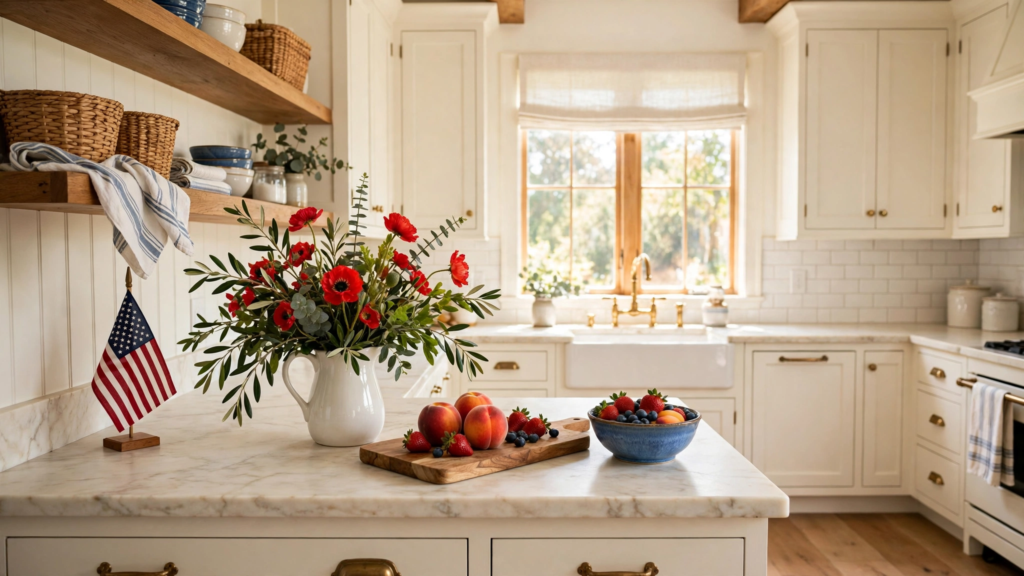
Place a white ceramic pitcher filled with red and blue flowers beside a wooden cutting board. Add a small American flag, a bowl of summer fruit, or a blue ceramic container.
Keep the arrangement practical so your counters remain usable for cooking and entertaining.
8. Decorate With Patriotic Flowers
Fresh flowers can make patriotic decor feel much more natural.
Red flowers such as roses, geraniums, or carnations can be paired with white blooms and blue accents.
Because naturally blue flowers are less common, you can use blue glass vases, blue hydrangeas when available, or simple blue ribbons to complete the palette.
Place arrangements in entryways, dining rooms, kitchens, and outdoor entertaining areas.
9. Add Red Gingham for a Farmhouse Feel
Red gingham is a classic choice for casual summer decorating.
Use it on table runners, napkins, kitchen towels, chair cushions, or picnic blankets.
Pair it with white dishes, natural wood, galvanized metal, or blue accents for a relaxed farmhouse-inspired Independence Day look.
The pattern also works beautifully for outdoor gatherings.
10. Make a Patriotic Outdoor Dining Area
If you are hosting friends or family outside, turn the patio into a comfortable holiday dining space.
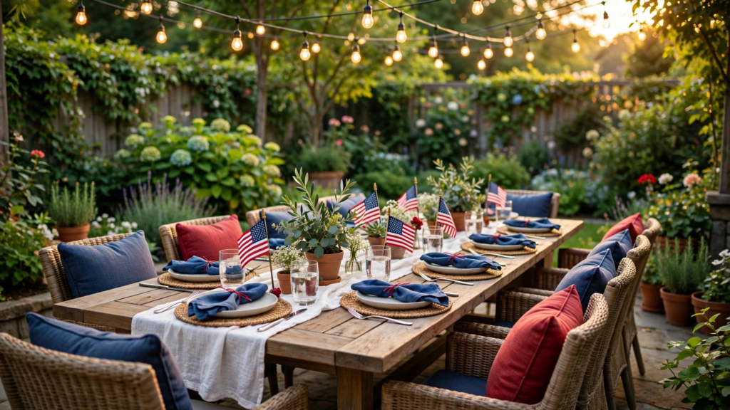
Use a wooden or metal table with simple outdoor chairs, a striped table runner, red and blue cushions, lanterns, and plenty of greenery.
Add string lights overhead for evening gatherings. Keep the decorations practical enough that the space still feels like an outdoor room rather than a party supply display.
11. Hang a Simple Star Garland
A star garland is an easy way to decorate walls, mantels, shelves, and porches.
For a sophisticated look, choose fabric, paper, or wooden stars in muted red, navy, cream, and natural wood tones.
Hang the garland across a fireplace mantel or along a porch railing.
One well-placed garland usually looks better than several competing decorations.
12. Decorate the Fireplace Mantel
A fireplace mantel can become a beautiful patriotic focal point.
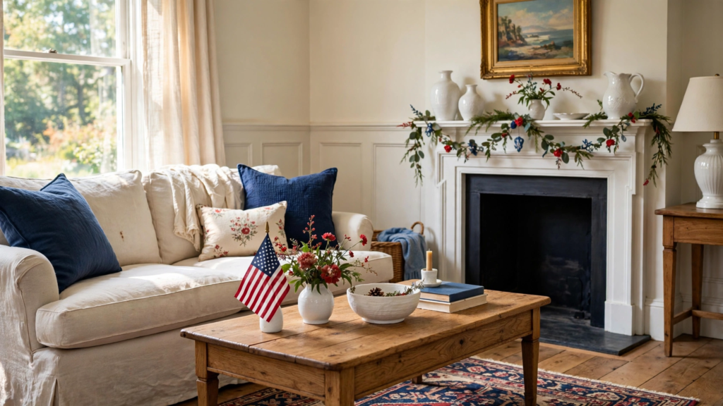
Start with a simple mirror or artwork above the mantel. Add greenery, white ceramic pieces, a few small American flags, and subtle red and blue accents.
For a traditional look, add a navy ribbon or star garland. For a modern home, keep the palette mostly neutral with just a few patriotic details.
13. Style a Patriotic Coffee Table
A coffee table only needs a few carefully chosen pieces.
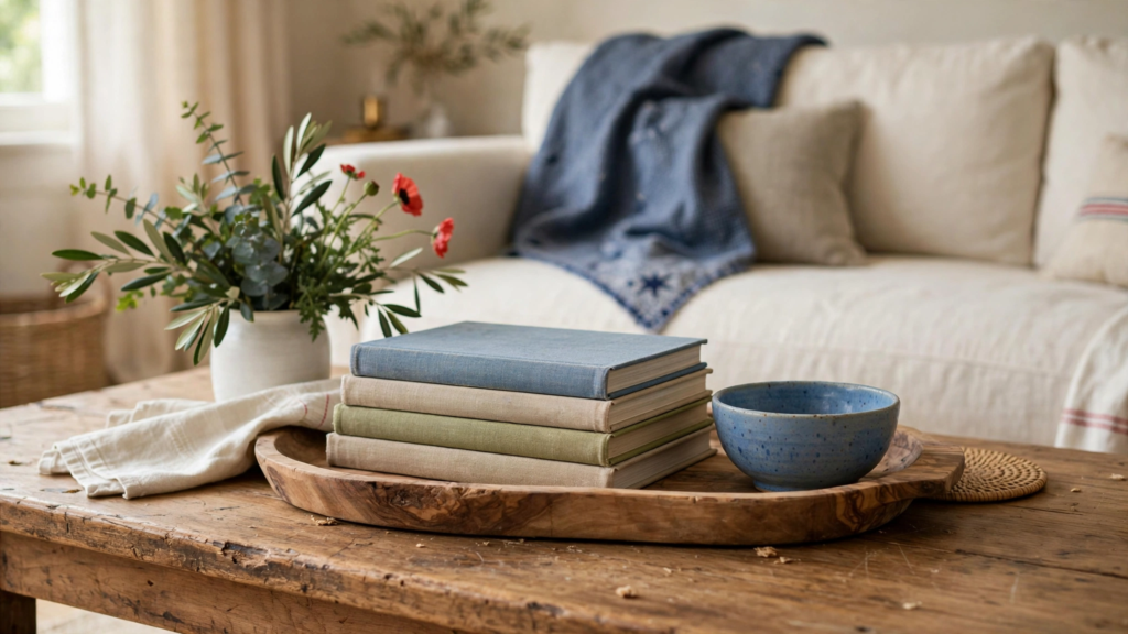
Try a stack of summer books, a small blue ceramic bowl, a white vase filled with greenery, and a subtle red accent.
A wooden tray can help keep everything organized while making it easy to clear the table when guests arrive.
14. Use Stars as a Subtle Motif
You do not have to decorate with large American flags everywhere.
Small star motifs can create a patriotic feeling in a much quieter way.
Look for star-patterned pillows, ceramic dishes, wooden ornaments, table linens, artwork, or small decorative objects.
Repeating the same shape in different materials can make the holiday theme feel cohesive.
15. Create a Festive Entryway
Give guests a patriotic welcome as soon as they walk through the door.
Add a small blue bench cushion, red flowers, a striped runner, and a simple basket filled with summer essentials.
A small flag or star-shaped decoration can provide the final seasonal detail.
Keep the entryway uncluttered so it remains functional.
16. Add Patriotic Decor to the Bedroom
Holiday decorating does not have to stop in the entertaining spaces.
For a subtle bedroom update, add a navy throw, red accent pillow, striped bedding, or a small patriotic artwork.
Keep the main bedding neutral so the room remains restful.
Even one navy-and-white striped lumbar pillow can create a summer holiday feeling without making the bedroom look themed.
17. Decorate With Vintage Americana
Vintage-inspired pieces can give 4th of July decor much more character.
Look for old-style American flags, distressed wood signs, antique-looking metal containers, vintage postcards, old-fashioned glassware, and classic red-and-blue textiles.
Mix these pieces with modern furniture so the room feels collected rather than like a historical display.
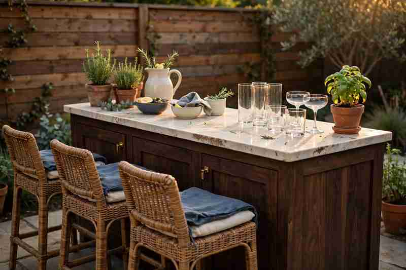
18. Create a Patriotic Bar or Drink Station
A small drink station can become both decorative and useful during a July 4th gathering.
Use a wooden cart or countertop with blue glassware, a white pitcher, red berries, fresh lemons, striped napkins, and a small floral arrangement.
Add a beverage dispenser for lemonade, iced tea, or another summer drink.
The setup gives guests an easy place to serve themselves while adding another festive focal point.
19. Decorate With Natural Wood and Patriotic Colors
Natural wood is an excellent way to soften the stronger holiday colors.
Pair a wooden dining table with navy napkins, white plates, red flowers, and woven placemats.
The warm wood creates balance and keeps the room feeling relaxed.
This approach works particularly well in farmhouse, coastal, traditional, and modern rustic homes.
20. Add Simple Patriotic Details to the Backyard
You do not need elaborate outdoor decorations to make the backyard feel ready for July 4th.
Place small flags along a garden path, add red and blue outdoor cushions, hang string lights, and set up a simple table for drinks and snacks.
Lanterns and potted plants can provide atmosphere without competing with the natural landscape.
21. Create a Collected Fourth of July Look
The most stylish approach may be the simplest: combine holiday decorations with things you already own.
Mix an American flag with vintage pottery, natural baskets, fresh flowers, striped textiles, wood furniture, and neutral ceramics.
The goal is not to make every corner scream “July 4th.” Instead, create a home that feels warm, summery, welcoming, and unmistakably festive.
How to Decorate for the 4th of July Without Going Overboard
A patriotic home can still feel sophisticated.
Start with a neutral base and choose one or two areas to decorate more heavily. The front porch, dining table, and living room are usually enough to establish the holiday mood throughout the house.
Then repeat small elements such as navy stripes, red flowers, stars, or natural wood in different rooms.
This creates a connection between spaces without requiring matching decorations everywhere.
4th of July Decor Ideas for Small Homes
Small spaces can still look festive without becoming crowded.
Try:
A small flag beside the entry door
A red, white, and blue table centerpiece
Two patriotic pillow covers
A small star garland
Blue and white kitchen towels
A single floral arrangement
Patriotic artwork on a shelf
A small balcony table with seasonal linens
When space is limited, focus on vertical surfaces and temporary textiles instead of adding lots of tabletop decorations.
Easy DIY 4th of July Decorations
If you enjoy simple crafts, several holiday decorations can be made without expensive supplies.
Create a fabric star garland using leftover cotton or linen. Fill glass jars with small flags and greenery. Wrap navy ribbon around existing vases. Or make a simple centerpiece using red flowers, white blooms, and blue glassware.
The goal is to create something that looks intentional, not necessarily complicated.
4th of July Decorating Mistakes to Avoid
One of the biggest mistakes is using too many bright holiday colors at once.
If everything is red, white, and blue, the room can quickly feel visually busy. Use neutral colors such as cream, beige, natural wood, and soft gray to give the eye somewhere to rest.
Avoid covering every surface with flags and signs as well. A few meaningful decorations usually create a stronger look than dozens of inexpensive holiday pieces.
Finally, remember that Independence Day is in the middle of summer. Fresh flowers, greenery, natural textures, and outdoor entertaining pieces can make patriotic decor feel more connected to the season.
4th of July Home Decor Checklist
Before guests arrive, look around your home and check for:
☐ A patriotic front door or porch detail ☐ Red, white, and blue accents ☐ Fresh flowers or greenery ☐ A festive dining table ☐ Seasonal pillows or textiles ☐ Outdoor seating and lighting ☐ A simple centerpiece ☐ A few stars or flag details ☐ Comfortable spaces for guests ☐ Enough neutral elements to balance the holiday colors
Frequently Asked Questions
How can I decorate my home for the 4th of July?
Start with red, white, and blue accents in the rooms where guests spend the most time. Add patriotic pillows, flowers, flags, table linens, wreaths, and outdoor decorations while keeping larger furniture and backgrounds neutral.
What colors work best for 4th of July home decor?
Classic red, white, and blue are the obvious choices, but cream, navy, natural wood, beige, and muted green can make the palette feel more sophisticated.
How can I make patriotic decor look elegant?
Use fewer decorations and focus on quality textures. Linen, natural wood, ceramics, vintage textiles, greenery, and subtle star patterns can make traditional patriotic colors feel much more polished.
What is an easy 4th of July decoration for a small apartment?
Try a small flag near the entrance, blue-and-white pillows, a red floral arrangement, striped kitchen towels, or a simple patriotic centerpiece. These take up very little space but still create a festive atmosphere.
Can I use 4th of July decorations outside?
Absolutely. Front porches, patios, balconies, decks, and backyards are ideal for flags, outdoor cushions, string lights, lanterns, planters, and patriotic table settings. Just make sure fabrics and decorations are suitable for outdoor conditions.
Final Thoughts
The best 4th of July home decor ideas are festive without making your home feel like a party store.
Use the traditional red, white, and blue palette as a starting point, then soften it with linen, natural wood, greenery, ceramics, vintage pieces, and warm summer textures. A decorated porch, beautiful dining table, a few patriotic pillows, and some fresh flowers may be all you need.
Whether your style is farmhouse, traditional, coastal, modern, or somewhere in between, you can make Independence Day feel special while keeping your home comfortable and personal.
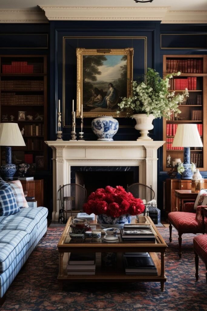
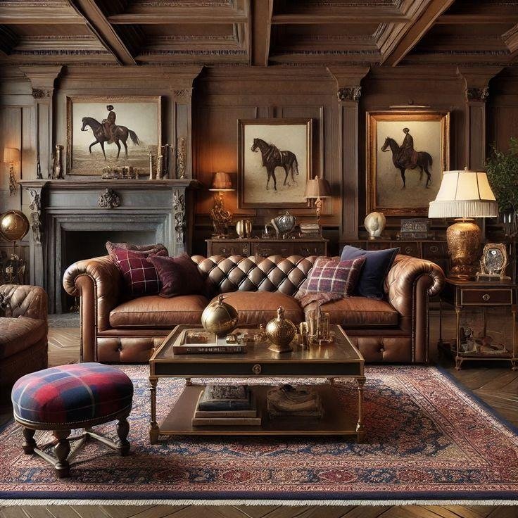
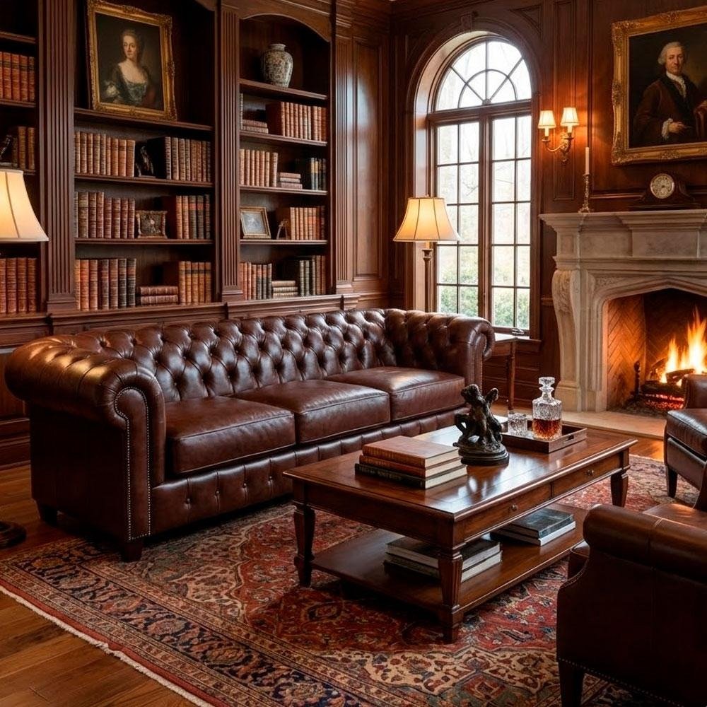
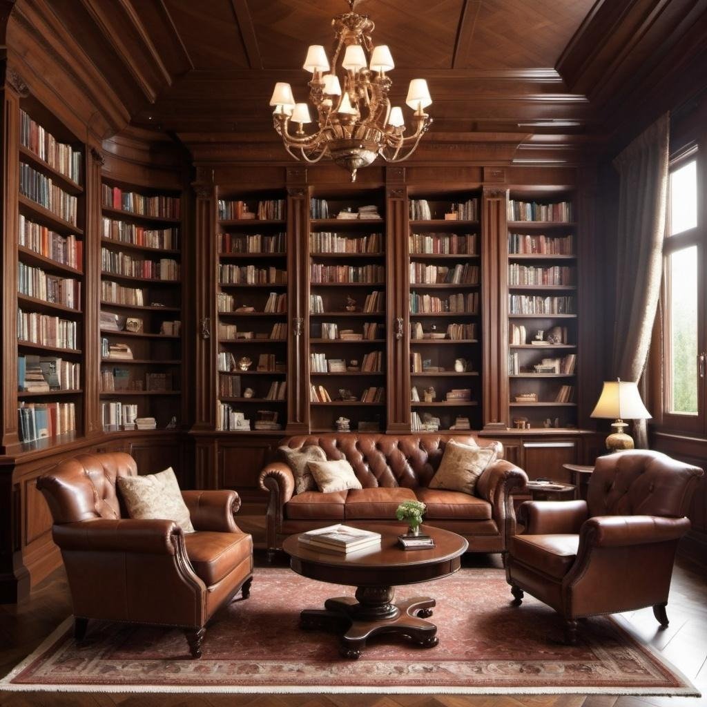
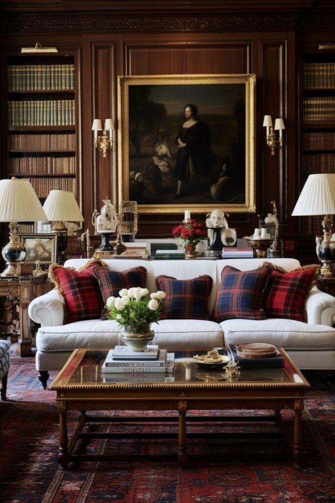
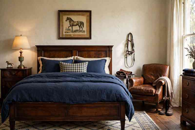
If you love the polished, collected feeling of Ralph Lauren interiors but also want the warm, lived-in comfort of a Nancy Meyers movie, the combination is hard to beat.
Ralph Lauren-inspired rooms tend to bring in classic tailoring, rich wood, leather, traditional patterns, and timeless colors. Nancy Meyers-style interiors add another layer: soft lighting, comfortable seating, relaxed kitchens, creamy neutrals, fresh flowers, and rooms that feel genuinely inviting.
Put the two together and you get a home that feels elegant without being stiff.
These 22 Ralph Lauren home looks inspired by the cozy interiors associated with Nancy Meyers are full of ideas you can actually use, whether you’re decorating a living room, bedroom, kitchen, dining room, or entryway.
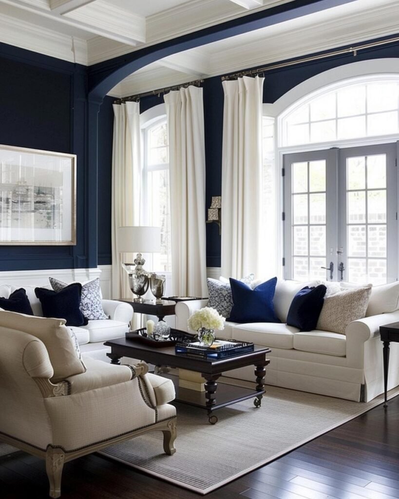
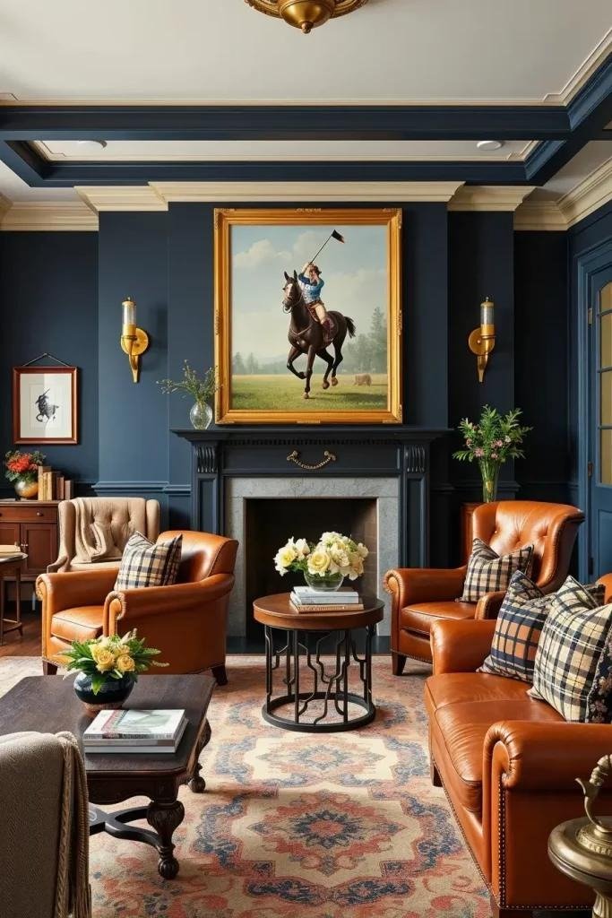
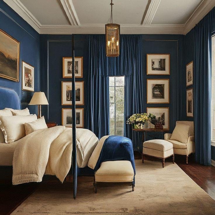
1. Layer Navy With Warm Cream
Few color combinations feel as timeless as navy and cream.
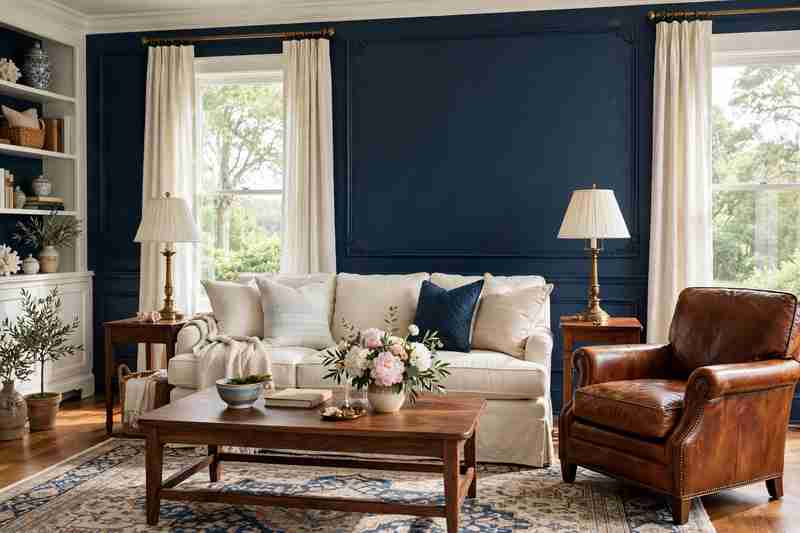
Use deep navy on an accent wall, upholstered chair, curtains, or cabinetry, then balance it with creamy walls, linen upholstery, and warm wood. The darker blue gives the room Ralph Lauren’s tailored character, while the cream keeps it relaxed and welcoming.
Add a vintage-style rug and a few brass details to complete the look.
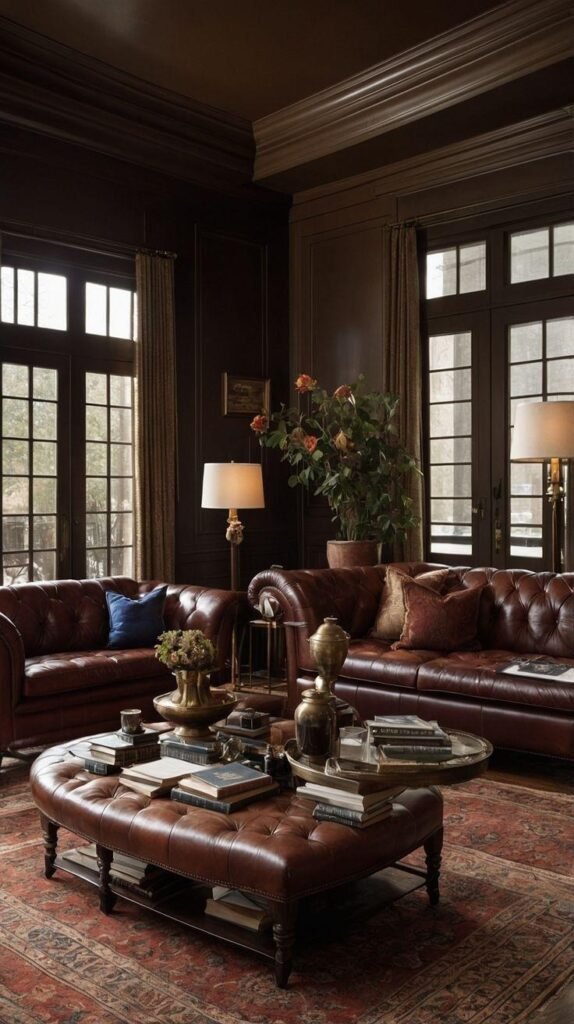
2. Mix Dark Wood With Soft Linen
Dark wood furniture can make a room feel sophisticated, but too much of it can become heavy.
Nancy Meyers-style interiors offer an easy solution: soften rich walnut, mahogany, or stained oak with cream linen sofas, relaxed curtains, and neutral upholstery.
The contrast creates a room that feels collected rather than overly decorated.
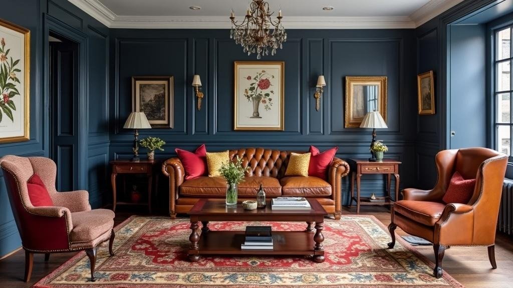
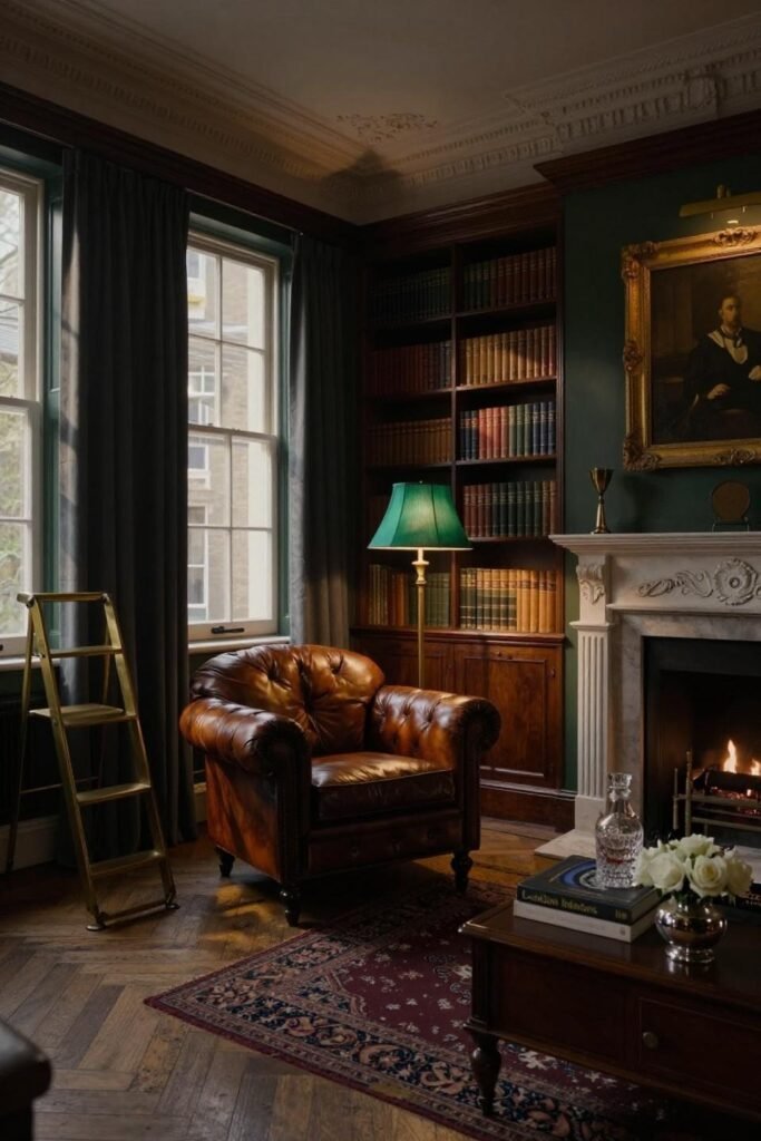
3. Add a Classic Leather Chair
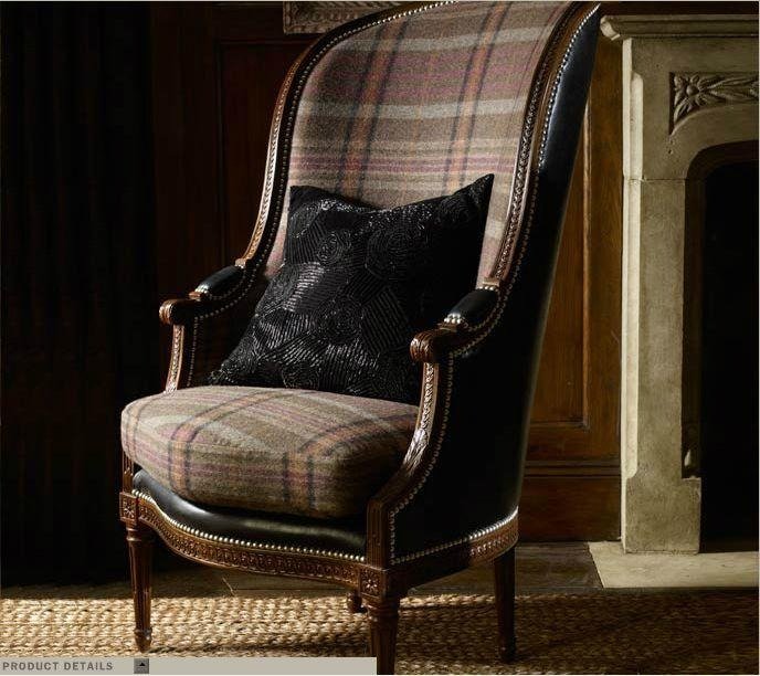
A worn-in leather chair can instantly introduce Ralph Lauren character.
Look for a cognac, saddle brown, or deep chestnut leather finish. Pair it with a soft throw, a patterned cushion, or a nearby wooden side table.
Don’t worry if the leather develops marks over time. A little patina can make the piece look even better.
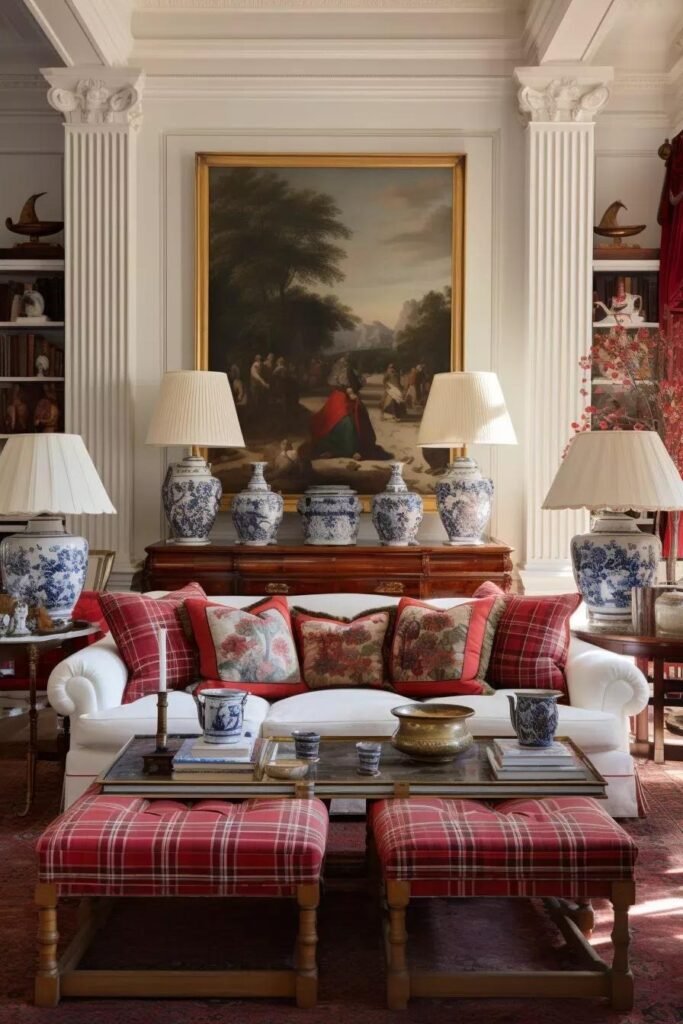
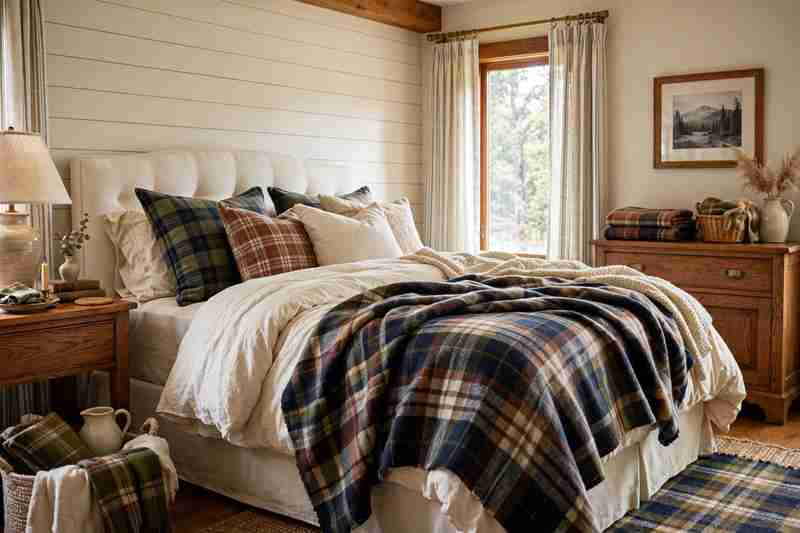
4. Create a Cozy Plaid Moment
Plaid is one of the easiest ways to bring traditional Ralph Lauren style into a comfortable home.
You don’t need plaid everywhere. Try it on an accent chair, throw blanket, ottoman, curtains, or a pair of cushions.
For a softer Nancy Meyers-inspired interpretation, choose muted navy, cream, taupe, forest green, or warm brown instead of extremely bright colors.
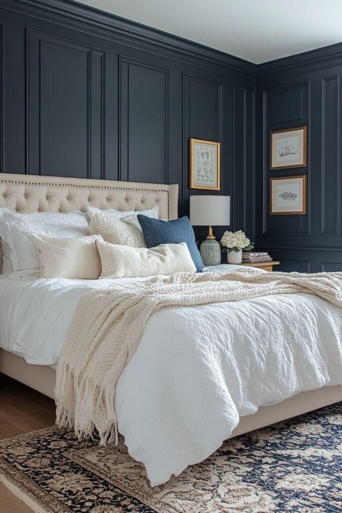
5. Use a Soft Blue Bedroom Palette
Soft blue is perfect for combining classic elegance with relaxed comfort.
Paint the walls a muted blue-gray, then layer the room with cream bedding, natural wood furniture, and subtle brass lighting.
Add striped or checked pillows for a little traditional character without making the bedroom feel formal.
6. Choose a Classic Four-Poster Bed
A four-poster bed can make a bedroom feel instantly established and timeless.
For a cozy look, choose one in warm wood rather than an overly ornate finish. Dress it with white or cream bedding, a quilted coverlet, and plenty of soft pillows.
Keep the surrounding furniture simple so the bed remains the focal point.
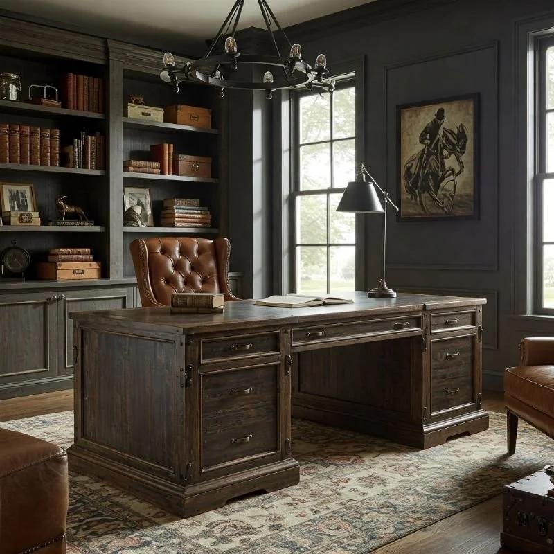
7. Build a Traditional Home Office
A Ralph Lauren and Nancy Meyers-inspired office should feel like somewhere you’d actually want to spend an afternoon.
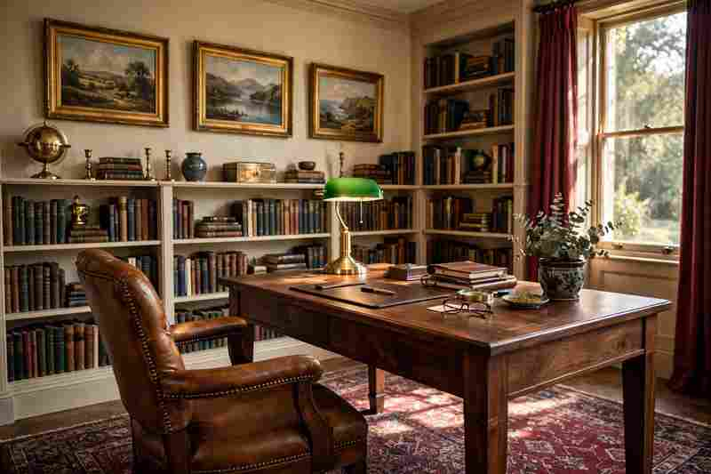
Start with a substantial wooden desk, comfortable upholstered chair, traditional lamp, books, framed artwork, and a patterned rug.
Instead of making everything perfectly symmetrical, allow a few personal-looking objects to create a more natural atmosphere.
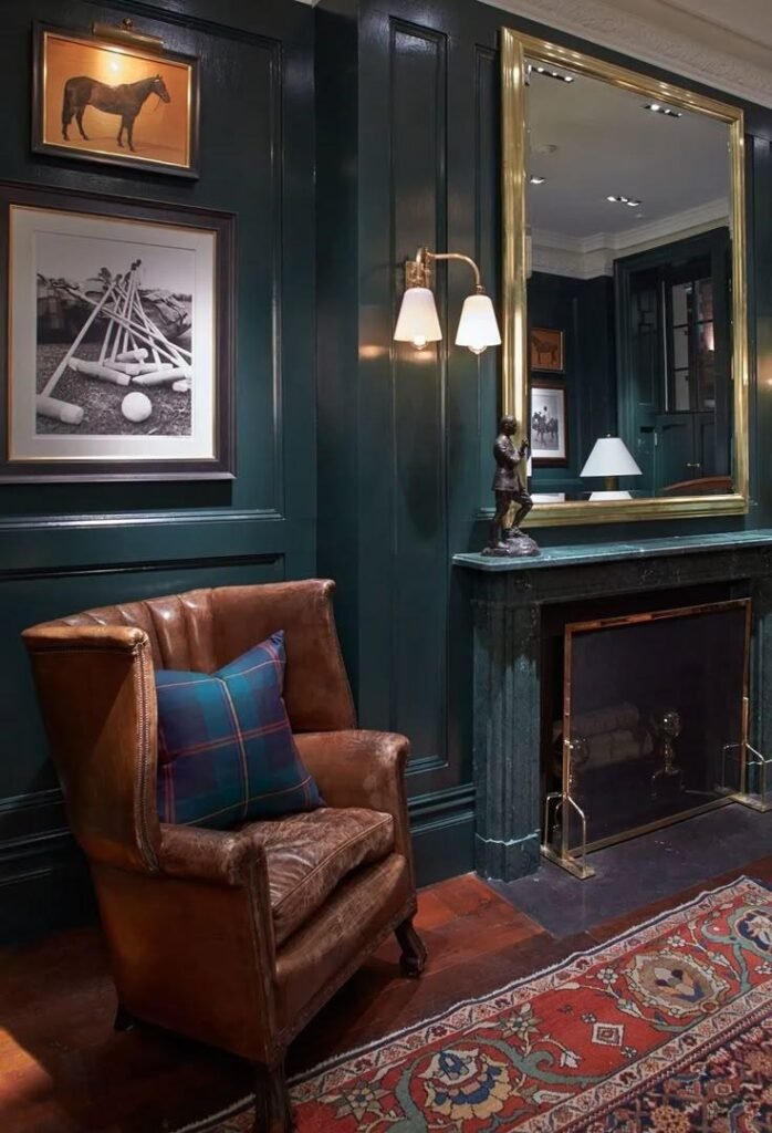
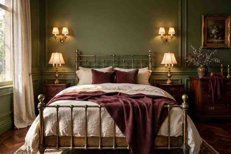
8. Add Deep Green for a Richer Feel
Forest green, olive, and mossy green can give a neutral room much more depth.
Use green on built-in cabinetry, a velvet chair, curtains, an accent wall, or smaller decorative pieces.
Combine it with cream, walnut, brass, and natural fabrics for a classic palette that feels both polished and cozy.
9. Create an Elegant but Relaxed Dining Room
A formal dining room does not have to feel intimidating.
Pair a traditional wood dining table with comfortable upholstered chairs, a simple linen runner, and a classic chandelier.
Add a large floral arrangement or a bowl of seasonal branches as the centerpiece. Keep the table styling relaxed enough that the room still feels ready for an ordinary family dinner.
10. Try a Warm White Kitchen
The kitchen is where the Nancy Meyers influence can really shine.
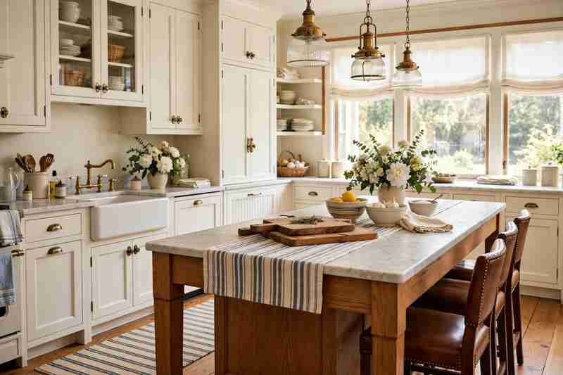
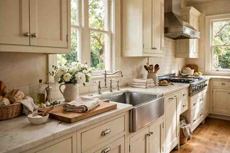
Choose creamy white cabinets instead of stark white, then add warm wood, marble or stone countertops, brass hardware, and traditional lighting.
A large island with comfortable stools can make the kitchen feel like the social heart of the house.
For Ralph Lauren character, introduce a striped runner, dark wood accessories, or a vintage-style pendant.
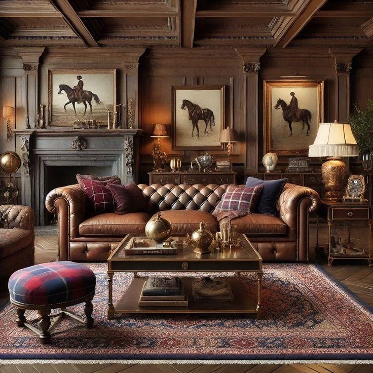
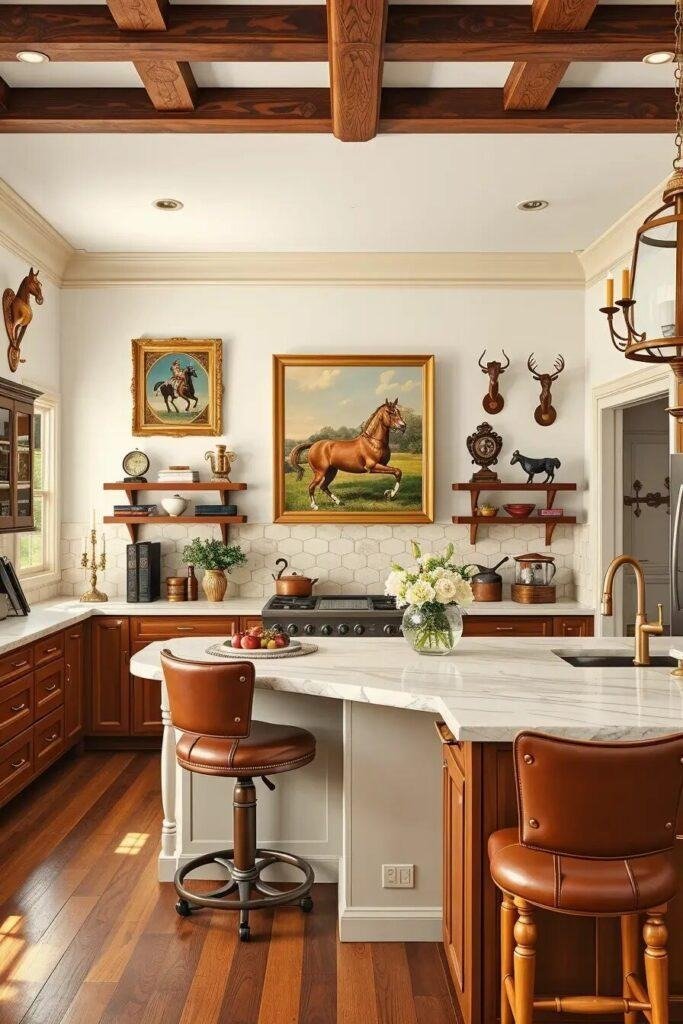
11. Add Equestrian-Inspired Details
Ralph Lauren’s equestrian influence can be introduced without turning the room into a themed space.
Look for leather accents, riding-inspired artwork, saddle brown tones, brass hardware, woven baskets, and sturdy wood furniture.
The trick is restraint. One or two equestrian references can give a room personality without making the design feel like a showroom.
12. Use Stripes as a Neutral Pattern
Stripes are a reliable choice when you want pattern without visual chaos.
Try ticking stripes on cushions, wide linen stripes on curtains, or classic blue-and-white stripes on upholstery.
Combine them with solid cream, beige, brown, or navy pieces so the pattern has room to breathe.
13. Create a Collected Library Wall
Bookshelves instantly make a room feel more personal.
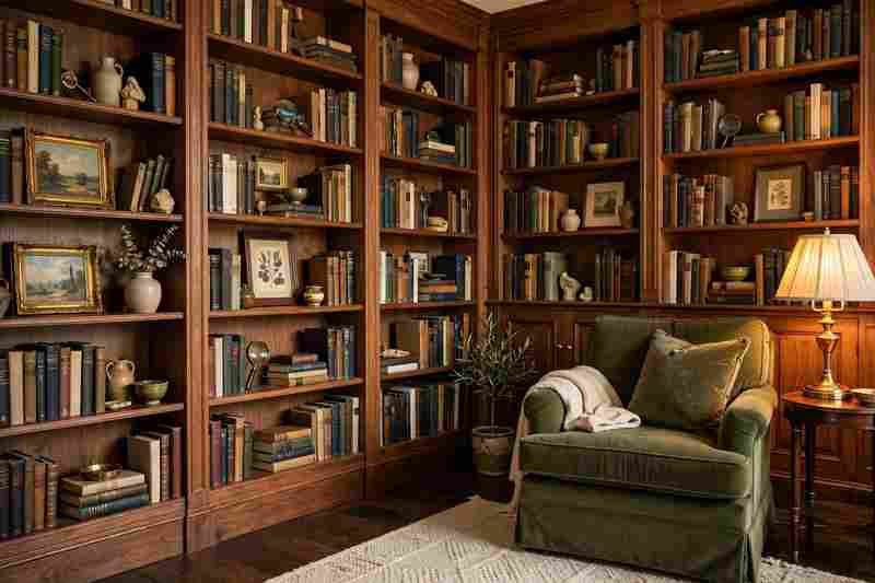
Use built-in shelves or freestanding bookcases to display books alongside framed artwork, ceramics, small lamps, baskets, and collected objects.
Avoid filling every shelf completely. A little empty space allows the individual pieces to stand out.
14. Mix Camel, Cream, and Chocolate Brown
This palette has the warmth of a classic Ralph Lauren interior while maintaining the relaxed atmosphere often associated with Nancy Meyers homes.
Use cream for walls and upholstery, camel for leather or accent seating, and chocolate brown for wood furniture or smaller accessories.
Add soft brass lighting and an aged rug to make the combination feel layered.
15. Add a Vintage-Style Rug
A beautiful rug can tie the entire room together.
Look for Persian-inspired patterns, faded traditional motifs, muted florals, or classic geometric designs. The colors do not need to be bright. Soft navy, rust, faded red, cream, olive, and brown can all work beautifully.
A slightly worn appearance can make a polished room feel more relaxed.
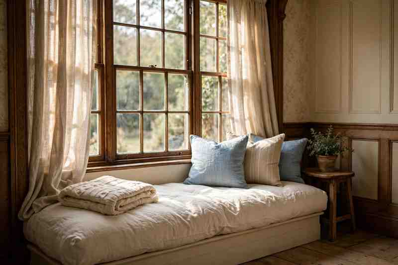
16. Bring in a Cozy Window Seat
A window seat is one of those details that makes a home feel designed for living.
Build a cushioned bench beneath a large window and layer it with pillows, a soft throw, and a small side table.
Use linen or cotton upholstery in cream, oatmeal, soft blue, or muted green to keep the look relaxed.
17. Style a Traditional Fireplace
A fireplace can become the anchor of a Ralph Lauren-inspired living room.
A classic mantel, dark wood, natural stone, or painted surround can provide a strong architectural foundation. Above it, hang artwork, a mirror, or a simple collection of framed pieces.
Keep the area around the fireplace comfortable with upholstered seating, floor lamps, and a substantial rug.
18. Mix Brass With Aged Wood
Warm metals work particularly well with traditional interiors.
Brushed or aged brass lighting, cabinet hardware, picture frames, and table lamps can bring warmth to dark wood furniture.
Avoid using brass on every surface. A few repeated accents are enough to make the room feel intentional.
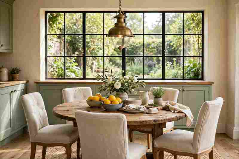
19. Create a Cozy Country Kitchen Corner
A small breakfast corner can give a kitchen that relaxed movie-set feeling without requiring a huge renovation.
Try a round wooden table, comfortable chairs, a simple pendant light, and a nearby window overlooking the garden.
Add a vase of flowers, ceramic dishes, or a bowl of fruit for everyday warmth.
20. Use Dark Walls in a Small Room
Dark paint can make a small room surprisingly cozy.
Try deep navy, charcoal, chocolate brown, or forest green on the walls. Then balance the darker backdrop with cream upholstery, warm lamps, brass accents, and natural wood.
This works especially well in studies, dining rooms, libraries, and intimate living spaces.
21. Layer Traditional Patterns Carefully
The richest traditional rooms often contain more than one pattern.
The key is to vary the scale. Pair a large floral with a small check, then add a stripe or subtle geometric pattern.
Keep the colors related so the room feels connected rather than chaotic.
For example, navy, cream, muted red, and warm brown can create a cohesive palette across several different patterns.
22. Finish With a Collected, Lived-In Look
The final ingredient is not a particular color or piece of furniture. It is the feeling that the room has developed naturally over time.
Combine newer furniture with vintage-looking pieces, books, artwork, baskets, lamps, ceramics, fresh flowers, and textiles.
Don’t make every surface perfectly styled. A few everyday objects can make the room feel warmer and more believable.
How to Get the Ralph Lauren Meets Nancy Meyers Look
You don’t need to copy an entire room to achieve this style. Start with a simple foundation and build layers gradually.
Begin With Warm Neutrals
Cream, ivory, oatmeal, beige, camel, and warm white make excellent base colors.
They provide the relaxed backdrop associated with cozy Nancy Meyers interiors while allowing richer Ralph Lauren-inspired accents to stand out.
Add One Rich Accent Color
Choose one deeper color such as navy, forest green, burgundy, chocolate brown, or muted red.
Repeat it around the room through upholstery, artwork, cushions, rugs, or curtains.
Bring in Natural Materials
Wood, leather, linen, cotton, stone, wool, and woven materials make the room feel tactile and comfortable.
These materials also prevent a traditional space from looking overly polished.
Mix Old and New
Don’t buy every piece from the same collection.
Combine a newer sofa with an antique-style side table. Pair modern lighting with a traditional rug. Put contemporary artwork above a classic wooden console.
The contrast gives the room character.
Ralph Lauren and Nancy Meyers Color Palette Ideas
If you’re unsure where to begin, try one of these combinations:
Navy + Cream + Cognac: classic, tailored, and welcoming.
Forest Green + Ivory + Walnut: rich and sophisticated.
Soft Blue + White + Natural Oak: fresh and relaxed.
Camel + Cream + Chocolate: warm and traditional.
Burgundy + Taupe + Dark Wood: moody and elegant.
Olive + Beige + Aged Brass: earthy and timeless.
Small Ways to Get the Look on a Budget
You don’t need to replace every piece of furniture.
Start with details that make a noticeable difference:
Replace cool-white bulbs with warmer lighting
Add linen-look curtains
Introduce a vintage-style rug
Swap basic hardware for brass or aged metal
Add a leather accent chair
Use striped or checked cushions
Display more books and artwork
Add fresh flowers or branches
Introduce baskets and natural textures
Paint one room a richer color
A few carefully chosen changes can make an existing room feel completely different.
Common Mistakes to Avoid
The Ralph Lauren-inspired look works best when it feels natural rather than overly themed.
Avoid filling the room with too many equestrian accessories, matching every piece of furniture, using excessive dark wood, or adding several competing patterns in unrelated colors.
You also don’t need to make everything perfectly symmetrical.
The goal is a home that feels collected, comfortable, and classic.
Ralph Lauren Meets Nancy Meyers Style Checklist
Save this checklist when decorating:
☐ Start with warm cream or neutral walls ☐ Add one rich accent color ☐ Include natural wood ☐ Mix in linen or cotton textiles ☐ Add one leather accent ☐ Try classic stripes or plaid ☐ Use a traditional-style rug ☐ Add warm brass or aged metal ☐ Display books and collected objects ☐ Mix vintage-inspired and modern pieces ☐ Keep seating comfortable ☐ Add flowers or natural branches ☐ Use warm layered lighting ☐ Leave some surfaces naturally uncluttered
Frequently Asked Questions
What is Ralph Lauren home style?
Ralph Lauren-inspired interiors are known for classic American and English influences, rich woods, tailored textiles, leather, traditional patterns, deep colors, and a collected feeling.
How does Nancy Meyers style differ from Ralph Lauren style?
Nancy Meyers-inspired interiors generally emphasize comfort, warmth, soft neutrals, natural light, practical kitchens, relaxed furnishings, and approachable details. Ralph Lauren interiors tend to introduce more tailored patterns, richer colors, dark wood, leather, and traditional character.
Can you combine Ralph Lauren and Nancy Meyers styles?
Absolutely. The two styles work particularly well together because both can feel timeless and comfortable. Use Ralph Lauren-inspired colors, leather, wood, and patterns, then soften them with creamy neutrals, linen, comfortable furniture, and relaxed styling.
What colors work best for this decorating style?
Cream, navy, forest green, camel, chocolate brown, soft blue, burgundy, olive, beige, and warm white all work well.
How can I make my home feel cozy but expensive?
Focus on texture and proportion rather than simply buying expensive decor. Use quality-looking fabrics, warm lighting, natural materials, traditional patterns, and fewer but more substantial decorative pieces.
Final Thoughts
A Ralph Lauren-inspired home does not have to feel formal, and a Nancy Meyers-inspired home does not have to feel overly casual.
The most appealing combination sits somewhere in between: classic but comfortable, polished but personal, and elegant enough to feel special while still making you want to put your feet up.
Start with a warm neutral foundation, add natural wood and one or two richer colors, then layer in leather, linen, stripes, vintage-inspired pieces, books, flowers, and comfortable furniture.
The result should feel less like a perfectly decorated showroom and more like a beautiful home that has been loved for years.
A great backyard does not have to be enormous, expensive, or professionally designed. Sometimes the biggest difference comes from a few smart changes that make the space easier to use and more enjoyable.
Whether you want a cozy garden retreat, a better entertaining area, a low-maintenance yard, or simply more privacy, the right backyard landscaping ideas can completely change how your outdoor space feels.
These 23 ideas range from simple weekend projects to larger landscaping upgrades, so you can find options that fit your yard, budget, and personal style.
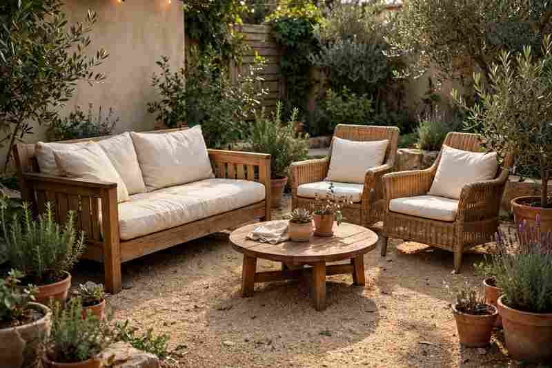
1. Create a Cozy Backyard Seating Area
Start with a dedicated spot where you can actually relax.
A simple outdoor sofa, two comfortable chairs, and a small coffee table can turn an unused corner into a favorite part of the yard. Add an outdoor rug, cushions, and a few potted plants to make the area feel more connected to the house.
For a natural look, combine wood furniture with neutral fabrics and plenty of greenery.
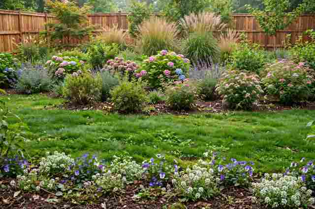
2. Add a Curved Garden Border
Curved planting beds can make a backyard feel softer and more thoughtfully planned.
Instead of drawing straight lines around the lawn, create gentle curves around trees, patios, or seating areas. Fill the beds with a mix of shrubs, flowering plants, grasses, and ground cover.
Keep the curve broad rather than overly complicated. Simple shapes are usually easier to maintain and look more natural.
3. Build a Backyard Fire Pit Area
A fire pit can give your backyard a clear gathering point.
Surround it with comfortable chairs or built-in seating, then define the area with gravel, stone, brick, or pavers. Leave enough space around the fire feature for safe movement and follow local fire regulations.
For a polished look, repeat the same stone or material elsewhere in the yard.
4. Use Layered Planting for a Fuller Garden
If your garden beds look flat, think vertically.
Place taller shrubs or ornamental trees toward the back, medium-height plants in the middle, and low-growing flowers or ground covers toward the front.
This layered approach creates depth without requiring dozens of different plant varieties.
Choose plants based on your local climate, sunlight, soil, and watering conditions rather than choosing only by appearance.
5. Install a Simple Backyard Pathway
A pathway can make a backyard feel more organized while guiding people toward different areas.
Use stepping stones, gravel, brick, natural stone, or concrete pavers to connect the patio, garden, shed, fire pit, or seating area.
You do not necessarily need a perfectly straight path. A gentle curve can make the destination feel more interesting and give plants room to soften the edges.
6. Add Privacy With Layered Greenery
Privacy does not always require a tall fence.
Evergreen shrubs, ornamental grasses, small trees, climbing plants, and dense planting can create a natural screen while making the yard feel greener.
For the best result, combine plants at different heights instead of creating one solid wall of greenery.
If you are planting near a property boundary, check mature plant sizes before choosing species.
7. Create a Backyard Dining Zone
If you regularly eat outdoors, give your dining area a proper place in the landscape.
A sturdy outdoor table, comfortable chairs, overhead lighting, and nearby plants can make an ordinary patio feel like an outdoor dining room.
Position the table somewhere convenient to the kitchen if possible. You’ll appreciate the shorter trips when carrying food, drinks, and dishes.
8. Replace Part of the Lawn With Garden Beds
A large lawn can be beautiful, but it is not always the best use of every square foot.
Consider replacing an unused section with planting beds, gravel, ground cover, or a small outdoor living area. This can add visual interest while reducing the amount of grass that needs mowing.
Keep some lawn if you enjoy using it. The goal is not to eliminate grass completely, but to make the yard work better for you.
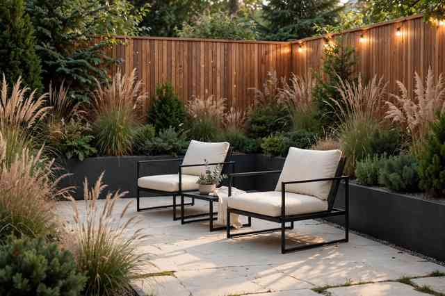
9. Add Ornamental Grasses
Ornamental grasses bring movement and texture to backyard landscaping.
Their soft foliage can look especially beautiful around patios, pathways, fences, and garden borders. Many varieties also add seasonal interest when their seed heads catch the light.
Use groups of the same grass rather than scattering single plants everywhere. Repetition creates a more intentional look.
10. Design Around a Mature Tree
A mature tree can become the centerpiece of your backyard.
Instead of treating it as an obstacle, build the landscaping around it. Add a curved planting bed, a circular seating area, shade-loving plants, or a small pathway that leads toward the tree.
Be careful not to pile soil against the trunk or disturb the tree’s root zone. The landscaping should work with the tree rather than compete with it.
11. Add a Small Water Feature
You do not need a huge pond to introduce water into the garden.
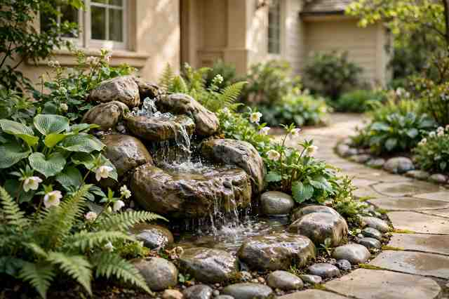
A compact fountain, bubbling urn, small pond, or recirculating water feature can add sound and movement to a quiet backyard.
Place it where you can actually hear or see it from your seating area. A feature hidden behind dense plants may look nice but provide less enjoyment.
12. Create a Cottage-Style Backyard Garden
For a softer, more romantic backyard, try a cottage garden approach.
Mix flowering perennials, herbs, shrubs, climbing plants, and informal pathways. Allow some plants to spill slightly over borders instead of keeping every edge perfectly clipped.
Use a relaxed palette of whites, pinks, lavender, blues, and soft greens for a classic cottage feel.
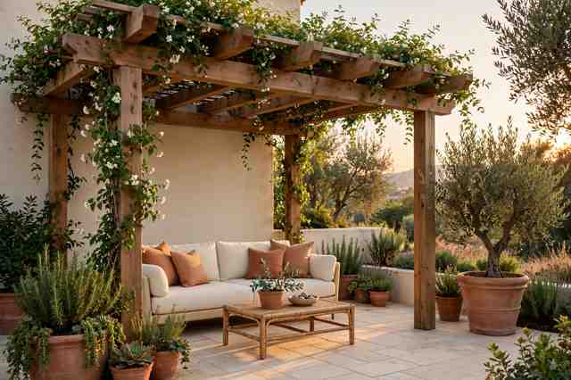
13. Add a Pergola Over the Patio
A pergola can give an outdoor living area more structure without completely enclosing it.
Use it to define a dining space, lounge area, or outdoor kitchen. Climbing plants can soften the structure over time, while curtains or outdoor shades can provide additional privacy and protection from the sun.
Choose a size that feels proportional to the patio. An oversized structure can make a small yard feel crowded.
14. Use Large Planters as Landscape Anchors
Large planters are an easy way to add structure without changing the entire yard.
Place matching containers near a patio entrance, along a pathway, beside outdoor steps, or around a dining area.
Choose plants that suit the amount of sun available. Large containers are particularly useful when you want to introduce color or greenery without committing to a permanent garden bed.
15. Create a Low-Maintenance Gravel Garden
If mowing and constant garden maintenance are not your thing, consider a gravel-focused landscape.
Combine decorative gravel with drought-tolerant plants, ornamental grasses, stone features, and a few larger architectural plants.
The trick is to create deliberate planting zones rather than covering the entire backyard in random gravel. A restrained material palette usually looks much more polished.
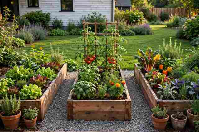
16. Build a Raised Vegetable Garden
A backyard can be beautiful and productive at the same time.
Raised garden beds make it easier to organize vegetables, herbs, and edible flowers while giving the garden a defined structure. Cedar or other suitable outdoor materials can create attractive borders.
Place the beds somewhere that receives the amount of sunlight required by the crops you plan to grow, and keep paths wide enough for comfortable access.
17. Add Warm Outdoor Lighting
Good lighting can completely change a backyard after sunset.
Use pathway lights to guide movement, subtle uplighting to highlight trees, and warm accent lights around patios and seating areas.
Avoid lighting every corner equally. A few carefully placed lights with darker areas between them usually create a more comfortable atmosphere.
18. Create a Secret Garden Corner
An unused corner can become one of the most charming parts of the backyard.
Use a small arch, climbing plants, dense shrubs, or a simple gate to create a sense of separation. Add a bench or small bistro table inside.
This does not need to be large. Even a few feet of tucked-away planting can create the feeling of a private garden retreat.
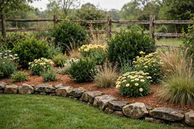
19. Use Natural Stone for Garden Edging
Natural stone can give planting beds a finished appearance without making them feel too formal.
Use flat stones, fieldstone, or another locally appropriate material to define the edge between lawn and garden. Repeat the stone near pathways or patios for a more cohesive landscape.
Avoid overly perfect lines if you want an organic garden style.
20. Create a Backyard Outdoor Kitchen
If you spend a lot of time entertaining outside, an outdoor kitchen can be a worthwhile upgrade.
Even a compact setup with a grill, countertop, storage, and nearby dining space can make outdoor cooking much easier.
Plan the layout around how you actually prepare meals. Keep frequently used cooking, prep, and serving areas close together.
21. Mix Evergreen and Seasonal Plants
A backyard can look bare when everything blooms during the same short period.
Create more year-round interest by combining evergreen shrubs with seasonal flowers, grasses, trees, and plants that provide changing foliage.
Evergreens provide the foundation, while seasonal plants bring color and variety throughout the year.
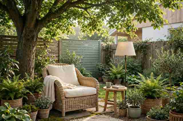
22. Turn a Small Corner Into a Reading Retreat
You do not need a huge backyard to create a personal outdoor escape.
Find a shaded corner and add a comfortable chair, small side table, outdoor cushion, and a few surrounding plants. A compact pergola or umbrella can provide additional shade where appropriate.
Keep the design simple. The purpose is to create somewhere you’ll actually want to sit.
23. Connect the Backyard to the House
The most successful backyard landscapes often feel like an extension of the home’s interior.
Repeat colors, materials, and textures from the house outdoors. If your interior uses warm wood and neutral fabrics, carry those tones onto the patio. If your home has stone details, consider repeating the stone in a pathway or garden wall.
This visual connection makes the entire property feel more cohesive.
How to Plan a Backyard Landscaping Makeover
Before buying plants or ordering materials, spend some time looking at how your backyard currently works.
Start With the Layout
Mark the areas that receive full sun, partial shade, and deep shade. Note existing trees, drainage issues, property boundaries, utilities, and places where water collects.
Then decide what you want the yard to do.
Do you need more entertaining space? Better privacy? A children’s play area? More garden space? A quiet place to relax?
Your answer should guide the design.
Choose a Few Main Zones
Instead of trying to improve everything at once, divide the yard into practical zones.
For example:
Dining area
Lounge area
Garden beds
Pathway
Fire pit
Vegetable garden
Private retreat
Clear zones make a backyard feel organized without requiring a complicated landscape design.
Repeat Materials and Plants
Repetition is one of the easiest ways to make a landscape look professionally planned.
Repeat a particular stone along the patio and pathway. Use the same shrub in several planting beds. Repeat one accent color through flowers and outdoor cushions.
This creates rhythm without making everything identical.
Backyard Landscaping Ideas on a Budget
You can make a noticeable difference without rebuilding the entire yard.
Start with projects that have a strong visual impact:
Refresh existing garden beds with new mulch
Add several large containers
Create a simple gravel seating area
Install solar or low-voltage pathway lighting
Edge the lawn and planting beds cleanly
Paint or stain an existing pergola
Add outdoor cushions and a rug
Plant inexpensive ground cover
Create a small herb garden
Reorganize existing plants into groups
Sometimes cleaning up what you already have makes a bigger difference than buying more.
Common Backyard Landscaping Mistakes
A beautiful landscape still needs to be practical.
Avoid planting trees too close to structures, choosing plants that are poorly suited to your climate, overcrowding garden beds, or creating pathways that are too narrow.
It is also easy to underestimate mature plant sizes. A small shrub at the garden center can become a much larger plant after several years.
Think about maintenance before committing to the design. A yard that looks fantastic but requires hours of weekly work may quickly become frustrating.
A Simple Backyard Landscaping Checklist
Save this list before starting your project:
☐ Identify sunny and shady areas ☐ Decide how you want to use the backyard ☐ Create practical outdoor zones ☐ Plan pathways between major areas ☐ Consider privacy needs ☐ Choose plants for your climate and soil ☐ Check mature plant sizes ☐ Repeat materials for a cohesive look ☐ Add lighting for evening use ☐ Plan irrigation and drainage ☐ Choose realistic maintenance levels ☐ Leave room for plants to grow
Frequently Asked Questions
What is the easiest backyard landscaping idea to try?
Adding large planters, refreshing garden beds, creating a simple seating area, or installing a small pathway can produce noticeable results without major construction.
How can I make my backyard look more expensive?
Use repetition, keep the material palette limited, define outdoor zones, add layered planting, and improve lighting. A clean, intentional layout often looks more polished than a yard filled with expensive but unrelated features.
What is a good low-maintenance backyard landscaping idea?
Gravel gardens, evergreen shrubs, appropriate ground covers, ornamental grasses, and well-planned planting beds can reduce maintenance. Choose plants that naturally suit your local climate rather than forcing high-maintenance varieties to survive.
How do I add privacy to my backyard without a fence?
Layered greenery is one option. Combine evergreen shrubs, small trees, ornamental grasses, and climbing plants to create visual screening while keeping the yard feeling natural.
How do I make a small backyard feel bigger?
Keep the layout simple, use fewer but more intentional planting zones, create a clear pathway, and avoid filling every corner with furniture or plants. Using similar materials across the patio and garden can also make the space feel more connected.
Final Thoughts
The best backyard landscaping ideas are the ones that make your outdoor space easier and more enjoyable to use.
You might start with something small, such as a curved garden bed or a cozy seating corner, and build from there. Or you may decide your yard needs a larger transformation with a pergola, outdoor kitchen, new pathway, and layered planting.
Whatever direction you choose, focus first on how you want to live in the space. Once the function is right, the plants, materials, colors, and decorative details become much easier to choose
A bathroom upgrade does not always need a complete gut renovation. The smartest 2026 bathroom trends focus on making the room feel more comfortable, functional, and thoughtfully designed while choosing improvements that can actually be enjoyed for years.
From warmer materials and spa-like showers to clever storage and statement lighting, today’s bathrooms are moving away from cold, overly matching spaces. The look is more personal, layered, and practical.
If you’re planning a bathroom remodel or simply collecting ideas for your next home project, these 20 bathroom trends are worth saving.
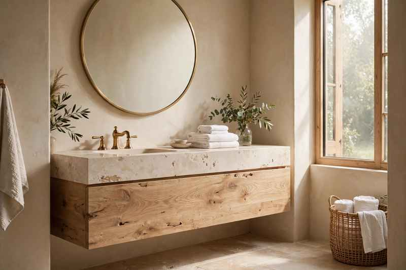
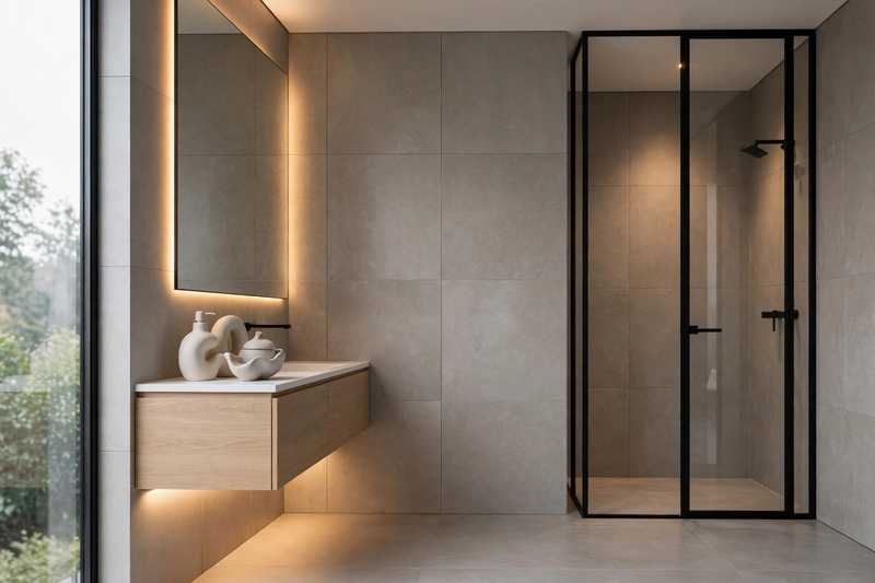
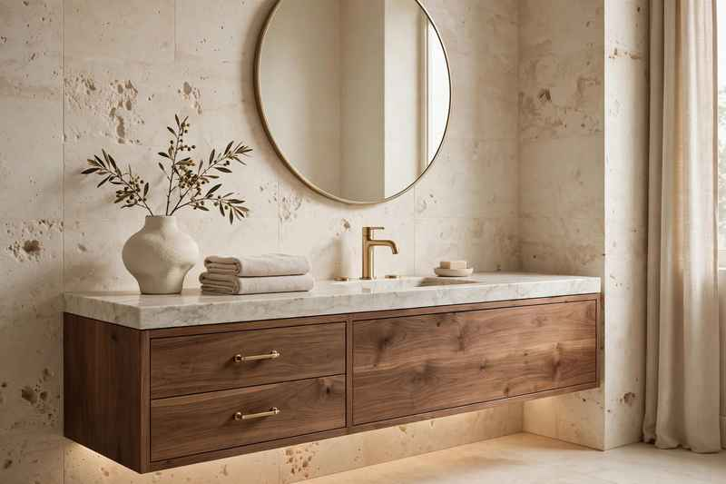
1. Warm Wood Bathroom Vanities
White bathrooms are still around, but warmer wood tones are bringing much-needed character into modern spaces.
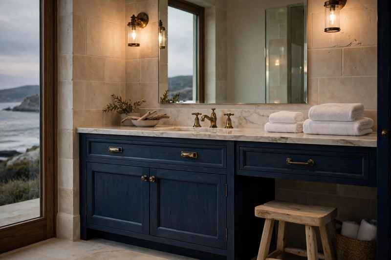
Oak, walnut, teak, and medium-toned wood vanities can soften hard surfaces such as tile, stone, and porcelain. A simple floating vanity in natural oak can make even a compact bathroom feel more inviting.
For a timeless look, pair wood cabinetry with cream walls, brushed brass hardware, and natural stone counters.
Best for: Modern, organic, transitional, and Scandinavian-inspired bathrooms.
2. Large Walk-In Showers
The traditional shower-tub combination is making room for larger walk-in showers in bathrooms where space allows.
A generous shower can make the room feel more open while creating a more comfortable daily routine. Frameless glass keeps the sightlines clean, while a built-in bench adds both function and a spa-like touch.
If you’re remodeling, consider placing the shower controls near the entrance so you can turn the water on without stepping directly underneath it.
3. Spa-Style Shower Systems
Bathroom design is becoming more focused on everyday comfort, and the shower is one of the best places to invest.
A spa-style shower might include a rainfall showerhead, handheld sprayer, body sprays, a built-in niche, or multiple shower controls. You don’t need every feature to get the effect.
Even a rainfall showerhead combined with a handheld fixture and a simple stone-look wall can create a much more luxurious experience.
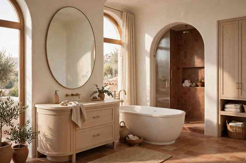
4. Curved Bathroom Shapes
Straight lines have dominated bathrooms for years, but softer shapes are becoming increasingly popular.
Rounded mirrors, curved vanities, arched shower openings, and softly shaped bathtubs can break up a room filled with hard rectangular surfaces.
This trend works especially well in minimalist bathrooms because one curved feature can provide visual interest without adding clutter.
5. Statement Bathroom Mirrors
The bathroom mirror is no longer treated as an afterthought.
A large sculptural mirror can become one of the main design features above a vanity. Try an oversized round mirror for a softer look, a pill-shaped mirror for a modern bathroom, or an antique-inspired frame for a more traditional space.
Backlit mirrors are another practical option when you want both style and useful task lighting.
6. Fluted and Reeded Vanity Details
Fluted wood and reeded surfaces are adding texture to bathroom cabinetry without making the room feel busy.
The vertical lines can make a vanity appear taller while giving a simple cabinet a custom furniture-like appearance.
For a subtle approach, use reeded detailing only on the vanity doors. Pair it with simple countertops and understated hardware so the texture remains the star.
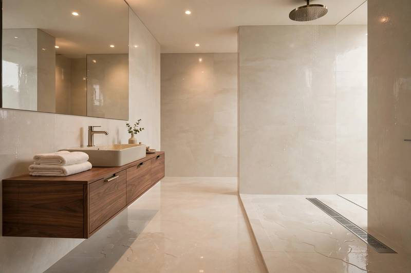
7. Large-Format Bathroom Tiles
Large tiles can create a cleaner appearance because fewer grout lines are visible.
They are especially useful in contemporary bathrooms where you want walls and floors to feel calm and continuous. Large-format porcelain can also mimic marble, limestone, or concrete without requiring the maintenance associated with some natural materials.
Choose a finish with appropriate slip resistance for floors, especially in wet areas.
8. Warm Neutral Bathroom Colors
Cool gray bathrooms are giving way to warmer neutrals.
Think creamy white, mushroom, taupe, beige, warm greige, soft clay, and sandy brown. These colors work beautifully with wood, stone, linen, and aged metal finishes.
If an entire neutral bathroom feels too plain, add contrast through darker cabinetry, patterned tile, artwork, or a richly textured runner.
9. Freestanding Bathtubs With Personality
Freestanding tubs continue to make a strong statement, but the focus is shifting toward shapes that feel architectural rather than overly ornate.
A simple oval tub can give a bathroom a relaxed spa feeling, while a sculptural tub can become the focal point of a larger primary bathroom.
Before choosing one, check the available floor space and make sure there is enough room around the tub for comfortable cleaning and movement.
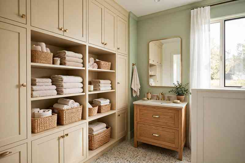
10. Dedicated Bathroom Storage Walls
One of the smartest bathroom upgrades may be something you barely notice: better storage.
A full-height storage wall can house towels, toiletries, cleaning supplies, toilet paper, and everyday essentials without covering the vanity with clutter.
In smaller bathrooms, recessed medicine cabinets and wall niches can provide useful storage while keeping the floor area open.
11. Backlit Bathroom Mirrors
Good lighting can completely change how a bathroom feels.
Backlit mirrors provide a soft layer of illumination while giving the vanity area a polished appearance. They can work particularly well in modern and minimalist bathrooms.
For practical grooming, don’t rely on the mirror alone. Add flattering vertical or side lighting around the face to reduce shadows.
12. Mixed Metal Bathroom Fixtures
Matching every metal finish is becoming less necessary.
A bathroom can feel more collected when two complementary finishes are used intentionally. For example, brushed brass hardware can work with a chrome faucet, or matte black lighting can be paired with warm brass cabinet pulls.
The key is repetition. Repeat each metal finish at least a couple of times so the combination feels deliberate rather than accidental.
13. Bathroom Wet Rooms
For larger renovations, wet-room bathrooms offer a sleek and highly practical layout.
Instead of separating the shower from the rest of the room with a bulky enclosure, the wet area is designed to handle water through proper waterproofing, drainage, and carefully selected materials.
This can make a smaller bathroom feel more spacious, but professional waterproofing is essential. This is not an area where cutting corners makes sense.
14. Natural Stone Bathroom Details
Natural stone is bringing organic texture back into bathroom design.
Travertine, limestone, marble, and other stone surfaces can add variation that manufactured materials sometimes struggle to replicate. You can use stone across a large surface or simply introduce it through a vanity countertop, shower bench, backsplash, or accessories.
For a more budget-friendly approach, combine one stone feature with simple porcelain tile elsewhere.
15. Built-In Shower Niches
A shower niche is one of those small bathroom upgrades that makes a surprisingly big difference.
Instead of balancing bottles on the floor or a small corner shelf, a properly positioned niche gives shampoo, soap, and other products a dedicated home.
For a custom look, match the niche tile to another material already used in the bathroom. A contrasting stone slab can also turn the storage feature into a subtle design detail.
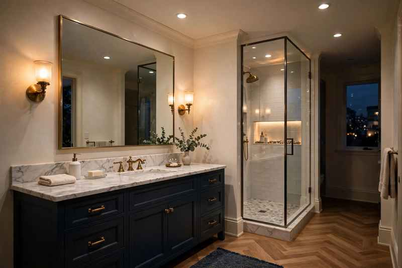
16. Layered Bathroom Lighting
One ceiling fixture is rarely enough for a well-designed bathroom.
A better lighting plan combines several sources: general overhead lighting, vanity lighting, shower lighting where appropriate, and decorative illumination.
Wall sconces beside the mirror can add character while providing useful face-level lighting. A small pendant can bring personality to a larger bathroom.
17. Wallpaper in Powder Rooms
Powder rooms are becoming places to take design risks.
Because they are smaller and usually don’t contain a shower, wallpaper can introduce pattern and personality without competing with a large wet area.
Try botanical prints, classic stripes, small-scale geometric patterns, or moody colors. Pair bold wallpaper with simple fixtures so the room still feels balanced.
18. Furniture-Style Bathroom Vanities
Bathroom vanities are beginning to look less like standard built-ins and more like actual furniture.
A dresser-inspired vanity with visible legs, detailed drawer fronts, or a rich wood finish can instantly make the bathroom feel more considered.
This approach works especially well in traditional, vintage-inspired, and transitional bathrooms where an overly sleek cabinet might feel out of place.
19. Quiet Luxury Bathroom Materials
The biggest bathroom trend may be choosing materials that don’t scream for attention.
Instead of filling the room with trendy finishes, combine quality-looking basics: natural stone or stone-look tile, warm wood, understated fixtures, soft textiles, and simple lighting.
The result feels expensive without depending on a single flashy feature.
A bathroom designed this way is also easier to update later because the foundation remains timeless.
20. Bathrooms Designed for Everyday Wellness
The modern bathroom is increasingly being treated as a place to slow down rather than simply get ready.
That can mean a comfortable shower, warm lighting, a deep soaking tub, towel storage within easy reach, natural textures, or even a small stool for convenience.
You don’t need to build a luxury hotel bathroom to create this feeling. Focus on the details that improve your actual routine.
How to Choose the Right 2026 Bathroom Trends
Not every trend belongs in every bathroom. The best upgrades depend on your room’s size, layout, budget, and how you use the space.
Start With Function
Before choosing tile colors or hardware, identify what currently annoys you.
Is there nowhere to put toiletries? Is the shower cramped? Is the lighting terrible? Does the vanity lack usable drawers?
Fixing those problems should come before purely decorative upgrades.
Pick a Timeless Base
Keep expensive permanent features relatively calm.
Warm neutrals, natural stone looks, simple cabinetry, and classic tile can provide a foundation that lasts. Use trends through mirrors, lighting, hardware, paint, and accessories that are easier to replace.
Invest Where You Touch and Use
A beautiful bathroom is not much fun if the shower is uncomfortable or the storage doesn’t work.
Put more of your renovation budget toward high-use features such as plumbing fixtures, cabinetry, lighting, waterproofing, and ventilation.
Think About Maintenance
A material can look fantastic in a photograph and become frustrating in daily life.
Before choosing a finish, consider cleaning requirements, water marks, grout maintenance, durability, and how the material will age.
Smart Bathroom Upgrades for Different Budgets
You don’t need a full renovation to borrow the look of these 2026 bathroom trends.
Lower budget: Replace cabinet hardware, update the mirror, improve lighting, add new towels, repaint the walls, or install a more attractive shower fixture.
Mid-range: Upgrade the vanity, countertop, lighting plan, shower hardware, or flooring.
Major renovation: Rework the layout, enlarge the shower, add a wet-room design, install custom cabinetry, or introduce premium stone and built-in storage.
The smartest approach is to spend heavily on improvements that are difficult to change later and save money on finishes that can be refreshed easily.
2026 Bathroom Trend Mistakes to Avoid
A few common mistakes can make a bathroom remodel feel dated surprisingly quickly.
Choosing too many competing finishes
Sacrificing storage for appearance
Using poor bathroom lighting
Ignoring ventilation
Picking slippery flooring
Following a trend without considering the home’s overall style
Installing expensive materials without planning maintenance
Underestimating waterproofing requirements
Making the bathroom too visually cold with excessive white and gray
Adding decorative features that make cleaning harder
A good bathroom should look beautiful, but it also needs to work on an ordinary Monday morning.
Bathroom Trend Checklist
Before starting your upgrade, save this checklist:
☐ Choose a practical bathroom layout ☐ Plan storage before selecting finishes ☐ Select a warm or timeless base palette ☐ Choose flooring with appropriate slip resistance ☐ Plan layered lighting ☐ Decide whether mixed metals fit the design ☐ Select durable shower materials ☐ Include a shower niche if useful ☐ Check ventilation requirements ☐ Consider long-term cleaning and maintenance ☐ Spend more on difficult-to-replace features ☐ Add personality through easier-to-change details
Frequently Asked Questions
What is the biggest bathroom trend for 2026?
Warm, comfortable, spa-inspired bathrooms are among the strongest design directions for 2026. Natural wood, warm neutrals, larger showers, curved details, and layered lighting are all helping bathrooms feel less sterile and more inviting.
Are gray bathrooms out of style in 2026?
Gray is not necessarily out, but warmer colors are becoming more popular. Cream, taupe, beige, mushroom, soft brown, and earthy shades can create a warmer atmosphere while still feeling modern.
What bathroom upgrades are worth the money?
Upgrades that improve daily use are usually the safest investment. Better storage, quality plumbing fixtures, good lighting, waterproofing, ventilation, and a well-planned shower can make a noticeable difference for years.
Are freestanding tubs still popular?
Yes, freestanding tubs remain popular, particularly in larger primary bathrooms. Their success depends heavily on the room’s available space and whether the tub actually fits the way the bathroom is used.
How can I make a small bathroom look more expensive?
Use fewer visual breaks, choose a cohesive color palette, add a large mirror, improve lighting, and keep surfaces relatively uncluttered. Warm wood, quality-looking hardware, and large-format tile can also make a small bathroom feel more polished.
Final Thoughts
The best 2026 bathroom trends aren’t necessarily the loudest ones. They are the ideas that make the room easier to use, more comfortable, and more enjoyable to live with.
Warm wood, larger showers, thoughtful storage, curved details, natural materials, layered lighting, and calm colors can all work together without making the bathroom feel overly trendy.
If you’re planning a major renovation, start with the layout and the features you use every day. Then layer in the finishes and details that make the space feel like yours.
Your front yard is the first part of your home visitors see, but creating good curb appeal does not mean covering every inch with flowers.
The best front yard landscaping ideas usually combine a few thoughtful elements: attractive plants, defined pathways, well-placed lighting, interesting textures, and a layout that complements the house.
Even a small front yard can look polished with the right combination of greenery and hardscaping. A larger yard gives you more room to create layers, but the same basic principles apply.
If your front yard feels a little plain, these 24 landscaping ideas can help you turn it into a welcoming and attractive entrance without making it look overly complicated.
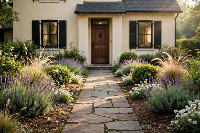
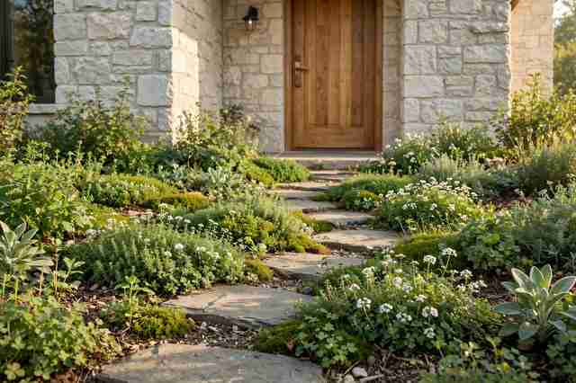
1. Frame the Front Walkway With Plants
A simple walkway can look much more inviting when it is framed with plants.
Use low-growing shrubs, ornamental grasses, flowering perennials, or neat ground covers along both sides of the path. Keep the plants slightly lower near the entrance so they do not block the view of the front door.
For a classic look, repeat the same plant on both sides. For a more relaxed garden, mix several varieties while keeping the overall color palette consistent.
2. Add Large Statement Planters
Large planters are an easy way to add structure to a front yard.
Place matching containers beside the front door, garage entrance, or beginning of the walkway. Oversized pots can also fill an awkward corner where planting directly in the ground is difficult.
Terracotta works beautifully with warm traditional homes, while charcoal, concrete, or stone planters suit contemporary exteriors.
Choose plants that fit the amount of sunlight the area receives.
3. Create a Layered Planting Bed
Flat planting beds can make a front yard feel unfinished.
Instead, create layers with taller shrubs at the back, medium-height plants in the middle, and low-growing flowers or ground covers toward the edge.
This gives the landscape more depth and helps the garden look interesting from the street.
Repeat a few plants throughout the bed so the design feels intentional rather than random.
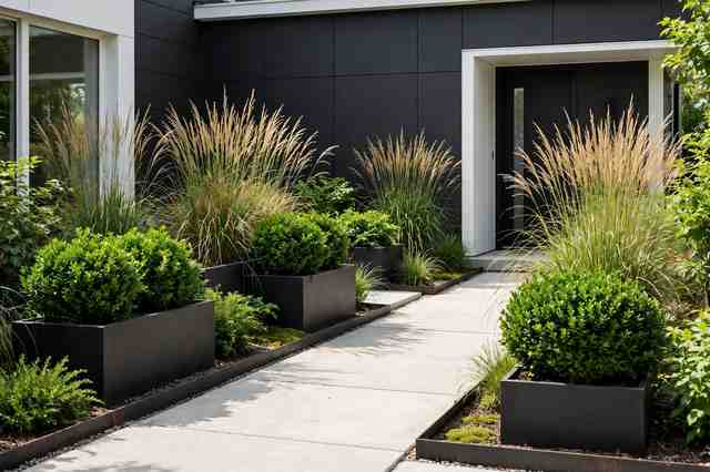
4. Use Ornamental Grasses
Ornamental grasses can add movement and texture without requiring a complicated planting scheme.
Their soft, flowing shapes contrast nicely with brick, stone, concrete, and straight architectural lines.
Try planting groups of grasses beside a walkway or mixing them with flowering perennials.
For a modern front yard, use grasses with simple architectural plants and dark mulch or gravel.
5. Make the Front Door the Focal Point
Good landscaping should guide attention toward the entrance.
Keep the area around the front door visually clear, then use plants, containers, lighting, or a pathway to draw the eye toward it.
A pair of planters can create symmetry, while a curved planting bed can make the entrance feel softer.
Think about the view from the street. The front door should remain easy to see rather than disappearing behind plants.
6. Add a Curved Garden Border
Straight garden beds can look formal, while gentle curves create a softer appearance.
A curved planting bed can follow the shape of the walkway or lawn and make a small yard feel more natural.
Keep curves broad rather than creating lots of tiny bends. One well-designed sweeping border usually looks more polished than several narrow curves.
7. Plant a Small Flowering Tree
A small ornamental tree can completely change the character of a front yard.
Choose a variety that suits your climate and the mature size available in your space. Flowering trees can provide seasonal color, while smaller evergreen trees offer year-round structure.
Position the tree so it complements the house without blocking windows, pathways, utility access, or important sightlines.
8. Try a Low Maintenance Gravel Garden
If you want attractive landscaping without a large lawn or demanding flower beds, consider gravel.
A gravel garden can combine decorative stone with drought-tolerant plants, grasses, shrubs, and architectural foliage.
Use larger rocks or edging to define the planting areas and prevent the gravel from spreading onto the walkway.
This style works especially well with contemporary and desert-inspired homes.
9. Add Stepping Stones to the Entrance
Stepping stones can make a front garden feel more welcoming.
Use natural stone, concrete pavers, or large-format slabs depending on the style of the house. Leave consistent spacing between the stones and surround them with gravel, ground cover, or low plants.
For a modern look, choose large rectangular slabs. Irregular natural stones work better for cottage and informal gardens.
10. Install Low Landscape Lighting
Front yard lighting can make a huge difference after sunset.
Small path lights can define walkways, while uplights can highlight trees, textured walls, or architectural features.
Keep the lighting subtle. The goal is to make the entrance safer and more attractive, not to flood the entire yard with bright light.
Warm-toned lighting generally creates a softer residential atmosphere.
11. Combine Shrubs With Seasonal Flowers
Shrubs provide structure while seasonal flowers add color.
Use evergreen or long-lasting shrubs as the foundation, then add flowers that can be changed or refreshed throughout the year.
This approach means the front yard still looks intentional when the flowers are not blooming.
Choose a limited color palette for each planting bed rather than mixing every available flower color.
12. Use a Low Hedge for Definition
A low hedge can give a front yard a clean, finished edge.
Boxwood-style shrubs, compact evergreens, or other suitable plants can separate the lawn from the sidewalk or driveway.
Keep the hedge low enough to preserve visibility and avoid creating a wall between the house and street.
For a more relaxed appearance, allow the plants to grow naturally rather than trimming every edge perfectly.
13. Replace Some Lawn With Ground Cover
Large expanses of lawn are not always necessary for good curb appeal.
Ground covers can add texture while reducing the amount of grass that needs regular maintenance. Depending on your climate, options may include low-growing perennials, creeping plants, ornamental ground covers, or other landscape-suitable species.
Use them around trees, between stepping stones, or along planting borders.
Always choose species appropriate for your local conditions and avoid invasive plants.
14. Create a Front Yard Seating Spot
If your front yard has enough space, a small seating area can make it feel more connected to the home.
A simple bench beneath a small tree or beside a planting bed can create a charming resting spot.
Choose weather-resistant furniture and position it where it does not interfere with the main walkway.
This works particularly well for wide front porches and larger suburban yards.
15. Use Natural Stone Edging
Natural stone can give planting beds a more established appearance.
Place stones along the edge of a lawn, flower bed, or pathway to create a visual transition between different materials.
Choose stone that complements the home’s exterior rather than introducing a completely unrelated color.
For a cohesive design, repeat the same stone somewhere else in the landscape.
16. Add a Modern Black-and-Green Palette
A simple black-and-green combination can make contemporary landscaping look striking.
Use dark planters, black metal edging, or charcoal gravel with different shades of green foliage.
Plants with bold shapes work especially well here.
The dark elements provide contrast while the greenery keeps the design from feeling too severe.
17. Create a Cottage-Style Front Garden
For a softer and more romantic look, mix flowering plants at different heights.
Use a combination of shrubs, perennials, grasses, and climbing plants around the entrance. Avoid making every plant identical or perfectly spaced.
Soft pinks, whites, lavender, pale yellow, and green foliage can create a classic cottage palette.
The garden should feel abundant without blocking windows or paths.
18. Highlight the Mailbox With Landscaping
The mailbox is easy to overlook, but it can become part of the overall curb appeal.
Surround it with a small planting bed containing low flowers, ornamental grasses, or compact shrubs.
Keep plants away from the actual mailbox opening and make sure the area remains easy for mail delivery.
A simple planting design is usually more effective than an oversized arrangement.
19. Add a Small Water Feature
A water feature can create a focal point in a larger front yard.
Consider a small bubbling fountain, stone basin, or simple wall-mounted feature rather than something that dominates the entire landscape.
Surround it with greenery and natural stone so it feels integrated with the garden.
Think about maintenance requirements before installing one, especially if the feature will collect leaves or require regular cleaning.
20. Use Repetition for a More Expensive Look
One of the easiest landscaping tricks is repetition.
Instead of planting dozens of unrelated species, repeat the same shrub, grass, flower, or planter several times.
For example, a row of matching shrubs along the walkway can create rhythm, while repeated grasses can connect separate planting areas.
Repetition makes even a modest landscaping project feel more deliberate.
21. Landscape Around a Mature Tree
A mature tree is already a major asset, so make it part of the design.
Create a simple planting bed around the tree using shade-tolerant plants where appropriate. Add a clean border and keep the planting scheme relatively restrained.
Avoid piling soil against the trunk or disturbing the tree’s root system.
A mature tree surrounded by a thoughtfully designed garden can become the strongest feature in the front yard.
22. Mix Evergreen and Seasonal Plants
A front yard should not rely entirely on plants that look good for one season.
Evergreen shrubs and trees provide structure throughout the year, while flowering plants bring seasonal changes.
This combination can keep the garden attractive during both flowering and quieter periods.
When planning, think about how the yard will look in different seasons rather than judging everything by its summer appearance.
23. Match Landscaping to the House Style
Your landscaping will look more cohesive when it relates to the architecture.
A modern house might pair well with geometric planting beds, ornamental grasses, large concrete planters, and restrained greenery.
A traditional home can work beautifully with symmetrical shrubs, brick paths, flowering borders, and classic containers.
For a cottage-style house, softer curves, natural stone, and abundant planting may feel more appropriate.
There is no single best front yard style. The house itself is your starting point.
24. Create a Simple Layered Front Yard
When in doubt, keep the design simple and build it in layers.
Start with the major elements: driveway, walkway, lawn, trees, and planting beds. Then add shrubs, smaller plants, containers, lighting, and decorative details.
Give each element enough breathing room.
A front yard does not need dozens of features to look impressive. A clean layout with healthy plants and a clear path to the front door can create excellent curb appeal.
How to Plan a Front Yard Landscaping Makeover
Before buying plants or digging new beds, spend some time looking at the space.
Start by identifying the areas that need the most attention. Is the walkway unattractive? Does the entrance disappear from the street? Is the lawn too large? Does the front yard lack color?
Then consider sunlight, drainage, soil, mature plant size, and maintenance.
A plant that looks beautiful at the garden center may become a problem if it grows too large for the space.
It also helps to take a photograph of your front yard and sketch the major planting areas over it. This makes it easier to see where repetition, height, and focal points are needed.
Easy Front Yard Landscaping Ideas on a Budget
You do not need a complete landscape renovation to improve curb appeal.
Try a few smaller projects first:
Refresh the mulch or gravel
Add two matching planters near the entrance
Define the walkway with low plants
Add solar or low-voltage path lights
Trim overgrown shrubs
Replace tired annual flowers
Paint or refresh a garden bench
Add a small flowering tree
Create a clean edge around planting beds
Replace patchy lawn with suitable ground cover
Start with the changes that are most visible from the street.
Front Yard Landscaping Mistakes to Avoid
Beautiful landscaping is often as much about what you leave out as what you add.
Avoid planting trees too close to the house or choosing shrubs without considering their mature size. Do not block the front door with tall plants, and avoid creating narrow pathways that are difficult to navigate.
Too many different materials can also make a small front yard feel busy.
Finally, do not choose plants only because they look good in photos. Climate, sunlight, water needs, soil conditions, and maintenance should all influence your choices.
Frequently Asked Questions
What is the easiest way to improve front yard curb appeal?
Start with the entrance. Clean up the walkway, trim overgrown plants, add attractive containers, refresh planting beds, and improve lighting around the front door.
How can I make a small front yard look bigger?
Keep the layout simple, use fewer but better-proportioned plants, create clear pathways, and use vertical elements such as small trees or narrow shrubs. Avoid filling every available space.
What plants are best for front yard landscaping?
The best plants depend on your climate, soil, sunlight, and maintenance preferences. Choose plants that naturally thrive in your area rather than selecting solely based on appearance.
How do I make my front yard look expensive?
Use repetition, consistent materials, defined planting beds, quality-looking containers, attractive lighting, and a restrained color palette. A simple, well-maintained design often looks more polished than an overcrowded one.
Should I remove my front lawn?
Not necessarily. If you use the lawn and it suits your climate, keep it. If it requires excessive maintenance or leaves little room for useful planting, replacing part of it with suitable ground cover, shrubs, or garden beds may make more sense.
Final Thoughts
Great curb appeal does not require a huge budget or an elaborate landscape plan.
The most successful front yards usually have a clear entrance, healthy plants, thoughtful proportions, and a few memorable details. Start with the structure, then add color and personality gradually.
Whether you prefer a neat modern garden, a relaxed cottage landscape, or a classic front yard filled with shrubs and flowers, the goal is the same: create an entrance that feels welcoming and looks naturally connected to your home.
Choose a few of these ideas that suit your space, rather than trying to use all 24 at once. A simple plan executed well will always look better than a yard packed with every trend
There is something instantly comforting about a Nancy Meyers-inspired kitchen. It feels bright without being stark, elegant without being formal, and beautifully lived-in without looking messy.
Think creamy cabinets, oversized islands, warm wood, classic lighting, natural stone, open shelving, fresh flowers, and enough room for people to gather. The style often feels collected rather than decorated all at once.
The good news is that you do not need a huge kitchen or a Hollywood-sized renovation to get the look. Many of the details come down to color, materials, lighting, and the little things that make a kitchen feel welcoming.
If you love timeless kitchens that look beautiful in photographs but still feel practical enough for everyday life, these 21 ideas are worth saving.
1. Creamy White Kitchen Cabinets
Creamy white cabinets are one of the easiest ways to capture the Nancy Meyers kitchen aesthetic.
Instead of a cold, bright white, choose a warmer shade with subtle beige or ivory undertones. This makes the kitchen feel softer and more inviting, especially when paired with natural wood and aged metal finishes.
Flat-panel cabinets can work, but classic shaker doors are especially effective for this look.
Pair them with simple hardware and let the warm color do most of the work.
2. A Large Kitchen Island
A generous kitchen island is more than a workspace in this style. It becomes the heart of the room.
Choose an island large enough for food preparation, casual meals, homework, coffee, or simply gathering around while someone cooks.
A painted base in cream, soft gray, muted blue, or warm green can give the island its own personality while keeping the rest of the kitchen neutral.
If space is limited, focus on proportion rather than size. Even a modest island can feel special when it has comfortable seating and a beautiful countertop.
3. Warm Natural Wood Accents
A Nancy Meyers-inspired kitchen rarely feels completely white.
Natural wood adds the warmth needed to keep a light kitchen from looking sterile. Try wooden cutting boards, stools, beams, open shelves, dining furniture, or a butcher-block section on the island.
Oak, walnut, pine, and lightly aged woods can all work.
The trick is to let the grain remain visible rather than choosing heavily polished finishes.
4. Marble or Marble-Look Countertops
Natural stone brings a timeless quality to the kitchen.
White marble with soft gray veining works particularly well with creamy cabinetry. If real marble is not practical for your lifestyle or budget, there are plenty of durable alternatives that create a similar visual effect.
Keep the rest of the countertop relatively simple. A few wooden boards, a ceramic bowl, and a vase of greenery are usually enough.
You want the stone to be part of the architecture, not buried under accessories.
5. Classic Brass Hardware
Small hardware changes can have a surprisingly big impact.
Aged brass or brushed brass cabinet pulls can add warmth to white and cream kitchens without making them feel overly glamorous.
Choose simple shapes rather than highly decorative handles. Cup pulls, round knobs, and traditional bar pulls all fit naturally into this aesthetic.
For a more collected appearance, allow the brass to develop a slightly aged character rather than insisting that every piece look perfectly polished.
6. Farmhouse-Inspired Kitchen Sinks
A deep apron-front sink immediately gives a kitchen a classic, welcoming quality.
White fireclay is an obvious choice, but other materials can work depending on the overall design. The important part is the generous proportions and traditional silhouette.
Pair the sink with a simple bridge-style or gooseneck faucet in brass, polished nickel, or aged metal.
Add a wooden cutting board nearby and the whole area starts to feel practical as well as decorative.
7. Soft Blue Kitchen Cabinets
If you want color without losing the calm quality of the style, soft blue is an excellent choice.
Think dusty blue, faded denim, muted slate, or blue-gray rather than bright primary blue.
Use it across the entire kitchen or reserve it for the island. Cream walls, warm wood, brass hardware, and pale countertops keep the color feeling timeless.
This is particularly beautiful in kitchens with plenty of natural light.
8. Open Shelving With Everyday Dishes
Open shelves can make a kitchen feel more personal.
Rather than filling them with decorative objects, display things you actually use. Stack white plates, place a few bowls beside them, add wooden cutting boards, and finish with a small plant or ceramic vase.
The goal is not perfect styling.
A few slightly mismatched pieces can actually make the shelves feel more authentic and lived-in.
9. Glass-Front Cabinets
If you like the idea of open shelving but want less visual clutter, glass-front cabinets offer a good middle ground.
Use them to display everyday dishes, glassware, serving pieces, or a small collection of ceramics.
Clear glass keeps the kitchen visually open while the cabinet frames provide more structure than completely open shelves.
Choose simple cabinet profiles so the display feels timeless.
10. Oversized Pendant Lights
Lighting can completely change the character of a kitchen.
Large pendant lights above an island create a focal point while providing practical task lighting. Look for shades in aged brass, antique bronze, linen, milk glass, or simple painted metal.
Two or three pendants can work beautifully over a longer island.
For a softer look, choose fixtures with warm finishes and diffused light rather than highly polished contemporary designs.
11. A Cozy Breakfast Nook
One of the most charming Nancy Meyers kitchen ideas is making room for casual meals.
A small breakfast nook with a wooden table, comfortable chairs, and a nearby window can give the kitchen a relaxed everyday feeling.
If you have a larger space, consider a built-in bench with washable cushions.
For a small kitchen, even a round café table tucked beside a window can create the same sense of intimacy.
12. Traditional Range Hoods
A kitchen hood does not have to disappear into the cabinetry.
A custom range hood can become one of the room’s strongest architectural details. Plaster, painted wood, limestone, or a simple wood surround can create a warm focal point.
Keep the shape classic and let the material complement the cabinets.
A hood that looks slightly furniture-like can make a new kitchen feel as though it has been there for years.
13. Layered Neutral Colors
The secret to a beautiful neutral kitchen is using several shades rather than one.
Combine ivory cabinets with warm white walls, beige upholstery, pale stone, honey-toned wood, and slightly darker natural accents.
These subtle differences create depth.
If everything is exactly the same shade of white, the room can feel flat. Layering warm neutrals gives the kitchen that relaxed, collected quality people often associate with classic movie interiors.
14. A Kitchen With Personality
A Nancy Meyers-inspired kitchen should not feel like a showroom.
Add things that suggest someone actually lives there. A bowl of lemons, a stack of cookbooks, a favorite ceramic mug, a wooden stool, fresh herbs, or a vase of flowers can make the space feel personal.
The key is restraint.
Choose useful objects that are attractive enough to leave visible rather than covering every surface with decorations.
15. Checkerboard or Classic Tile Floors
Classic flooring can add character without overwhelming the room.
A soft black-and-white checkerboard floor creates a traditional look, while warmer beige-and-cream combinations feel gentler.
If you prefer something more subtle, natural stone or pale wood flooring can provide the same timeless foundation.
Avoid overly trendy patterns if your goal is a kitchen that will still look beautiful years from now.
16. A Large Farmhouse-Style Table
Instead of relying entirely on an island for seating, consider bringing a dining table directly into or beside the kitchen.
A large wooden table creates an inviting gathering spot and adds another natural material to the room.
Mix it with comfortable chairs, a bench, or even slightly mismatched seating.
The result should feel like a place where people can linger over coffee rather than simply eat and leave.
17. Soft Green Kitchen Details
Muted green is another beautiful way to introduce color.
Sage, eucalyptus, moss, and olive tones work especially well with creamy whites and natural wood.
You can use green on the island, lower cabinets, a vintage-style cabinet, or simply through plants and accessories.
For a subtle update, start with green ceramics, herbs, artwork, or a painted piece of furniture before committing to cabinetry.
18. Vintage-Inspired Accessories
The right accessories can make a newly renovated kitchen feel established.
Look for vintage-style crocks, wooden bowls, ceramic pitchers, woven baskets, old cutting boards, framed botanical prints, and traditional glassware.
You do not need everything to be genuinely antique.
The goal is to introduce pieces with character and variation so the kitchen does not feel as though every item came from the same showroom.
19. A Dedicated Coffee Station
A coffee station is both practical and visually appealing.
Set aside a small section of countertop for a coffee maker, mugs, a sugar bowl, and a jar of coffee beans. Add an open shelf above it if you have the space.
Wooden trays and ceramic containers can keep everything organized without making the area look overly styled.
This small detail can make the kitchen feel especially welcoming in the morning.
20. Large Windows and Natural Light
Natural light is one of the most important parts of the look.
Large windows, glass doors, or strategically placed skylights can make warm cabinetry and natural materials look even better.
Keep window treatments simple. Soft linen shades, café curtains, or relaxed fabric panels can add privacy without blocking too much light.
If your kitchen is naturally dark, use warm cream finishes and layered lighting to create a similar feeling.
21. The Collected, Lived-In Kitchen
Perhaps the most important idea is to avoid making the kitchen look too perfect.
The most appealing versions of this style combine beautiful architecture with everyday details. A wooden board leaning against the backsplash, a bowl of fruit, slightly imperfect ceramics, fresh flowers, cookbooks, and comfortable seating all help.
Think timeless rather than trendy.
The kitchen should look like it has evolved over time, even if you designed it recently.
How to Get the Nancy Meyers Kitchen Look
You do not need to copy a specific movie kitchen to create this atmosphere. Start with a warm neutral foundation, then layer in a few classic elements.
Try this simple formula:
Cream or warm white + natural wood + classic hardware + stone + soft lighting + lived-in accessories
From there, choose one accent color. Soft blue, sage green, muted black, or warm terracotta can all work beautifully.
Keep the countertops relatively uncluttered, but do not hide everything. A few everyday objects can make the room feel much more welcoming.
Most importantly, prioritize comfort. A beautiful kitchen that feels uncomfortable will never have the same appeal as one where people naturally want to sit, talk, cook, and stay awhile.
Easy Nancy Meyers Kitchen Updates on a Budget
You can capture the style without replacing your entire kitchen.
Start with the details that have the biggest visual impact:
Replace dated cabinet hardware with classic brass or nickel
Add warm wood cutting boards and serving pieces
Bring in a ceramic pitcher or vase
Display attractive everyday dishes on open shelves
Add a vintage-inspired rug
Replace harsh bulbs with warmer lighting
Introduce fresh herbs or flowers
Paint an island a soft blue, sage, or cream
Add linen café curtains
Style a small coffee station
These changes can shift the mood of the room without requiring a major renovation.
Nancy Meyers Kitchen Color Palette Ideas
If you are choosing colors for a new kitchen, consider these combinations:
Classic: warm white + cream + natural oak + brass
Coastal: soft blue + ivory + pale oak + brushed nickel
Cottage: sage green + cream + walnut + aged brass
Traditional: warm white + charcoal + medium wood + antique brass
Fresh: soft beige + muted green + white oak + natural stone
The common thread is warmth. Even when the palette is mostly neutral, small variations in tone keep the kitchen interesting.
Frequently Asked Questions
What makes a kitchen look like a Nancy Meyers kitchen?
Warm neutral colors, comfortable furniture, natural materials, classic cabinetry, large windows, traditional lighting, fresh flowers, and practical everyday accessories are common elements of the aesthetic.
What color cabinets work best for this style?
Cream, warm white, soft blue, sage green, and muted gray are all strong choices. Warm whites are especially versatile if you want a timeless foundation.
Are Nancy Meyers kitchens modern or traditional?
They often blend both. The cabinetry and materials may feel traditional, while the layout, appliances, lighting, and styling can be contemporary.
How can I get the look without remodeling?
Focus on accessories and smaller details first. Change cabinet hardware, add wood accents, update lighting, introduce fresh flowers, display attractive dishes, and bring in warm textiles.
What countertop looks best with this kitchen style?
White or creamy stone with subtle veining works particularly well. Marble, quartz, and other stone-look surfaces can all complement warm cabinetry and natural wood.
Final Thoughts
The appeal of a Nancy Meyers-inspired kitchen is not really about copying one particular room. It is about creating a space that feels warm, timeless, comfortable, and genuinely useful.
Start with a soft color palette, bring in natural materials, choose classic details, and leave room for everyday life. A wooden bowl on the counter, flowers beside the sink, a comfortable breakfast chair, or a stack of well-used cookbooks can sometimes do more for the atmosphere than an expensive decorative piece.
The prettiest kitchen is often the one that makes you want to stay for another cup of coffee
Your patio does not need a complete renovation to feel fresh. A new outdoor rug, better lighting, a comfortable seating arrangement, or a few well-chosen plants can completely change the way the space looks and feels.
This year’s patio trends are leaning toward spaces that feel more like real outdoor rooms than temporary summer setups. Think comfortable furniture, warm materials, layered lighting, natural textures, practical shade, and colors that work with the surrounding landscape.
Whether you have a large backyard patio or a tiny apartment terrace, these outdoor patio trends can help you create a space that feels stylish without sacrificing comfort.
1. Outdoor Living Rooms
One of the biggest patio trends this year is treating the outdoor area like another living room.
Instead of arranging a few chairs around a table, create separate zones for lounging, dining, and relaxing. A deep outdoor sofa, coffee table, accent chairs, and an outdoor rug can make the patio feel surprisingly similar to an indoor room.
Choose furniture that is comfortable enough for long evenings outside rather than pieces that simply look attractive.
Try this: Use a large rug to visually anchor your seating area and position the furniture around it.
2. Warm Wood Patio Furniture
Cool gray outdoor furniture is giving way to warmer finishes.
Teak, acacia, cedar, and other natural-looking woods bring softness to patios filled with concrete, stone, or metal. Wood furniture also works beautifully with greenery, woven accessories, and neutral fabrics.
For a timeless patio, pair a natural wood dining table with cream cushions and simple black or bronze lighting.
The combination feels relaxed without looking overly rustic.
3. Earthy Patio Color Palettes
Outdoor spaces are moving beyond basic beige and gray.
Terracotta, olive green, clay, warm brown, muted blue, sand, and creamy white are becoming popular choices for outdoor decorating. These shades naturally connect a patio with plants, soil, stone, and surrounding landscapes.
You do not need to replace all your furniture to try the trend.
Add earthy colors through cushions, outdoor rugs, ceramic planters, umbrellas, and throw pillows.
4. Oversized Outdoor Sofas
Small patio chairs are not disappearing, but larger, more comfortable seating is becoming much more appealing.
An oversized outdoor sofa can turn an unused corner into the favorite spot in the backyard. Look for deep cushions, durable performance fabric, and enough room for several people to sit comfortably.
For smaller patios, a compact L-shaped sectional can provide the same relaxed feeling without taking over the entire space.
5. Statement Outdoor Rugs
An outdoor rug can make a patio feel finished almost instantly.
Instead of choosing a rug simply because it is weather-resistant, consider its pattern and color as part of the overall design. Stripes, faded geometric patterns, vintage-inspired designs, and subtle botanical motifs can all work beautifully outside.
A patterned rug is particularly useful when the furniture is neutral.
Design tip: Make sure at least the front legs of your main seating pieces sit on the rug. This helps the arrangement feel intentional rather than scattered.
6. Layered Patio Lighting
A single bright outdoor light rarely creates an inviting atmosphere.
This year, patios are using several types of lighting together. Wall sconces can provide practical illumination, while lanterns, string lights, table lamps, and candles add softer layers.
The result is much more relaxing after sunset.
Try combining overhead lighting with low-level lighting around seating areas and pathways. Warm-toned bulbs generally create a more comfortable evening atmosphere than harsh, cool lighting.
7. Built-In Patio Fire Features
Fire features continue to make outdoor spaces feel more inviting.
A built-in fire pit, modern fire table, or linear gas fireplace can become the natural gathering point of a patio. The style can range from rustic stone to sleek concrete depending on the rest of the home.
If you are working with a small space, a compact fire table can provide the same cozy focal point without requiring a large permanent structure.
Always follow local fire-safety requirements and manufacturer instructions when installing or using outdoor fire features.
8. Natural Stone Patios
Natural stone brings instant character to an outdoor space.
Travertine, limestone, slate, flagstone, and other stone surfaces can create a more substantial look than basic concrete. The irregular edges and natural variations also prevent the patio from feeling too uniform.
For a modern look, combine large-format stone with simple furniture. For a more relaxed garden patio, mix stone with timber, climbing plants, and aged planters.
9. Outdoor Dining Areas
Patios are becoming more useful for everyday meals, not just occasional barbecues.
A proper outdoor dining area makes it easier to eat breakfast outside, host friends, or enjoy dinner on warm evenings. Choose a table size based on how you actually use the space rather than trying to fill every available inch.
A round table can work especially well in a smaller patio because it creates easier movement around the seating.
10. Pergolas With Soft Shade
Shade is becoming part of the design rather than an afterthought.
Pergolas provide structure while allowing light to filter through. Add retractable fabric, outdoor curtains, climbing plants, or a slatted roof when additional shade is needed.
A simple wood pergola can create a beautiful frame over an outdoor dining table, while a dark metal version works well with contemporary architecture.
11. Outdoor Curtains
Outdoor curtains are an easy way to make a patio feel more private and polished.
White and cream curtains create a breezy resort-inspired look, while taupe, olive, charcoal, or muted blue can create a more dramatic outdoor room.
Use weather-appropriate fabric and install the curtains so they can be opened completely when you want more airflow.
They are especially useful around covered patios, pergolas, and poolside seating areas.
12. Curved Patio Furniture
Straight lines are making room for softer shapes.
Curved sofas, rounded lounge chairs, circular coffee tables, and arched structures can make an outdoor seating area feel more relaxed and conversational.
A curved sectional is particularly effective around a fire pit because it naturally directs attention toward the center.
If your existing furniture is angular, simply add a round coffee table or circular outdoor rug to introduce the trend without replacing everything.
13. Mediterranean-Inspired Patios
Mediterranean style works naturally outdoors.
Think limewashed walls, terracotta pots, warm stone, olive trees, rustic wood, textured plaster, and creamy fabrics. The palette tends to feel sun-washed rather than overly bright.
For an easy update, add terracotta planters, striped cushions, a weathered wood table, and plenty of greenery.
The goal is a patio that feels collected and relaxed rather than perfectly matched.
14. Outdoor Kitchens That Feel Like Real Kitchens
Outdoor kitchens are becoming more sophisticated.
Instead of a grill standing alone on a small cart, larger setups can include countertops, storage, refrigerators, sinks, pizza ovens, and dedicated serving areas.
The most attractive versions often borrow design details from the home’s interior kitchen, such as matching stone, cabinetry colors, or hardware finishes.
Even if you do not need a full outdoor kitchen, a small prep counter beside the grill can make outdoor cooking much easier.
15. Lush Container Gardens
You do not need a huge garden to make a patio feel green.
Large containers filled with herbs, ornamental grasses, flowering plants, shrubs, and small trees can create layers of greenery around the seating area.
Use different pot heights rather than lining identical planters along one wall. A mixture of ceramic, terracotta, stone, and textured containers usually looks more natural.
Choose plants suited to your local climate and the amount of sunlight your patio receives.
16. Privacy Through Plants
Privacy screens do not always need to be made from solid walls.
Tall grasses, bamboo where appropriate, climbing vines, hedges, large planters, and strategically placed trees can create a softer visual barrier.
This approach also helps the patio feel connected to the garden rather than boxed in.
For a contemporary patio, try tall grasses in simple rectangular planters. For a cottage-style space, flowering climbers can create a much softer effect.
17. Mixed Outdoor Materials
Patio design is becoming less matchy-matchy.
Wood, woven fibers, stone, metal, ceramic, concrete, and linen-look fabrics can all work together when the colors are connected.
For example, pair warm teak with a cream outdoor sofa, black metal lighting, stone planters, and a natural fiber-style rug.
The different textures give the space depth without requiring lots of decoration.
18. Vintage-Inspired Outdoor Pieces
A patio does not have to look brand new to look stylish.
Vintage-inspired garden chairs, weathered pots, antique-looking lanterns, old-style benches, and traditional café tables can add personality to a newer outdoor space.
Mix one or two character pieces with modern furniture instead of creating an entirely vintage patio.
This keeps the space comfortable while giving it a collected look.
19. Outdoor Bars and Beverage Stations
A dedicated drink station can make entertaining much easier.
A compact outdoor bar does not have to be elaborate. A narrow console, bar cart, stone counter, or built-in shelf can hold glasses, bottles, an ice bucket, and serving accessories.
For smaller patios, a rolling bar cart is especially practical because it can be moved when you need additional floor space.
20. Moody Outdoor Spaces
Not every patio needs to be bright and coastal.
Deep green, charcoal, chocolate brown, navy, and black can create a sophisticated outdoor setting, especially when balanced with warm wood and plenty of greenery.
A dark pergola, charcoal cushions, or black-framed furniture can give a patio a more dramatic personality.
Add warm lighting so the darker palette feels cozy rather than heavy at night.
21. Small Patio Zones
Small patios are getting smarter rather than simply trying to fit more furniture into the available area.
Think about what you actually want to do outside. Maybe that means morning coffee, reading, dining for two, or relaxing with a drink.
A small bistro table, comfortable lounge chair, vertical garden, and wall-mounted lighting may be more useful than squeezing in a full dining set.
Small patio formula: one main purpose + appropriately sized furniture + vertical greenery + good lighting.
22. Patios Designed for Year-Round Use
The best outdoor spaces are not limited to one season.
Covered areas, outdoor heaters, weather-resistant cushions, retractable shades, fire features, and flexible furniture can make patios useful for much longer throughout the year.
The exact additions depend on your climate, but the basic idea is simple: design the patio around how you want to use it in different weather conditions.
A covered dining area might be more valuable than an oversized uncovered lounge if summer heat or frequent rain limits how often you use the space.
How to Choose the Right Patio Trends for Your Space
You do not need to copy all 22 ideas. In fact, choosing too many trends can make an outdoor space feel cluttered.
Start with the way you use your patio.
If you love hosting, prioritize comfortable seating, an outdoor dining area, lighting, and a fire feature. If you prefer quiet mornings, focus on a comfortable chair, plants, shade, and a small table.
Then look at the materials already around your home.
A brick house may look great with warm wood and earthy colors, while a modern home might work better with concrete, black metal, pale stone, and structured greenery.
Finally, invest in the things you use constantly. Good seating, shade, lighting, and durable surfaces usually make a bigger difference than decorative accessories.
Simple Outdoor Patio Update Checklist
Want to refresh your patio without a major renovation?
Start with these easy updates:
Add an outdoor rug
Replace tired cushions
Introduce two or three earthy accent colors
Add warm layered lighting
Bring in larger planters
Create a dedicated dining or lounging zone
Add a shade solution
Mix wood, stone, metal, and textured fabrics
Include one strong focal point
Keep pathways clear and comfortable
A few thoughtful changes can make a patio feel completely different without rebuilding the entire space.
Frequently Asked Questions
What is the biggest outdoor patio trend this year?
Outdoor spaces designed like comfortable living rooms are one of the strongest trends. Sofas, rugs, layered lighting, shade, and defined seating zones make patios more functional and inviting.
What colors are trending for outdoor patios?
Warm neutrals, terracotta, olive green, muted blue, cream, sand, brown, and charcoal are popular choices. These colors work particularly well with natural wood and greenery.
How can I make a small patio look stylish?
Choose furniture that fits the scale of the space, then use a rug, vertical plants, wall lighting, and one defined purpose. Avoid filling every corner with furniture.
How can I make my patio feel more expensive?
Focus on materials and layering. Natural wood, quality-looking outdoor fabrics, stone, large planters, warm lighting, and a well-proportioned rug can create a more polished appearance.
What should I prioritize when decorating a patio?
Start with comfort and function. Choose seating, shade, lighting, and a layout that suit the way you actually use the space. Decorative details can come afterward.
Final Thoughts
The best patio trends are not necessarily the ones that look impressive for a single photograph. They are the ideas that make you want to spend more time outside.
Warm wood, comfortable sofas, natural stone, layered lighting, lush plants, practical shade, and thoughtful outdoor rooms can all make a patio feel more welcoming. Choose the ideas that fit your home, climate, and lifestyle, then build the space gradually.
A stylish patio does not need to be perfect. It just needs to feel like a place you genuinely want to use.
Coastal style does not have to mean seashell decorations, bright blue walls, or a room that looks like a beach souvenir shop. In 2026, the most beautiful coastal interiors feel calmer, warmer, and more sophisticated, with natural textures, relaxed furniture, soft colors, and just enough ocean-inspired detail.
The best part is that you can bring this look into almost any home, even if you live far from the coast.
Think creamy walls, pale oak, linen curtains, woven lighting, weathered finishes, soft blue accents, and rooms that feel comfortable rather than overly decorated. These 23 coastal interior design ideas show how to create that relaxed luxury while keeping the space practical for everyday living.
1. Layered Cream and Sand Tones
Start with a palette inspired by sand, shells, driftwood, and warm sunlight.
Cream walls, beige upholstery, oatmeal linen, and pale wood create a soft foundation. Instead of using several shades of bright white, mix warm neutrals with slightly different undertones.
The result feels coastal without being obviously themed.
2. Natural Light With Linen Curtains
Natural light does much of the decorating in a coastal home.
Choose lightweight linen or linen-look curtains that soften the sunlight without completely blocking it. Hang them high and wide around larger windows to make the room feel more open.
Keep the window area relatively uncluttered so daylight remains one of the room’s strongest features.
3. Pale Oak Coastal Kitchens
Pale wood brings warmth to a coastal kitchen without making it feel rustic.
Pair light oak cabinets with creamy stone counters, off-white walls, and simple hardware. A woven pendant above the island can reinforce the relaxed atmosphere.
For more contrast, add muted blue or sage green to the island.
4. Soft Blue Accent Walls
Coastal interiors do not need bright turquoise.
Dusty blue, blue-gray, faded denim, and muted sea-glass shades feel much more refined. Use one of these colors on an accent wall, kitchen island, built-in shelving, or upholstered chair.
Pair blue with warm cream instead of stark white for a softer result.
5. Oversized Woven Pendant Lights
A large woven pendant can become the focal point of a coastal room without introducing another strong color.
Look for natural rattan, seagrass, cane, or woven fiber finishes. Their irregular texture adds warmth to otherwise simple rooms.
One oversized fixture often looks more sophisticated than several small decorative lights.
6. Coastal Living Rooms With Tailored Sofas
Comfort is essential, but coastal furniture does not have to look oversized or sloppy.
A tailored linen sofa in ivory, cream, or warm beige creates a clean foundation. Add relaxed cushions in blue, striped fabric, or natural woven materials.
A substantial coffee table in pale wood or stone can anchor the seating area.
7. Natural Stone as a Coastal Feature
Stone introduces an earthy element that works beautifully with coastal colors.
Limestone, travertine, light marble, and other natural-looking stones can be used for fireplaces, countertops, side tables, or accent walls.
Let the natural variation show rather than choosing a perfectly uniform finish.
8. Relaxed Coastal Bedrooms
A coastal bedroom should feel restful before anything else.
Use breathable-looking bedding in cream or white, a natural wood bed, soft blue cushions, and lightweight curtains. A woven bench at the foot of the bed adds texture without making the room feel crowded.
Keep bedside styling simple so the room retains its calm atmosphere.
9. Coastal Stripes Used Sparingly
Stripes are a classic coastal pattern, but they work best when they are not everywhere.
Try a striped accent chair, lumbar pillow, rug, or pair of curtains. Blue and cream stripes are an easy choice, while taupe, gray, or muted green can create a less traditional look.
Combine stripes with solid fabrics and natural textures.
10. Warm Coastal Dining Rooms
A coastal dining room can feel elegant without becoming formal.
Start with a natural wood table and comfortable upholstered or woven chairs. Add a large pendant overhead and keep the centerpiece simple.
A bowl of greenery, a few candles, or a simple ceramic vessel can be enough.
11. Arched Doorways and Soft Shapes
Curves can soften the clean lines often found in modern homes.
Arched doorways, rounded coffee tables, curved sofas, and circular mirrors introduce a more relaxed architectural rhythm.
If your home does not have arches, use curved furniture or lighting to bring in the same feeling without construction.
12. Woven Textures Everywhere
Texture is one of the easiest ways to make neutral coastal interiors interesting.
Try mixing:
Jute rugs
Rattan chairs
Cane cabinet doors
Woven baskets
Linen cushions
Seagrass accessories
Textured throws
Do not use every texture in one room. Choose two or three and repeat them naturally.
13. Moody Coastal Bathrooms
Coastal bathrooms do not have to be bright white.
Deep navy, blue-green, charcoal, or muted green can create a dramatic contrast with pale stone and warm metal fixtures.
A dark vanity paired with creamy tile and brass hardware can feel coastal without looking predictable.
14. Coastal Home Offices
A home office can borrow coastal elements without looking like a vacation room.
Use a pale wood desk, comfortable upholstered chair, linen window treatments, and a soft neutral wall color. A landscape photograph or abstract artwork in ocean-inspired colors can provide a subtle focal point.
Keep storage practical and surfaces relatively clear.
15. Blue Kitchen Islands
If you want color in a coastal kitchen, the island is a good place to use it.
Deep navy creates contrast and feels classic. Dusty blue or muted blue-gray produces a lighter look.
Keep the perimeter cabinetry neutral and let the island become the room’s visual anchor.
16. Coastal Fireplaces With Texture
A fireplace can make a coastal living room feel grounded and cozy.
Limewashed brick, textured plaster, pale stone, or simple white masonry can work beautifully. Add a substantial wood mantel if the architecture allows it.
Keep the mantel styling restrained with one large artwork, ceramic vessels, or a few natural branches.
17. Soft Green Coastal Interiors
Green is a beautiful alternative to the usual blue-and-white coastal palette.
Sage, eucalyptus, seafoam, and muted olive can work with cream, natural wood, and stone.
This combination is particularly useful if you want the room to feel connected to both the ocean and surrounding landscape.
18. Coastal Entryways With Character
The entryway sets the tone before anyone reaches the living room.
A natural wood console, oversized mirror, woven basket, ceramic lamp, and simple artwork can create a relaxed first impression.
Add a small bench if space allows. It gives the area a practical purpose while adding another layer of texture.
19. Indoor-Outdoor Coastal Living
When architecture allows it, make the transition between indoors and outdoors feel effortless.
Large glass doors, similar flooring, natural furniture, and repeated colors can visually connect the living room to a patio or terrace.
Even without a seaside view, this approach can make a home feel brighter and more open.
20. Coastal Decor With Vintage Pieces
New furniture can sometimes make a coastal home feel too polished.
Bring in one or two older-looking pieces instead. A weathered wood stool, vintage chest, old frame, antique mirror, or aged ceramic can give the room a sense of history.
Mixing old and new is often more interesting than buying everything from one collection.
21. Minimal Coastal Kitchens
For a cleaner interpretation of coastal style, reduce the number of decorative elements and focus on materials.
Cream cabinets, pale wood, simple stone, understated hardware, and a few ceramic pieces can be enough.
This approach works especially well in smaller kitchens because visual simplicity can make the room feel more spacious.
22. Coastal-Inspired Artwork
You do not need pictures of seashells or lighthouses to bring the coast into a room.
Look for artwork with soft blue, sand, cream, gray, or muted green tones. Abstract landscapes, textured canvases, ocean photography, and simple line drawings can all work.
Choose artwork that complements the room instead of making the theme obvious.
23. The Collected Luxe Coastal Living Room
The most successful coastal rooms usually combine several ideas rather than relying on one obvious theme.
Picture a cream linen sofa, pale oak coffee table, woven pendant, soft blue cushions, natural rug, textured artwork, and a few weathered accessories. Everything feels connected, but nothing looks like it came as a matching set.
That balance is what makes coastal design feel luxurious instead of predictable.
How to Make Coastal Style Feel Luxe Instead of Themed
The difference often comes down to restraint.
Instead of decorating around a literal beach theme, focus on the qualities you associate with a beautiful coastal home: light, natural materials, comfortable furniture, relaxed colors, and plenty of texture.
Choose Warm Neutrals First
Start with cream, ivory, sand, oatmeal, taupe, or warm beige.
Then introduce blue or green as an accent. This creates a more sophisticated base than starting with bright blue and white.
Mix Textures
A neutral room needs variation.
Combine linen with wood, jute with stone, rattan with cotton, or ceramic with aged metal. The colors can remain quiet while the textures provide visual interest.
Use Coastal Colors as Accents
Instead of painting every wall blue, consider:
A navy armchair
Blue kitchen island
Sea-glass cushions
Muted green curtains
Coastal artwork
Blue-gray bathroom vanity
This makes it easier to update the room later.
Coastal Design Mistakes to Avoid
Too Many Nautical Accessories
Anchors, ropes, shells, and signs can quickly make a room feel themed. Choose one subtle reference instead of decorating every surface.
Too Much Bright White
Pure white can sometimes make coastal rooms feel cold. Cream and warm off-white often create a softer atmosphere.
Matching Every Natural Texture
A room full of rattan, jute, wicker, seagrass, and bamboo can start to look repetitive. Mix natural materials with painted cabinetry, stone, metal, and upholstered furniture.
Ignoring Comfort
A coastal home should look relaxed because it actually feels comfortable. Choose sofas, chairs, rugs, and bedding that work for everyday use.
Forgetting Contrast
A completely pale room can lose definition. Add darker wood, navy, black accents, or aged brass to give the eye somewhere to rest.
A Quick Luxe Coastal Checklist
Before finishing your room, save this checklist:
Use a warm neutral foundation
Add one coastal accent color
Include natural wood
Layer at least two or three textures
Choose comfortable furniture
Let natural light lead the design
Add one statement light fixture
Mix old-looking and new pieces
Use artwork instead of obvious beach decor
Add contrast with darker accents
Keep nautical accessories limited
Leave some empty space
Frequently Asked Questions
What is luxe coastal interior design?
Luxe coastal design combines the relaxed feeling of coastal interiors with more refined materials, tailored furniture, sophisticated lighting, natural stone, quality-looking textiles, and a restrained color palette.
What colors are best for a coastal home in 2026?
Warm creams, sand, beige, pale blue, navy, muted green, soft gray, and natural wood tones are versatile choices. The best combination depends on the home’s lighting and existing finishes.
How can I make coastal decor look expensive?
Focus on natural-looking materials, good proportions, layered textures, warm lighting, and fewer decorative objects. A simple room with beautiful linen, wood, stone, and thoughtful lighting can feel more sophisticated than one filled with accessories.
Does coastal decor have to be blue and white?
No. Blue and white are classic, but modern coastal interiors can use cream, beige, green, taupe, terracotta, brown, and soft gray. Natural materials can create the coastal feeling without relying heavily on color.
Can I use coastal style in a non-beach house?
Absolutely. Focus on the atmosphere rather than literal seaside references. Natural textures, relaxed furniture, warm neutrals, soft colors, and plenty of light can work in almost any home.
Final Thoughts
The most appealing coastal interiors of 2026 are less about decorating for the beach and more about creating a home that feels light, comfortable, natural, and quietly polished.
Start with warm neutrals and natural materials, then add a little blue or green, plenty of texture, and one or two pieces with personality. You do not need to change the entire room. Sometimes a linen curtain, woven pendant, pale wood table, or muted blue chair is enough to shift the atmosphere.
A room can feel expensive without being filled with expensive-looking things. The secret behind the classic Ralph Lauren Home aesthetic is usually the combination: rich wood, tailored upholstery, aged metals, traditional patterns, collected accessories, and colors that feel grounded rather than loud.
Think deep navy beside warm cream. Leather next to linen. A weathered wood table under an elegant chandelier. Books stacked casually beside a brass lamp. Nothing has to match perfectly, and that is part of the appeal.
If you love interiors that feel polished but comfortable, these 25 Ralph Lauren-inspired home looks are worth saving. They work particularly well for living rooms, bedrooms, dining spaces, offices, and cozy corners that need a little more character.
1. Navy and Cream Living Room
8
Few combinations feel as timeless as navy and cream.
Use a cream sofa as the foundation, then bring in navy through pillows, curtains, an accent chair, or a patterned rug. Dark wood furniture keeps the palette from looking too coastal or casual.
For the classic Ralph Lauren look, add leather somewhere in the room and avoid making every piece perfectly coordinated.
2. Rich Leather and Dark Wood
8
A worn leather sofa instantly gives a room more depth.
Pair caramel, cognac, or dark brown leather with walnut furniture, aged brass lighting, and textured textiles. A few books and vintage-looking accessories can make the space feel collected rather than newly decorated.
This is especially effective in a study, library, or traditional living room.
3. Classic Tartan Accents
8
Plaid is one of the easiest ways to bring that country-club-meets-country-house feeling into a room.
You do not need plaid everywhere. One upholstered chair, throw blanket, ottoman, or pair of cushions can be enough.
Try combining tartan with solid navy, camel, ivory, and dark green so the pattern feels intentional rather than overwhelming.
4. Equestrian-Inspired Decor
10
The equestrian influence is a natural fit for this style.
Leather furniture, riding-inspired artwork, saddle-toned accessories, brass hardware, and dark wood can create the feeling without turning the room into a themed space.
Keep the references subtle. One vintage horse print or leather accessory usually has more impact than a collection of obvious equestrian decorations.
5. A Tailored Blue Bedroom
7
A deep blue bedroom feels calm, sophisticated, and easy to live with.
Try navy walls with crisp white bedding and dark wood furniture. If painting the entire room feels too dramatic, use navy through a headboard, curtains, bedding, or accent wall.
Finish it with warm bedside lighting rather than bright overhead illumination.
6. Layered Bedding in Soft Neutrals
6
A rich-looking bedroom does not have to use bold colors.
Layer ivory, oatmeal, beige, camel, and soft gray through linen bedding, quilts, throws, and upholstered furniture. The variation in texture keeps neutral colors from looking flat.
A dark wood bed or antique-style nightstand provides the contrast the room needs.
7. A Traditional Home Office
8
A dark wood desk, leather chair, table lamp, and bookshelves can turn an ordinary home office into a room with real presence.
Choose practical furniture with substantial proportions rather than filling the space with decorative pieces. A framed map, landscape painting, or vintage-style artwork can add personality.
8. The Classic Red Accent
7
Red works beautifully when used in small doses.
A burgundy cushion, red plaid blanket, antique-style rug, or pair of lamps can add warmth to an otherwise navy and cream room.
Deep reds generally feel more timeless than bright primary red when you want a sophisticated atmosphere.
9. Americana With a Refined Twist
8
Americana does not have to mean stars and stripes everywhere.
Instead, use the color palette and materials: navy, faded red, cream, denim, leather, natural wood, woven textiles, and vintage-inspired artwork.
The result feels relaxed and familiar while still looking polished.
10. Plaid Dining Room
7
A dining room is a great place to use a stronger pattern.
Try plaid dining chairs around a substantial wood table, then keep the walls and table accessories relatively restrained. A brass chandelier or aged-metal pendant can provide a little shine.
For an especially collected look, mix traditional dining chairs with a slightly rustic table.
11. Brass Lighting Against Dark Walls
6
Dark walls and warm metal make a particularly handsome pairing.
Navy, forest green, charcoal, or chocolate walls can provide the backdrop, while brass sconces, table lamps, and picture frames add warmth.
Use warm bulbs so the room feels inviting instead of stark.
12. Cozy Country House Kitchen
10
For a kitchen with this aesthetic, think painted cabinets, natural wood, aged metal, stone countertops, and simple ceramics.
Cream and navy are particularly effective, but muted green or warm gray can work beautifully too.
Open shelves can hold everyday dishes, while a few vintage-looking pieces add character.
Fill them with a mixture of books, framed photographs, ceramics, small objects, and a little empty space. A leather chair and reading lamp can turn the wall into a proper reading corner.
The shelves should look collected over time, not arranged like a showroom.
14. Camel, Cream, and Chocolate Brown
8
Warm brown shades are perfect when you want a room to feel sophisticated without using dark blue.
Combine camel upholstery, chocolate wood, cream walls, and cognac leather. Add texture with wool, linen, and woven accessories.
This palette works especially well during fall and winter but does not feel seasonal when styled simply.
15. Layered Persian-Style Rugs
7
A traditional rug can make a room feel established immediately.
Look for faded reds, navy, tobacco, cream, or muted green. If the room already contains several patterns, choose a rug with a quieter design.
Layering a smaller vintage-style rug over a larger natural-fiber rug can add another dimension without requiring more furniture.
16. Coastal Style Without the Beach Theme
6
A sophisticated coastal room does not need seashells and nautical signs.
Use navy, white, natural wood, linen, woven textures, and aged brass. Striped textiles can reinforce the coastal feeling without making the room look themed.
The key is keeping the colors slightly muted and the materials natural.
17. A Dramatic Four-Poster Bedroom
7
A substantial four-poster bed can become the entire focal point of a bedroom.
Pair dark wood with crisp bedding, a patterned throw, traditional bedside lamps, and tailored curtains. You can keep the walls light for contrast or use a deep shade for a more intimate effect.
18. Vintage Maps and Travel Art
7
Travel-inspired artwork adds a sense of history to otherwise simple walls.
Old maps, sailing prints, landscapes, architectural drawings, and black-and-white photographs can all work. Mix frame styles slightly instead of buying an identical set.
This is one of the easiest ways to make a new home feel more collected.
19. Country Club-Inspired Lounge
10
Picture deep green or navy walls, leather seating, dark wood tables, brass lamps, plaid cushions, and a traditional rug.
This style works particularly well in rooms meant for conversation. Keep the furniture comfortable and arrange seating toward the center rather than pushing everything against the walls.
20. White Linen With Dark Wood
7
Crisp linen and dark wood create a beautiful contrast.
Use white or ivory bedding, a dark wood bed frame, simple lamps, and perhaps a patterned lumbar pillow at the front of the bed.
The look is simple enough for everyday life but still feels polished.
21. Deep Forest Green Interiors
8
Forest green has the depth that makes traditional interiors feel especially rich.
Use it on walls, cabinetry, curtains, or an upholstered chair. Combine it with warm brown leather, antique brass, cream, and walnut.
For a smaller room, painting the walls and trim in a similar deep shade can create a cozy, enveloping effect.
22. A Collected Console Table
7
You do not need to redesign an entire room to bring in this look.
Start with a substantial wooden console. Add a brass or ceramic lamp, a stack of books, framed artwork, and one interesting object.
Leave some breathing room. A few well-chosen pieces usually look better than filling every inch.
23. Tailored Stripes
8
Stripes are another reliable pattern for this aesthetic.
Blue-and-white ticking stripes, wider upholstery stripes, or subtle pinstripes can be used on chairs, curtains, bedding, and cushions.
Combine stripes with solids and one additional traditional pattern rather than using stripes on every surface.
24. A Rich Chocolate Bedroom
8
Chocolate brown creates a warmer alternative to navy.
Use it on walls, wood furniture, curtains, or a statement headboard, then balance it with cream bedding and warm lighting.
Brass details and small touches of burgundy can make the room feel particularly inviting.
25. The Collected, Layered Living Room
9
This is where all the elements come together.
Imagine a comfortable leather sofa, a patterned rug, dark wood tables, navy cushions, a plaid throw, brass lighting, framed artwork, books, and a few objects that look as though they were found rather than bought as a matching set.
That collected quality is what keeps the room from feeling overly decorated.
How to Get the Ralph Lauren Home Look Without Copying a Showroom
The easiest mistake is trying to buy every item from the same style family. That can make a room feel staged.
Instead, build the room in layers.
Start With a Strong Base
Choose one or two foundational elements first:
A dark wood table
A leather sofa
A classic upholstered bed
A traditional rug
Navy or green walls
Cream linen upholstery
Then add smaller pieces around them.
Mix Materials
Rich interiors rarely rely on one material. Combine:
Leather and linen
Wood and brass
Wool and cotton
Stone and aged metal
Woven baskets and polished surfaces
The contrast creates visual interest.
Keep the Color Palette Controlled
You can use several colors without making the room chaotic.
A reliable combination is:
60% warm neutrals 30% navy, green, brown, or another main color 10% accent colors such as burgundy, rust, or brass
The exact percentages do not need to be perfect. The idea is simply to let a few colors dominate while keeping the rest restrained.
What Makes a Room Feel Expensive?
It is usually not the number of decorative objects.
Proportion matters. So does lighting, texture, material quality, and how the pieces relate to each other.
A simple room with a beautiful rug, substantial wood furniture, comfortable upholstery, and warm lamps can feel far more sophisticated than a room packed with trendy accessories.
Common Mistakes to Avoid
Making Everything Match
Matching furniture sets can remove the collected feeling that makes traditional interiors interesting.
Using Too Many Patterns
Plaid, stripes, florals, and traditional rugs can coexist, but give each pattern enough space to breathe.
Going Too Dark Everywhere
Deep colors are beautiful, but balance them with cream upholstery, lighter textiles, reflective metal, or natural daylight.
Buying Decor Before Furniture
Large pieces establish the room. Small accessories should come afterward.
Making It Too Perfect
A few books, a folded blanket, an imperfect ceramic, or an old-looking frame can make a polished room feel much more natural.
A Simple Ralph Lauren-Inspired Shopping Checklist
Save this list before your next home decor trip:
One substantial wood furniture piece
Leather or tailored upholstery
Cream or ivory textiles
Navy, forest green, or chocolate accent
Traditional patterned rug
Plaid or striped textile
Warm metal lighting
Framed artwork
Books or collected objects
One vintage-inspired accent
Natural woven texture
Warm light bulbs
Frequently Asked Questions
What is Ralph Lauren Home style?
Ralph Lauren Home is known for interiors that draw from classic American, English country, equestrian, coastal, and traditional influences. Common elements include rich woods, leather, tailored textiles, classic patterns, deep colors, and layered accessories.
What colors work best for a Ralph Lauren-inspired home?
Navy, cream, forest green, camel, chocolate brown, burgundy, muted red, and warm neutrals are strong choices. They can be mixed in different proportions depending on how dramatic you want the room to feel.
How can I make my home look expensive without spending a lot?
Focus on composition rather than quantity. Good lighting, cohesive colors, natural-looking materials, vintage or secondhand furniture, quality-looking textiles, and carefully selected artwork can make a room feel considerably more polished.
Is Ralph Lauren decor still timeless?
The style works well because it is based heavily on classic materials, traditional patterns, and established color combinations rather than short-lived decorative trends. You can also update individual pieces without changing the overall character of the room.
How do I make traditional decor feel modern?
Keep the traditional foundation but simplify the accessories. Pair an antique-style table with contemporary lighting, use fewer decorative objects, or combine classic furniture with clean-lined upholstery.
Final Thoughts
A Ralph Lauren-inspired home is less about buying a particular collection and more about creating a feeling. Start with warm materials, a restrained color palette, comfortable furniture, and a few pieces with character.
Then let the room develop slowly. The most convincing spaces rarely look as though everything was purchased on the same afternoon.
Kitchen design is moving beyond plain white cabinets and predictable finishes. In 2026, homeowners are embracing warmer colors, stronger materials, vintage touches, statement lighting, and kitchens that feel connected to the rest of the home.
The best part? You do not need to completely remodel your kitchen to bring these ideas in. A new paint color, updated hardware, layered lighting, or even a few carefully chosen accessories can make a noticeable difference.
If you are planning a kitchen refresh, these 2026 kitchen trends are worth saving for inspiration.
1. Warm Wood Cabinets Are Back
Cool-toned kitchens are making room for warmer wood finishes. Oak, walnut, cherry-inspired tones, and medium wood stains can make a kitchen feel inviting without looking overly rustic.
For a balanced look, pair wood cabinets with simple countertops and understated hardware. Natural wood also works beautifully with cream, beige, muted green, and soft blue.
If your cabinets are already in good shape, you may not need to replace them. Refinishing or changing only the hardware can create a completely different impression.
2. Earthy Kitchen Colors Replace Stark White
White will always have a place in kitchen design, but warmer shades are becoming increasingly appealing.
Think:
Warm cream
Mushroom
Terracotta
Olive green
Clay
Taupe
Dusty blue
Deep brown
These colors add personality while remaining easy to live with.
One simple approach is to keep the cabinets neutral and introduce an earthy shade through the island, backsplash, curtains, or dining area.
3. Statement Kitchen Islands Take Center Stage
The kitchen island is no longer just extra counter space. It can become the strongest visual feature in the room.
A contrasting island can add interest without requiring the entire kitchen to change. Try a painted island against wood cabinets, a darker island with light cabinetry, or a bold stone surface that catches attention immediately.
Large islands can also combine seating, storage, food preparation, and entertaining in one practical zone.
4. Natural Stone With Plenty of Character
Instead of choosing materials that look perfectly uniform, homeowners are increasingly drawn to stone with visible movement and natural variation.
Veining, subtle color changes, and organic patterns can give countertops and backsplashes more personality.
If you love this look but want to keep the room calm, use a dramatic stone in one area and pair it with quieter cabinets and flooring.
5. Full-Height Backsplashes Make a Bigger Impact
A backsplash does not always have to stop beneath the cabinets.
Taking tile or stone higher up the wall creates a more finished appearance and gives the kitchen a strong visual backdrop. It can be especially effective behind a range or across an entire countertop wall.
For a timeless result, choose materials you will still enjoy looking at years from now rather than relying entirely on short-lived patterns.
6. Vintage Pieces Bring Personality
One of the easiest ways to make a new kitchen feel less predictable is to introduce something old.
A vintage stool, antique cutting board, old framed artwork, traditional pottery, or reclaimed wooden piece can soften a modern kitchen.
The goal is not to make everything look vintage. A few older pieces mixed with contemporary cabinetry can create the collected feel that many homeowners want.
7. Hidden Appliances Create a Cleaner Look
Modern kitchens are becoming more visually organized, and integrated appliances can help achieve that effect.
Refrigerators, dishwashers, and other appliances can be concealed behind matching cabinetry in designs where a seamless appearance is important.
This works particularly well in open-plan homes where the kitchen is visible from the living room. Keeping large appliances visually quiet can make the entire space feel more like a cohesive room.
8. Fluted and Ribbed Details Add Texture
Flat surfaces can sometimes make a kitchen feel one-dimensional. Fluted cabinet doors, ribbed islands, textured panels, and grooved wood details introduce depth without relying on bright colors.
Use this trend selectively. A fluted island or one textured cabinet section can be enough to create a focal point.
Pair it with smooth countertops and simple lighting so the room does not feel visually crowded.
9. Open Shelving Gets a More Thoughtful Treatment
Open shelves are still useful when they are styled with intention.
Instead of filling every inch, leave some breathing room between dishes, bowls, glasses, cookbooks, and decorative pieces. Mixing practical items with a few beautiful objects makes the shelves feel natural rather than staged.
Wood shelves can also warm up a kitchen filled with painted cabinetry.
10. Brass and Aged Metal Hardware Add Warmth
Hardware is one of the smallest details in a kitchen, but it can dramatically change the overall style.
Warm brass, aged brass, bronze, and other softer metallic finishes work especially well with today’s warmer kitchen palettes.
Try matching cabinet pulls with lighting or faucet finishes without making every metal surface identical. A little variation can make the space feel more collected.
11. Kitchens Are Becoming More Like Living Spaces
The kitchen is increasingly being designed as a room where people actually spend time, not simply a place to prepare meals.
Comfortable stools, upholstered seating, rugs, artwork, plants, books, and decorative lighting can make the space feel more connected to the rest of the home.
This approach works particularly well in larger kitchens with an island or breakfast area.
12. Decorative Lighting Becomes a Focal Point
Lighting does much more than illuminate countertops.
Oversized pendants, sculptural fixtures, vintage-inspired lanterns, and interesting wall lights can become decorative features in their own right.
For a layered kitchen, combine practical task lighting with ambient and decorative fixtures. This gives you flexibility throughout the day and makes the kitchen feel warmer in the evening.
13. Rich Green Cabinets Add a Sophisticated Touch
Green remains a strong choice for homeowners who want color without overwhelming the room.
Deep olive, moss, sage, and muted forest green can all work beautifully in kitchens. Darker greens pair especially well with warm wood, cream countertops, brass hardware, and natural stone.
If painting the entire kitchen feels too bold, try green on the island or lower cabinets instead.
14. The Pantry Becomes a Design Feature
A well-organized pantry can make everyday kitchen life easier while adding another opportunity for thoughtful design.
Glass jars, labeled containers, wood shelves, baskets, and dedicated storage areas can keep frequently used ingredients easy to find.
For larger homes, a walk-in pantry or secondary prep kitchen can also keep small appliances and food preparation mess out of the main kitchen.
15. Soft Kitchen Curtains Return
Kitchen windows do not always need to be completely bare.
Soft linen curtains, café curtains, relaxed Roman shades, and simple woven window treatments can add warmth and texture. They work particularly well in kitchens with natural wood, traditional cabinetry, or farmhouse-inspired details.
Keep window treatments practical around cooking areas. Choose washable fabrics and make sure curtains are positioned safely away from heat sources.
16. Two-Tone Cabinetry Creates Contrast
Using one cabinet color throughout the kitchen is no longer the only option.
Two-tone cabinetry can create a more customized look. Popular combinations include:
Cream uppers with warm wood lowers
White cabinets with a navy island
Sage green lowers with natural oak uppers
Taupe cabinets with a dark brown island
Soft blue cabinets with warm white walls
The key is choosing colors that relate to one another rather than competing for attention.
17. Breakfast Nooks Feel More Personal
Unused corners are getting new life as comfortable breakfast areas.
A small round table, built-in bench, upholstered chairs, pendant light, and a nearby window can turn an overlooked corner into one of the most inviting spots in the kitchen.
Add a small vase, artwork, or cushion for personality without filling the space with unnecessary decoration.
18. Warm Metal and Wood Work Together
Mixing materials is one of the easiest ways to give a kitchen depth.
Imagine warm oak cabinets paired with aged brass hardware, a stone countertop, woven stools, and a ceramic pendant. None of the materials has to dominate.
Natural wood helps soften harder surfaces, while metal details add a refined finishing touch.
19. Moody Kitchens Make a Statement
Not every kitchen needs to be bright and airy.
Deep navy, charcoal, chocolate brown, and dark green can create a dramatic kitchen with plenty of character. These colors work especially well when balanced with warm lighting, natural wood, lighter countertops, or reflective metal finishes.
If the room has limited natural light, consider using a dark color on the island or lower cabinets instead of covering every wall.
20. Kitchens Embrace a Collected, Less-Perfect Look
Perhaps the biggest shift is toward kitchens that feel personal rather than showroom-perfect.
A beautiful kitchen can have an antique bowl on the counter, a few cookbooks on a shelf, slightly mismatched stools, handmade ceramics, or artwork that has nothing to do with traditional kitchen decor.
The result feels more comfortable and lived-in.
Instead of asking whether every item matches, ask whether the room feels like somewhere you would genuinely want to cook, eat, talk, and spend time.
How to Choose the Right 2026 Kitchen Trends for Your Home
You do not have to use all 20 trends. In fact, choosing too many can make a kitchen feel busy.
Start with the elements that are hardest and most expensive to change, such as cabinetry, countertops, flooring, and backsplash materials. Then build around them with easier updates like lighting, hardware, curtains, stools, artwork, and accessories.
A simple formula is:
One main style + two or three supporting trends + plenty of practical storage.
For example, a warm traditional kitchen could combine oak cabinets, a cream backsplash, aged brass hardware, linen curtains, and vintage accessories.
A modern kitchen might use smooth cabinetry, a dramatic stone island, sculptural lighting, and minimal open shelving.
A Simple 2026 Kitchen Color Palette
If you are unsure where to start, these combinations can help narrow things down.
Warm and Natural
Warm white
Natural oak
Beige
Aged brass
Soft olive
Moody and Sophisticated
Deep green
Chocolate brown
Cream
Walnut
Antique brass
Soft and Fresh
Cream
Dusty blue
Light oak
Warm white
Brushed metal
Classic With a Modern Edge
Navy
Ivory
Walnut
Stone gray
Brass
Kitchen Trends to Use Carefully
Trends can be fun, but not every popular idea deserves a permanent place in your kitchen.
Be cautious with extremely bold finishes that are difficult or expensive to replace. A dramatic color or patterned tile may look fantastic, but consider whether you will still enjoy it after the initial excitement fades.
The easiest trends to experiment with are usually lighting, hardware, textiles, stools, artwork, and accessories.
For larger home projects, think about the entire house rather than designing the kitchen in isolation. Even exterior updates, such as roof work, can affect how you approach a home’s overall renovation priorities. If that is on your list too, you can explore roof replacement options separately.
FAQ About 2026 Kitchen Trends
What is the biggest kitchen trend for 2026?
Warm, personalized kitchens are a major design direction. Natural wood, earthy colors, layered materials, statement islands, and decorative details can all help create this look.
Are white kitchens going out of style in 2026?
Not completely. White kitchens remain versatile, but warmer whites, creams, natural wood, and more expressive colors are giving homeowners alternatives to the all-white kitchen.
What cabinet colors are popular for 2026 kitchens?
Warm wood, olive green, deep green, cream, taupe, navy, and other earthy or muted shades are strong choices for a more current kitchen.
Are kitchen curtains coming back?
Yes, curtains and softer window treatments can add warmth and texture to a kitchen. Linen panels, café curtains, and relaxed shades work particularly well when used thoughtfully and safely around cooking areas.
How can I update my kitchen without remodeling?
Start with affordable visual changes such as cabinet hardware, lighting, curtains, stools, artwork, rugs, and accessories. Painting an island or replacing a few decorative elements can also make a noticeable difference.
Final Thoughts
The most appealing 2026 kitchen trends are not necessarily the loudest ones. Warm wood, earthy colors, interesting stone, vintage pieces, layered lighting, and personal details can make a kitchen feel current without making it look like it came straight from a showroom.
Choose the ideas that fit your home’s architecture, your daily routine, and your personal taste. A kitchen that looks beautiful but still feels comfortable and practical will always have more staying power than a room built entirely around passing trends.
There is something instantly inviting about a Ralph Lauren-inspired bedroom. It feels polished without being precious, traditional without looking dated, and luxurious without needing everything to match.
The look often comes down to a few recognizable details: tailored bedding, rich wood, classic patterns, layered textiles, leather accents, deep blues, warm neutrals, and lighting that makes the whole room feel softer at night.
You do not need to recreate a designer bedroom piece by piece. Instead, borrow the elements that give the style its character and adapt them to your own space. These 24 Ralph Lauren bedroom ideas are a good place to start.
1. Start With a Classic Navy and White Palette
Navy and white are a natural combination for a Ralph Lauren-inspired bedroom.
Use crisp white bedding as the foundation, then introduce navy through pillows, a throw, curtains, or an upholstered headboard. The contrast feels classic and works particularly well with dark wood furniture.
For a softer result, add beige or oatmeal between the two colors.
2. Layer a Tartan or Plaid Blanket
Plaid brings an unmistakable traditional character to the bedroom.
A tartan blanket at the foot of the bed can add pattern without overwhelming the room. Deep navy, forest green, burgundy, camel, and cream are especially easy to pair with traditional furniture.
Keep the rest of the bedding relatively quiet so the plaid has room to stand out.
3. Choose a Statement Upholstered Headboard
A substantial upholstered headboard can give the bed the presence associated with classic luxury interiors.
Consider deep navy velvet, oatmeal linen, muted gray, or a subtle patterned fabric. A tall headboard works particularly well in rooms with high ceilings, while a lower profile can suit a smaller bedroom.
The important part is proportion. The headboard should feel substantial without dominating every other element.
4. Bring in Dark Wood Furniture
Rich wood instantly adds depth to a bedroom.
Mahogany, walnut, cherry, and other deeper wood tones can create the traditional foundation that this style is known for. Try a wooden nightstand, dresser, bench, or four-poster bed.
You do not need every piece to come from the same collection. Slight variations in wood tones can make the room feel collected over time.
5. Add Leather Accents
Leather introduces a masculine, equestrian-inspired note that works beautifully with classic bedroom decor.
A leather bench at the foot of the bed is an easy starting point. You could also use a leather desk chair, luggage-style storage trunk, or small leather accessories.
Choose aged-looking leather when possible. A little variation and wear can make the material feel more authentic.
6. Use Layered White Bedding
White bedding keeps a traditional bedroom feeling fresh.
Instead of using one perfectly flat layer, combine a fitted sheet, duvet or coverlet, folded blanket, and several pillows with slightly different textures.
Linen, cotton, matelassé, and subtle quilted fabrics can create depth while keeping the overall color simple.
7. Introduce Equestrian-Inspired Details
Ralph Lauren interiors often draw from riding culture, which makes equestrian details a natural fit.
You might use:
Horse artwork
Leather accessories
Riding-inspired photography
Brass hardware
Vintage trunks
Leather-bound books
Dark wood furniture
Choose one or two details rather than turning the room into a themed display.
8. Hang Classic Striped Curtains
Stripes can make a bedroom feel tailored and timeless.
Try navy and white ticking stripes, beige and cream stripes, or wider muted blue stripes. Floor-length curtains can add height while reinforcing the traditional look.
If the bedding already has a pattern, use a quieter stripe for the curtains.
9. Add a Vintage Trunk at the Foot of the Bed
A vintage trunk can work as both decoration and useful storage.
Place one at the end of the bed for extra blankets, seasonal bedding, or clothing. Leather straps, brass hardware, and a slightly weathered exterior can give it plenty of character.
If you use a trunk as a bench, make sure it is sturdy enough for the intended use.
10. Use Brass Lighting
Warm brass lighting can soften the darker colors often found in traditional bedrooms.
Try brass bedside lamps, a chandelier, picture lights, or wall sconces. Aged or brushed finishes generally feel more relaxed than highly polished brass.
Pair the metal with warm bulbs so the room feels inviting after sunset.
11. Mix Blue With Warm Camel
Blue does not have to be paired only with white.
Deep navy or muted denim looks especially rich beside camel, cognac, tan, and warm brown. Introduce these warmer shades through leather, a wool throw, curtains, or an upholstered chair.
The combination creates a sophisticated bedroom without requiring bright colors.
12. Add a Classic Four-Poster Bed
A four-poster bed creates an immediate focal point.
Dark wood gives the room a traditional feel, while painted white or warm gray can make the look lighter. Keep the bedding relaxed rather than overly formal.
You can leave the posts completely bare or add simple fabric panels depending on the size and architecture of the room.
13. Display Traditional Artwork
Traditional artwork can make a bedroom feel established and personal.
Instead of filling every wall, choose one large piece above the bed or create a small, carefully arranged collection.
14. Add a Cozy Reading Chair
A bedroom feels more complete when there is a comfortable place to sit.
Choose a leather club chair, classic upholstered armchair, or simple wingback chair. Add a small side table and a warm reading lamp.
Position it near a window if possible, but make sure it does not interfere with the main walking path through the room.
15. Bring in Deep Forest Green
Forest green adds another rich color that works naturally with the Ralph Lauren aesthetic.
Use it through a velvet cushion, wool blanket, upholstered bench, curtains, or painted furniture. Pair it with cream, dark wood, and brass for a traditional palette.
For a lighter room, use green as an accent rather than a wall color.
16. Layer Different Plaid Patterns
You can use more than one plaid in the same bedroom, provided the patterns are clearly different in scale.
For example, pair a large navy-and-cream blanket with a smaller check on one or two cushions. Keep the colors related so the combination feels deliberate.
Avoid putting several equally bold patterns next to each other.
17. Use a Classic Persian-Style Rug
A traditional rug can give the bedroom an instant sense of warmth and history.
Look for muted reds, faded navy, ivory, rust, or soft green. A slightly worn appearance can work particularly well because it adds character without making the room feel overly formal.
Make sure the rug is large enough to extend beyond the sides of the bed.
18. Add a Tufted Bench
A tufted bench at the foot of the bed combines function with traditional elegance.
Choose cream linen for a lighter look, deep navy velvet for drama, or warm brown leather for a more masculine room.
The bench does not need to match the headboard exactly. Coordinating colors and textures usually create a more natural result.
19. Create a Dark and Moody Bedroom
If you love dramatic interiors, take the Ralph Lauren-inspired palette deeper.
Try charcoal or navy walls with dark wood furniture, cream bedding, brass lighting, and warm leather accents.
The key is to balance the darker surfaces with enough soft textiles and warm lighting so the room feels cozy rather than gloomy.
20. Add Coastal Americana Details
For a lighter interpretation, borrow from classic coastal Americana.
Combine navy, white, faded blue, natural wood, striped textiles, and simple nautical artwork. Avoid excessive anchors and seashells. The goal is a subtle coastal influence rather than a themed room.
This version works particularly well in bedrooms with plenty of natural light.
21. Style the Nightstands With Intention
Nightstands do not need to be covered in accessories.
A classic lamp, a small stack of books, a framed photograph, and one decorative object are often enough. Keep useful items within reach while hiding visual clutter in drawers.
Matching nightstands can create symmetry, but mismatched vintage pieces can also look beautiful when their scale is similar.
22. Mix Velvet With Linen
Contrasting textures make a traditional bedroom feel richer without adding lots of color.
Pair smooth velvet cushions with relaxed linen bedding. Add a wool throw, woven rug, or leather accent for another layer.
Deep blue velvet beside natural cream linen is particularly effective if you want a refined but comfortable bedroom.
23. Add an Antique-Style Dresser
A substantial dresser can provide both storage and character.
Look for turned legs, brass pulls, paneled fronts, or a slightly aged wood finish. Style the top with a mirror, lamp, a small vase, and perhaps one piece of artwork.
Avoid filling every inch of the surface. The furniture itself should remain part of the visual story.
24. Finish With Warm, Layered Lighting
Beautiful bedroom lighting is often what makes the room feel luxurious after dark.
Combine several light sources rather than relying on one ceiling fixture:
Bedside lamps
Wall sconces
A floor lamp
A small table lamp
A central chandelier or pendant
Use warm-toned bulbs and shades that soften the light. The goal is a gentle glow rather than harsh overhead illumination.
How to Get the Ralph Lauren Look Without Copying a Showroom
The easiest way to recreate this style is to focus on materials and contrast rather than buying a matching bedroom set.
Start with a classic base such as cream bedding, dark wood, and one deep accent color. Then add a few recognizable details, such as plaid, leather, brass, traditional artwork, or a vintage trunk.
The room will feel more authentic if some pieces look like they were collected at different times.
A Simple Ralph Lauren Bedroom Color Palette
If you are unsure where to begin, try one of these combinations.
Classic Navy
Crisp white
Deep navy
Dark walnut
Aged brass
Equestrian
Cream
Forest green
Cognac leather
Dark brown
Coastal
White
Faded blue
Sand
Natural wood
Moody Traditional
Charcoal
Burgundy
Cream
Walnut
Choose one main palette and repeat its colors throughout the room. This keeps the bedroom cohesive without making everything match.
Common Mistakes to Avoid
Making Everything Too Perfect
Classic luxury does not mean every pillow has to be perfectly arranged. A casually folded blanket or a book on the nightstand can make the room feel much more inviting.
Using Too Many Patterns
Plaid, stripes, florals, and traditional rugs can work together, but they need a shared color palette. If everything competes for attention, the room loses its calm feeling.
Choosing Only Dark Furniture
Dark wood is beautiful, but too much of it can make a small bedroom feel heavy. Balance it with cream bedding, lighter walls, mirrors, and natural daylight.
Overdoing the Equestrian Theme
A leather bench and horse print can suggest the aesthetic. Multiple horse sculptures, riding gear, and themed signs can quickly make the room feel like a set.
Forgetting the Lighting
Even a beautifully decorated bedroom can feel cold under harsh overhead lighting. Layer several warm light sources to create a softer evening atmosphere.
Frequently Asked Questions
What colors are used in Ralph Lauren-style bedrooms?
Deep navy, cream, white, forest green, burgundy, camel, cognac, charcoal, and rich brown are common choices. The palette often combines one or two deep colors with warm neutrals.
How can I make my bedroom look expensive without spending a lot?
Focus on texture and presentation. Layer your bedding, use coordinated colors, add one substantial piece of artwork, improve the lighting, and keep surfaces uncluttered. Vintage or secondhand wood furniture can also add character without requiring a large budget.
What bedding works best for a Ralph Lauren-inspired bedroom?
Crisp white or cream bedding provides a versatile foundation. Add a plaid, striped, quilted, or textured blanket and a few coordinating pillows for more visual depth.
Can Ralph Lauren bedroom style work in a small room?
Yes. Use the same classic elements but keep the palette lighter and the furniture appropriately scaled. Cream bedding, one dark wood piece, a traditional rug, and warm lighting can create the look without overwhelming the room.
Is Ralph Lauren bedroom decor only for traditional homes?
No. The style can be adapted to modern spaces. Keep the classic colors and materials but use cleaner furniture shapes and fewer accessories for a more contemporary interpretation.
Create a Bedroom That Feels Collected, Not Copied
The appeal of a Ralph Lauren-inspired bedroom comes from the balance. Rich wood feels warmer beside crisp bedding. Deep navy becomes softer with cream linen. Leather looks more inviting when paired with woven textures and comfortable upholstery.
You do not need to reproduce a designer room exactly. Choose the colors, materials, patterns, and vintage touches that suit your home, then give yourself enough freedom to make the space feel personal.
That is what turns a beautiful bedroom into one you actually want to stay in.